How to Write an Email Body People Actually Read

You spent an hour crafting the perfect email. The subject line is a work of art. You hit “Send,” watch the open rate climb, and then… nothing. No clicks, no replies, no sales.
The subject line did its job, but the email failed. The problem isn’t your open rate; it’s what happens after the open. That’s where your email body comes in.
While most advice focuses on subject lines, the body is where conversions happen. This guide provides a strategic approach to writing email bodies that get results. You’ll learn the specific tactics that drive action and the common mistakes that kill engagement.
Key takeaways:
- The email body drives action—subject lines only get opens
- Lead with your point, not context—you have three seconds before they leave
- Structure for mobile first—55% of emails are opened on phones
- One clear CTA per email beats multiple competing asks
- Fix one thing at a time—test it for 10 emails before changing anything else
What Is the Body of an Email?
The body of an email is the main content section where your actual message lives. It’s everything between your greeting (“Hi John”) and your closing (“Thanks, Sarah”).
This is where you explain why you’re writing, share the details that matter, and tell the recipient what you need from them. Text, images, links—whatever you’re trying to communicate goes in the body.
Where the body fits in the complete email structure:
Your email subject line and preview text get the email opened. Everything after that—from “Hi Sarah” to your signature—is the email body. That’s where your actual message lives.
Within the body, you have four components that each do specific work:
- Greeting/salutation – “Hi,” “Hello,” or “Dear…” (sets your tone)
- Main message – Your core content and details (makes your case)
- Email call to action (CTA) – What you need them to do (drives the response)
- Closing and signature – “Thanks,” plus contact info (wraps it up)
When someone says “email body,” they might mean the whole thing from greeting to signature, or just the main message part. We’ll break down each of these components in detail later, including what goes wrong and how to fix it.
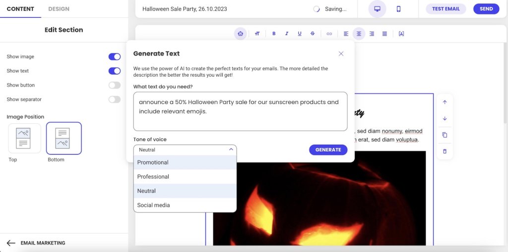
Creating effective email bodies doesn’t have to be complicated. SiteGround Email Marketing includes easy-to-use editors and pre-built templates that handle formatting automatically. And if you’re staring at a blank screen at 3pm wondering what to write, the built-in AI email writer can draft valuable content based on your campaign goals—then you just tweak it as you see fit.
Why the Body Matters in Email Marketing
Your email body determines whether people take action. Here’s why it matters:
- The body drives conversions (not just opens)
- You have three seconds to hold attention
- Mobile formatting makes or breaks readability
- Body engagement affects future deliverability
Let’s break down each of these.
The Body Drives Conversions
Subject lines get opens, but the body is what motivates clicks, responses, and conversions.
You spent 20 minutes crafting the perfect subject line. Your email open rate is 35%. Success, right?
Not if nobody clicks, responds, or does what you asked them to do.
Think of it this way: Your body builds the argument for why someone should care. Your CTA tells them what to do about it. Without a compelling body, even the clearest CTA fails because you haven’t given them a reason to act. But without a clear CTA, even the best body goes nowhere because people don’t know what you need from them. They work together.
You Have Three Seconds Before They Leave
The body is where emails actually fail.
Someone opens your email. They scan the first few lines looking for one thing: “What does this person want from me, and why should I care?” They give you about three seconds to answer that question.
If your body buries the answer in paragraph three, or wraps it in unnecessary context, or makes them work to figure it out—they’re done. The email gets closed, archived, or sits unread.
Mobile Formatting Makes or Breaks Readability
This scanning behavior gets even more ruthless on mobile. And 55% of emails are opened on mobile devices, according to Growth-Onomics, so your carefully written paragraph turns into a wall of plain text on a small screen.
Mobile readers are standing in line, walking between meetings, or half-watching TV. If your email body doesn’t immediately make sense on that tiny screen, you’ve lost them.
Email Body Engagement Affects Whether Future Emails Get Seen
This matters beyond response rates. Email providers are watching.
When people consistently open your emails but never click, scroll, or respond, those providers notice. Low email engagement compared to standard email benchmarks signals “this sender’s emails aren’t valuable.” Your future emails start getting treated as spam or filtered to promotions tabs—meaning your subject line doesn’t even get a chance to work.
The email body isn’t just about whether this email gets a response. It’s about whether your next 50 emails even get seen.
The 4 Key Components of Every Email Body
Every email body follows the same basic structure, whether you’re writing to a colleague, a customer, or a prospect. Understanding these four parts helps you organize your message so people actually read it.
Here’s what every email body needs:
- Email greeting – How you start the email (Hi, Hello, Dear). It sets your tone and gets the recipient reading.
- Main message – This is where email copywriting actually happens—delivering your value and keeping the reader interested.
- Call to action – What you need them to do next. This moves them from reading to actually doing something.
- Closing – How you sign off (Thanks, Best) plus your signature with contact info. The closing wraps it up professionally and makes sure they can reach you if needed.
Each part has one job. When one part fails—say your core message buries the point or your CTA is vague—the whole email fails.
Email Body Best Practices
Now that you know what goes where, let’s talk about how to execute each part so people actually read and respond.
Write Email Messages for Skimmers
People scan emails looking for relevance. If your first sentence doesn’t tell them what’s in it for them, they’re gone.
Lead with the benefit—what this email does for them. Then explain how. Context comes last, if at all.
The structure that works:
Lead with the benefit—the specific result they’ll get. “This cuts your response time in half.”
Then explain how it delivers that benefit. “By automating your most common replies…”
Context comes last, and only if it adds credibility. “Based on analysis of 10,000 customer emails…” Most of the time, you can skip context entirely.
Most emails do this backward. They start with three paragraphs of context (“We’ve been in business for 15 years…”), then finally get to the benefit. By then, the reader is gone.
See the difference:
Before: “I hope this email finds you well. I wanted to reach out to discuss our Q4 partnership opportunities. As you know, we’ve been working in the industry for over 15 years and have helped companies like yours…”
After: “Quick question about your Q4 budget—do you have 10 minutes next week to discuss how we cut response times by 40% for companies like yours?”
When to adjust this approach:
- Cold emails: Lead with value immediately. No context needed—they don’t know you yet.
- Ongoing conversations: Reference your previous discussion first, then add new info. They already have context.
- Email newsletters: Context matters here, but use clear section breaks and headlines so readers can scan and choose what to read.
Use Images and Links Strategically
Your email body isn’t just text—images and links play a role too. But both can work against you if you’re not strategic about how you use them.
Images
- Use 2-3 strategic images maximum. More than that competes for attention and slows load time on mobile.
- Always include alt text for accessibility and blocked images. So that means that you shouldn’t label your photo file as “image1.jpg”—explain what the image shows: “Product comparison chart showing 40% time savings.”
- Optimize file size for mobile loading. Large images kill the experience on slower connections.
- Never put your entire message in an image. When images don’t load (and they often don’t by default), your email is blank.
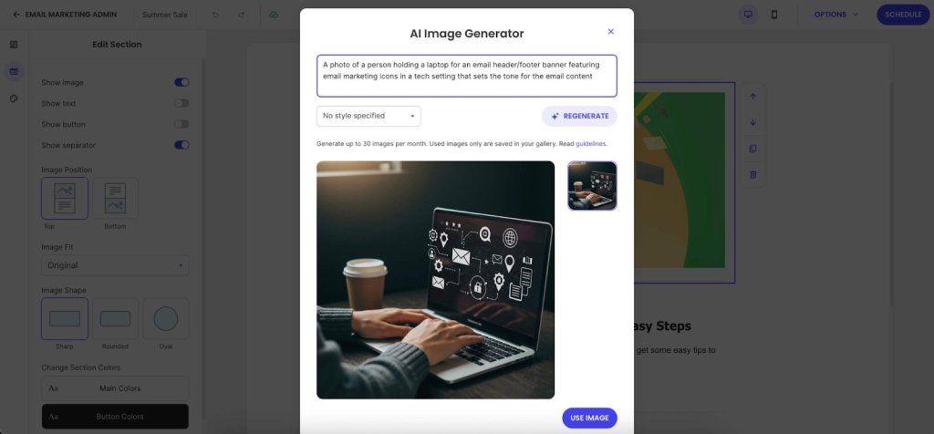
Need images but don’t have a designer on hand? SiteGround Email Marketing includes an AI Image Generator that turns text prompts into visuals. No more hunting through stock photo sites trying to find something that doesn’t look like every other professional email.
Links
- Stick to 1-3 strategic links that support your primary CTA. Every link is a potential exit point. Too many options creates decision paralysis—people click nothing.
- Use descriptive anchor text: “See the full case study” instead of “click here.” This helps accessibility and tells people what they’re clicking.
- Add white space between links on mobile. If two links are stacked 2mm apart, people will tap the wrong one. Give them room.
Keep in mind: Each link you add dilutes the power of your main CTA. Be selective about what deserves a link in your email body.
Format for Mobile-First Readability
Remember how over half of all emails are opened on mobile? That mobile reality shows up most in your formatting. If your email body doesn’t work on a small screen, it doesn’t work.
Essential formatting practices:
- Use short paragraphs with white space between them. What looks like a three-line paragraph on desktop turns into 8-10 lines of scrolling on mobile. Cut paragraphs in half.
- Use bullet points for lists of 3-5 items—features, steps, options. Don’t use a single bullet point when a regular sentence would work better.
- Stick to web-safe email fonts: Arial, Georgia, Helvetica. That custom brand font you love? It reverts to Arial in most email clients anyway. SiteGround Email Marketing lets you choose between font styles that work across all email clients without breaking.
- Pick one thing per section to emphasize, then leave the rest alone. If everything is bold, nothing stands out.
The mobile preview test: Send yourself a test, open it on your phone, and try tapping the CTA with your thumb. If you can’t read and act on it one-handed while standing, fix it.
Create One, Unmistakable Call to Action
Vague requests get vague (or no) results. Your CTA must be specific, action-oriented, and easy to find.
- Use Action-Oriented Language: Start with a verb. “Schedule Your Demo” is better than “Demo.”
- Place it Logically: Position your CTA immediately after you’ve made your case. Don’t bury it below your signature.
- Avoid Vague Language: Replace passive phrases like “Let me know what you think” with a direct ask, such as “Can you reply with your feedback by Friday?”
7 Common Email Body Mistakes To Avoid
These common errors can ruin an otherwise strong email campaign.
- Wasting your opening line
- Burying your point
- Using vague CTAs
- Signature overload
- Desktop-only formatting
- Skipping proper proofreading
- Judging results too quickly
Here’s what each mistake looks like and how to fix it.
1. Wasting Your Opening Line
“I hope this finds you well” burns your most valuable real estate on nothing. Your reader decides whether to keep reading in the first two lines.
What to do instead: Lead with context (“Following up on our Q4 budget conversation…”) or lead with value (“I found three ways to cut your checkout time…”)
2. Burying Your Point
Three paragraphs of context before you say why you’re writing means most people never get to your actual message.
What to do instead: Most important information first (inverted pyramid). One idea per paragraph, 2-3 sentences maximum on mobile.
3. Vague Calls to Action
“Let me know if you have questions” isn’t a CTA—it’s asking your reader to figure out the next step for you.
What to do instead: Specific action (“Reply with your available times this week”), one primary CTA (not five competing asks), place it after you’ve made your point (not buried below your signature).
4. Email Signature Overload
Eight lines of titles, social media links, legal disclaimers, and inspirational quotes. Your signature isn’t a LinkedIn profile.
What to do instead: Simple sign-off (“Thanks,” “Best”), name, title, company, phone number. That’s it. Bonus: SiteGround Email Marketing handles signature formatting automatically.
5. Desktop-Only Formatting
We covered mobile-first formatting in the best practices section, but this mistake is so common—and so costly—it’s worth calling out again. Your email looks perfect on your 27-inch monitor, unreadable on the phone where 55% of your recipients are reading it.
What to do instead: Preview on mobile before sending. Test that CTAs are thumb-friendly (44px minimum button size). Cut paragraphs in half for mobile readability.
6. Skipping Proofreading
Reading your email once before sending means your brain autocorrects what you meant to say, not what you actually typed.
What to do instead: Read backward (last sentence to first) to catch typos. Read out loud on mobile before sending important emails. Double-check CC/BCC fields (you can’t un-send). Watch for autocorrect disasters with client names.
7. Judging Too Quickly
Declaring something “doesn’t work” after one email tells you nothing.
What to do instead: Run at least 10 emails before making conclusions. Track email marketing metrics like click-through rate (not open rate)—clicks tell you the body worked. Test one element at a time: CTA placement, copy, length. Use email analytics to see where readers stop scrolling. Platforms like SiteGround Email Marketing show click rates by link and where engagement drops off.
Quick Reference Checklist for Your Next Email
Before you hit send, run through this quick checklist.
- Delete the first paragraph. Does the email still make sense? If yes, that first paragraph was filler—cut it. The value to your reader should be obvious in the first two sentences.
- Is the CTA a specific action? (e.g., “Reply with X” instead of “Let me know”).
- Is there enough white space? Are paragraphs short (2-3 sentences)?
- Did you preview it on mobile? Are the links easy to tap?
Build Better Emails with SiteGround
Fixing your email body doesn’t require becoming a world-class copywriter overnight. It’s about building better habits. Start with one fix from this guide—like shortening your paragraphs or clarifying your CTA—and apply it consistently.
That’s where SiteGround Email Marketing actually helps—from AI-assisted writing to automatic mobile formatting, it handles what takes you hours to figure out on your own.
Fix one thing at a time, and watch your engagement grow.
Improve Your Email Campaigns with SiteGround!
Want your emails to reach more people? Try SiteGround Email Marketing. With an average delivery rate of 98.8%, your emails will land in your subscribers' inboxes. ![]()


Comments ( 0 )
Thanks! Your comment will be held for moderation and will be shortly published, if it is related to this blog article. Comments for support inquiries or issues will not be published, if you have such please report it through our official channels of communication.
Leave a comment
Thanks! Your comment will be held for moderation and will be shortly published, if it is related to this blog article. Comments for support inquiries or issues will not be published, if you have such please report it through our official channels of communication.