Email accessibility: reach everyone on your list
Your email list is bigger than you think; you’re just not reaching all of it.
About 16% of people have disabilities that affect how they interact with emails. That’s roughly one in six subscribers who might struggle to read your tiny text, click your cramped buttons, or make sense of your “click here” links when a screen reader announces them out of context.
When you make your emails accessible, you’re not just reaching these subscribers, you’re improving results for everyone on your list. Let’s look at how to close this accessibility gap.
Key takeaways:
- 16% of subscribers face accessibility barriers – One in six people have disabilities affecting email interaction.
- Accessible design improves all metrics – Better readability, faster loading, and improved deliverability benefit everyone.
- Use descriptive link text – Replace “click here” with specific phrases like “Download the 2025 marketing guide.”
- Minimum 14px font size – Use readable sans-serif fonts; 16px is optimal for body text.
- Add alt text and test without images – Describe images for screen readers and verify emails work when images are blocked.
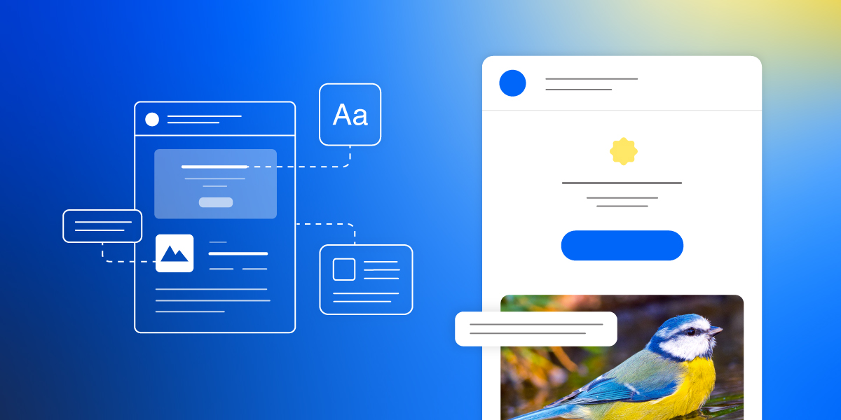
What is email accessibility?
Email accessibility is the practice of designing email messages that all your subscribers can read, understand, and interact with, including people with visual, motor, or cognitive disabilities. This means people who use screen readers due to vision impairments, subscribers with physical disabilities who struggle with small buttons, and anyone with cognitive differences who find complex layouts hard to follow.
But accessible design isn’t only about disabilities. An accessible email also works better for someone squinting at their phone in bright sunlight, a busy professional skimming messages while multitasking, or anyone with a slow internet connection waiting for image files to load. Larger fonts reduce eye strain for everyone. Clear link text helps anyone decide what to click. Simple layouts load faster on any connection.
When you create emails that are accessible, you remove barriers that prevent people from reading your digital content and clicking your links.
Why email accessibility matters
Email accessibility matters because it determines whether your subscribers (including people with disabilities) can actually read and interact with the messages you send them.
According to the World Health Organization, 1.3 billion people—about 16% of the global population—experience significant disability. Many of these disabilities affect how people interact with emails: vision impairments that require screen readers or other assistive technology, motor limitations that make small buttons hard to click, or cognitive differences that make busy layouts overwhelming.
Plus, what works for people with disabilities typically works better for everyone:
- Clear email CTAs get more clicks from all subscribers.
- Accessible email fonts reduce eye strain whether someone has low vision or just tired eyes at the end of the day.
- Simple email layouts load faster and scan easier on any device.
Most businesses see their email marketing metrics improve across the board when they prioritize accessibility.
Accessible emails also increase email deliverability. Proper HTML structure, balanced text-to-image ratios, and mobile-friendly layouts are factors email providers use when deciding whether to deliver your messages to inboxes or spam folders. When you optimize for accessibility, you’re also optimizing for inbox placement.
Beyond performance, there’s a legal consideration: courts are increasingly applying the Americans with Disabilities Act (ADA) to digital communications, including email. While regulations like the ADA and European Accessibility Act vary by region, following basic accessibility practices protects your business from potential claims.
Email accessibility follows the same principles as accessible web design. Both focus on removing barriers so everyone can access your digital content, like adding alt text, using readable fonts, and structuring content clearly covers most legal requirements and protects your business from potential claims.
Each of these practices closes part of the gap between your emails and the subscribers who can’t read them.
Types of accessibility needs to consider
Accessibility isn’t one-size-fits-all. Your subscribers might face different challenges when reading emails:
- Vision challenges range from total blindness (requiring screen readers) to low vision (needing larger text and zoom) to color blindness (where certain color combinations are impossible to distinguish).
- Motor limitations like arthritis, tremors, or limited hand mobility make it hard to tap small buttons or cramped links, especially on mobile devices.
- Cognitive differences including dyslexia, ADHD, and processing disorders mean dense layouts and complex language become overwhelming quickly.
- Situational barriers might affect everyone at some point: a broken arm, reading in bright sunlight, or listening to emails while driving all create temporary accessibility needs that require the same design solutions as permanent disabilities.
When you understand these barriers, you can design emails that actually work for everyone on your email list.
Email accessibility best practices
Making your emails accessible doesn’t mean starting from scratch. The essentials break down into three areas: what you write, how it looks, and the technical setup behind the scenes. Let’s start with the part you already control: your content.
Write accessible email copy
Email copywriting and the structure of your content determines whether people can understand and act on your message. These practices directly address the most common barriers creating the accessibility gap.
- Write clear email subject lines and preheaders. These are the first things subscribers see and the only things screen reader users might hear before deciding to open. Make them descriptive and specific. “Your order #12345 has shipped” works better than “Good news!”
- Use descriptive link text. Screen readers often jump from link to link, reading them out of context. “Download the 2025 marketing guide” tells people exactly what they’ll get. “Click here” or “Learn more” means nothing when read alone. Make every link meaningful on its own.
❌ “We’ve launched new features. Click here to learn more.”
✅ “We’ve launched new features. Read about our updated dashboard.”
- Keep language simple and direct. Skip the jargon and marketing speak. Short sentences and common words help everyone understand faster: people with cognitive differences, non-native speakers, and busy professionals skimming on their phones. If you need a specialized term, explain it.
- Structure content in logical order. Start with the most important information. Use headings to break up sections. Put related ideas together. Screen readers navigate by headings, so a clear structure helps people find what they need without reading every word.
Design accessible emails
Email design choices affect readability for everyone on your list. These visual elements make the difference between an email people can read and one they’ll delete.
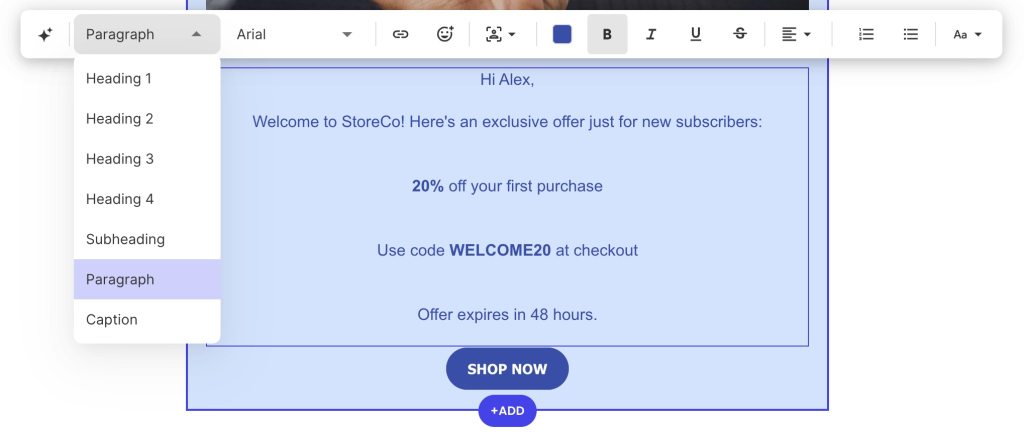
- Use a minimum 14px font size. Anything smaller strains eyes and disappears on mobile screens. For body text, 16px works even better and is considered optimal for readability. Save smaller sizes only for fine print like footer text, and even then, don’t go below 12px.
- Choose readable email fonts. Sans-serif fonts like Monsterrat, Roboto, Open Sans, or Poppins are excellent for email body text. For a more formal look, try serif fonts like Lora or PT Serif. Avoid decorative or script fonts for body copy—save those for headlines if you use them at all. Never use all caps for long passages since it’s harder to read. SiteGround Email Marketing, for example, offers both email-safe and web-safe fonts with automatic fallbacks, so your chosen fonts display consistently across all devices.

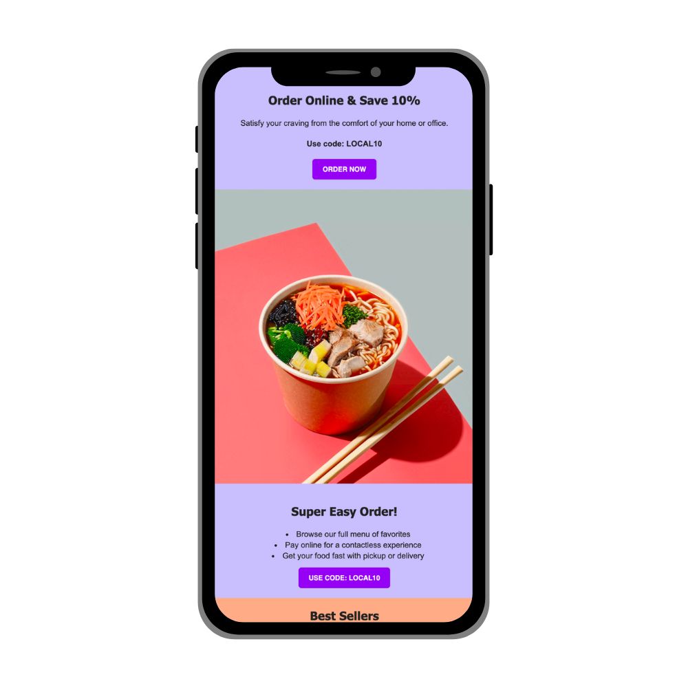
- Make email CTAs large and easy to click. Buttons should be at least 44×44 pixels so that they are large enough to tap accurately on mobile. Add enough space around them so people don’t accidentally click the wrong element. Use contrasting colors so they stand out from surrounding content.
- Add space around elements. Cramming content together overwhelms readers and makes clicking harder. Give your text room to breathe. Add padding around buttons. Space out paragraphs. This negative space (often called “white space” regardless of color) improves readability for everyone and makes motor navigation easier.
- Avoid putting text in images. Screen readers can’t read text that’s part of an image file. If you must include text in images (like promotional graphics), keep it minimal and always include that text in your alt description. Whenever possible, use your email editor’s text tools to create styled headlines and callouts instead of images with text.
Technical requirements
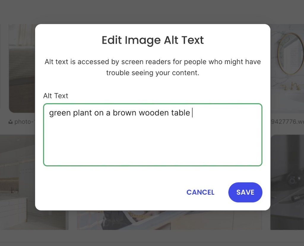
If you’re using SiteGround Email Marketing, the platform handles most technical accessibility requirements automatically: proper HTML structure, semantic markup, and clean email code all work behind the scenes. But understanding what’s happening (and why) helps you make better decisions about your content.Add alternative text to every image. Alt text describes images for screen reader users. Keep descriptions concise but informative: “Marketing team celebrating Q4 results” rather than “image123.jpg” or just “team photo.” For decorative images that don’t add meaning, use empty alt text (alt=””) so screen readers skip them. SiteGround Email Marketing makes this straightforward by prompting you to add alt text when you upload images.
- Create a clear visual hierarchy. Use larger, bolder text for main headlines and progressively smaller sizes for subheadings and body text. This visual structure helps all readers – including those using screen readers – understand how your content is organized. Screen readers in email rely on reading order and text formatting rather than semantic heading tags, so keep your layout logical and use size and weight to show importance. SiteGround Email Marketing templates include preset text styles that create this hierarchy automatically.
- Test with images turned off. Before sending, preview your email without images (most email platforms include this option) or send yourself a test and view it with images disabled in your inbox. For instance, Gmail asks before displaying external images to protect users from tracking pixels and malicious content. Can people understand your message? Are your CTAs visible? If the email breaks without images, restructure it.

SiteGround applies accessibility standards to both the platform you use and the emails you send. The accessible Client Area and Site Tools dashboards include high-contrast themes, keyboard navigation, and screen reader support – so creating emails is accessible too. Email templates are tested with accessibility consultants to catch issues before they reach subscribers, meaning accessibility is built into the entire process, not added as an afterthought.
How to check your email accessibility
Once you’ve built your email with these practices in mind, run through a few quick checks before sending. You don’t need specialized software or technical expertise. These straightforward tests catch most accessibility issues.
- Check your color contrast by squinting at your screen or viewing it in bright light. Dark text on light backgrounds (or vice versa) almost always works better than subtle shades. SiteGround Email Marketing also includes a built-in contrast checker that proactively alerts you when your color combo doesn’t mean accessibility standards.

- Read it out loud. This simple test catches confusing link text, unclear CTAs, and awkward phrasing. If something doesn’t make sense when you read it aloud, it won’t make sense to a screen reader either. Pay special attention to links. Do they make sense without the surrounding context?
- Send a test to yourself. Check how your email looks in the email clients your subscribers actually use: Gmail, Outlook, Apple Mail, whatever your analytics show as most common. Some accessibility features (like alt text) display differently across clients, and you want to catch any surprises before your real send.
- Preview on your phone. Since you’ve already sent these test emails, be sure to also check them on your actual phone, not just a desktop preview. Tap every button and link. Are they easy to hit without accidentally clicking something else? Can you read the text without zooming? Your phone preview shows you what mobile users experience and reveals accessibility issues that desktop testing misses.
Most email platforms, including SiteGround Email Marketing, let you send test emails to multiple addresses. Take advantage of this to review your message in different environments before it reaches the email list you’ve built.
Start making your emails accessible
You don’t need to overhaul everything at once. Start with three changes:
- Add alt text to images
- Use at least 14px font size
- Replace “click here” with descriptive link text
Each fix reaches more subscribers and improves performance for your entire list.
If you’re ready to make accessibility simpler, SiteGround Email Marketing handles the technical requirements automatically—proper HTML structure, accessibility prompts, and mobile-optimized templates. You also get automated email journeys to send welcome sequences or follow-ups without manual work, reliable inbox delivery backed by SiteGround’s infrastructure, and analytics that show what’s working. Less time wrestling with technical details means more time connecting with customers and growing your business.
Improve Your Email Campaigns with SiteGround!
Want your emails to reach more people? Try SiteGround Email Marketing. With an average delivery rate of 98.8%, your emails will land in your subscribers' inboxes. ![]()


Comments ( 0 )
Thanks! Your comment will be held for moderation and will be shortly published, if it is related to this blog article. Comments for support inquiries or issues will not be published, if you have such please report it through our official channels of communication.
Leave a comment
Thanks! Your comment will be held for moderation and will be shortly published, if it is related to this blog article. Comments for support inquiries or issues will not be published, if you have such please report it through our official channels of communication.