9 Contact Us Page Mistakes - Fixed with Real Examples

So, you want to make sure your Contact Us page isn’t just another forgotten link on your website? You’re in the right place.
In this article, we’ll explore 9 mistakes you’re probably making with your Contact Us pages and how you can fix them using real-life examples. Let’s transform your page into a functional, inviting, and engaging space.
Ready to get started? Let’s do this!
Why Is a Contact Us Page Important?
Think of your Contact Us page as your website’s conversation starter—it’s the inviting nudge that encourages visitors to reach out and engage with you. Whether they’re asking questions, sharing feedback, or just saying hello, this page is your chance to show that you’re approachable and eager to connect.
But why exactly is it so important? Unlike other pages like the About Us or Homepage, which primarily provide information, the Contact Us page is all about interaction. It’s a direct line between you and your audience, offering them a personalized space to engage with your brand. A well-designed Contact Us page isn’t just about getting messages—it can turn passive browsing into a lively chat, helping you build relationships and earn some trust along the way.
Ready to turn those casual browsers into enthusiastic customers? With SiteGround’s super user-friendly Website Builder, you can craft a killer Contact Us page in a flash! Dive in and watch the magic happen!
9 Mistakes on Contact Us Pages and How to Avoid Them
Alright, so you’ve got the basics down for your Contact Us page, but are you sure it’s hitting all the right notes? Even with the best intentions, some pages can slip up and send your visitors running instead of sticking around.
But don’t worry—we’ve got your back. Let’s check out some of the most common slip-ups businesses make on their Contact Us pages and, more importantly, how you can dodge them. With these tips, you’ll be on your way to crafting a page that’s not just working, but also gets your website visitors excited to reach out.
Mistake 1: Making the Contact Us Page Hard to Find
Let’s face it—if people have to go on a digital scavenger hunt just to get in touch, they’re likely to throw in the towel. That’s why this first mistake tops our list; making your Contact Us page hard to find is like hiding the key to your front door, leaving visitors feeling frustrated and ready to give up.
💡To avoid this, make sure your Contact Us page is easy to spot. Pop a link in your main menu, stick it in the footer, or even throw in a call-to-action button on important pages. The idea is to make it super simple to find and use, so people feel welcome and ready to connect whenever they need to chat.
If you’re going for a simple and minimalist website, make sure that the ‘contact’ option is right there in your menu. That way, as soon as someone lands on your homepage, they’ll know exactly how to get in touch with you.

Mistake 2: Overcomplicating the Design
Once visitors find your Contact Us page, you don’t want to lose them with a complicated design. So, keeping it simple is the way to go. Don’t cram it with too many bells and whistles, flashy graphics, or info that nobody really needs. This can totally overwhelm visitors and make it a real hassle for them to find what they’re looking for.
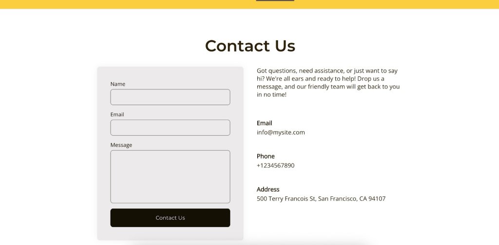
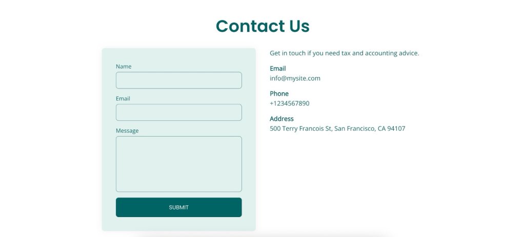
💡Instead, go for a clean and straightforward design that’s super easy to navigate. For example, if you offer services, focus on the info your potential customers really need, like your email, phone number, and address. Everything else might just end up being a distraction rather than a help.
Mistake 3: Offering Limited Contact Options
Imagine this: a visitor finally lands on your Contact Us page, ready to reach out—only to find a phone number and nothing else. What if they’re not into phone calls? They might just bail and never come back. That’s why mistake number three is not offering a mix of contact options.
💡Make sure everyone can get in touch in a way that suits them. The usual go-tos are phone, email, and address, but depending on your business type and location, different platforms might be more popular. For example, Instagram is a hit in the US, while WhatsApp is the go-to in Spain.
Just make sure those links make sense and serve a purpose—nothing’s more frustrating than being sent in circles, only to end up back at an email that keeps bouncing you around. Keep it straightforward and functional.
Pro tip: Keep your contact links in tip-top shape by clicking on them regularly to make sure they go where they’re supposed to. Check them out on different devices and browsers, and verify that emails actually land in the inbox.
And hey, let them know your average response time—it’s a nice touch that sets clear expectations.
Mistake 4: Ignoring Mobile Optimization
Skipping mobile optimization for your Contact Us page? That’s a big no, especially with everyone glued to their phones these days. If your page isn’t looking sharp or working smoothly on mobile, visitors might just throw their hands up in frustration and peace out. Let’s make sure your page is ready to impress, no matter the screen size.
💡Give it a spin on different devices to make sure everything, from text to buttons, is easy to read and use. When your page is mobile-friendly, it means everyone, no matter what gadget they’re on, can easily reach out and connect with you.
Quick tip: Make sure your buttons are easy to tap, no matter what device folks are using. Whether they’re on their phone during a crowded train ride, sitting at their desk with a huge screen, or relaxing on the couch with a tablet, your page should be a breeze to navigate.

Mistake 5: Using the Wrong Tone or Language
Once you’ve got your Contact Us page working smoothly on mobile, it’s time to think about the words you’re using. If your tone doesn’t match your brand or feels too stiff, it might make your business seem a bit distant or off-putting.
💡Try using a tone that fits your brand and makes visitors feel like they’re chatting with a friendly guide. This makes your brand more relatable and keeps the experience enjoyable.
Here are some tips to nail your copy:
- Reflect Your Brand’s Vibe: Whether you’re all about being chill, professional, or a little quirky, let that personality shine in your language. It helps create a consistent and welcoming experience.
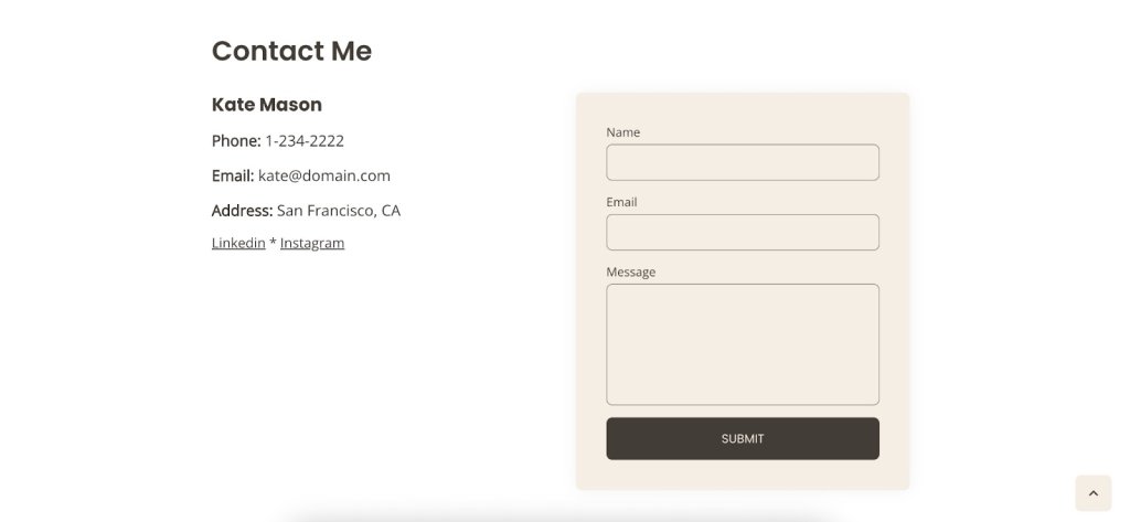
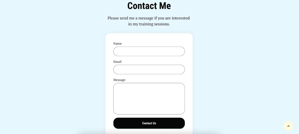
- Keep It Warm and Friendly: Use conversational language to make visitors feel at home. Phrases like “We’d love to hear from you” or “Drop us a line” can make things more inviting. Even small tweaks, like changing “Contact” to “Contact Me,” can work wonders by adding that personal touch and turning a generic page into a friendly invitation.
- Look for Creative Inspiration: Check out brands that have nailed their Contact Us pages. Some use humor or storytelling to make their pages stand out and be more memorable.
Need a little help crafting that perfect message? The right ChatGPT prompts can give you a hand, but remember, nothing beats your own judgment and unique flair. After all, you’re the best at knowing what makes your brand shine.
Mistake 6: Using Weak or Unclear CTAs
Now that you’ve got the tone and language perfectly aligned with your brand, let’s make sure visitors know exactly how to take the next step. If your calls to action are unclear or not very inviting, visitors might not know what to do next and could just leave without reaching out. So, ditch those snooze-fest CTAs like “Submit,” “Click Here,” “Learn More,” or “Fill Out the Form.” They’re vague, lack context, and sound about as exciting as watching paint dry, leaving visitors scratching their heads instead of engaging.
💡Make sure your CTAs are clear and catchy so they stand out. Use simple, action-driven words like “Get in Touch,” “Send Us a Message,” or “Chat Now” to guide people on what to do. When your CTAs are easy to find and clear, it makes connecting with you super simple, giving visitors a smooth path from browsing to reaching out.
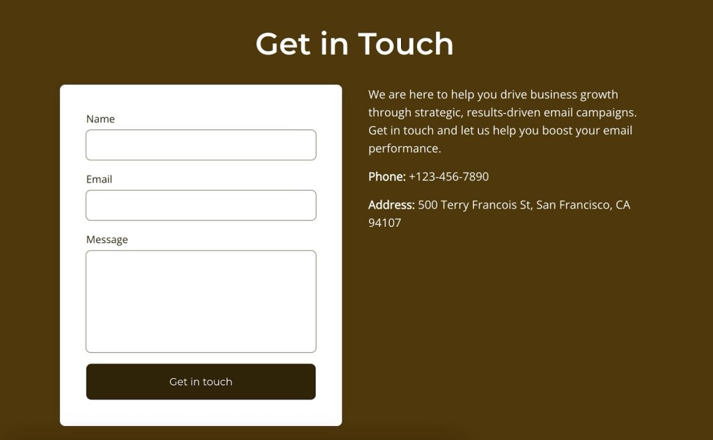
Mistake 7: Providing Incomplete Business Information
Leaving out key details is like giving someone a map with missing pieces—totally confusing and frustrating.
💡Make sure your business info is thorough and crystal clear so visitors can connect with you without any guesswork.
Here’s a quick checklist to keep things simple:
✅ Business address
✅ Operating hours
✅ Contact numbers
✅ Email address
✅ Social media links
And depending on your business, think about adding those extra details that save people from feeling lost. A few smart fields, such as dropdown menus for selecting the department or type of inquiry (like sales, support, or feedback), can be super handy. You don’t want to overload visitors, but these options can easily point them to the right team or service.
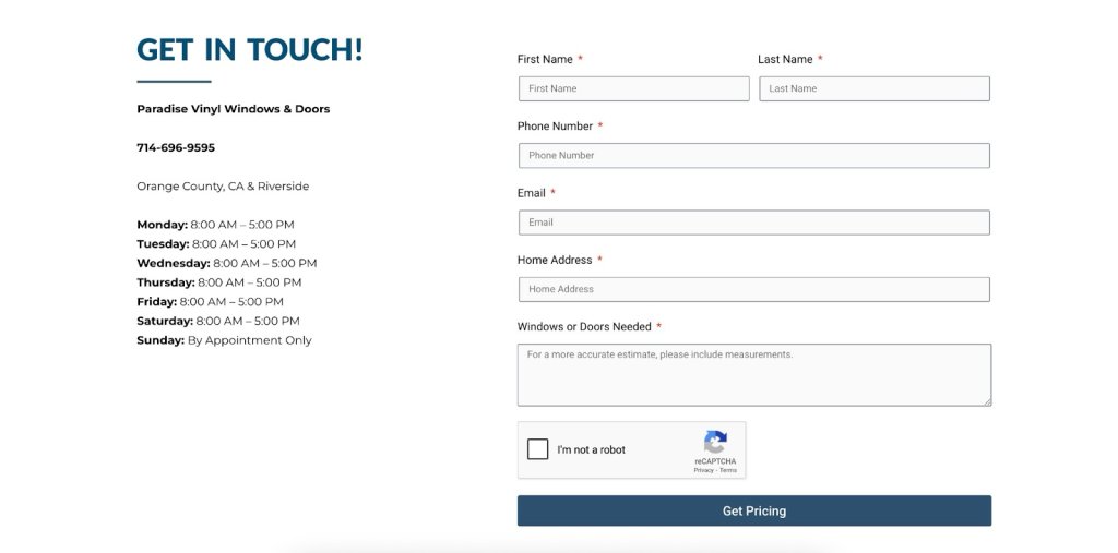
For example, if you offer yoga classes, maybe ask if they’re curious about classes types or pricing. It’s those little touches that make reaching out smooth and hassle-free. Take this studio, for example. They’ve nailed it by not only having a contact form and phone number but also giving folks a heads-up on how early they need to call to book a class.
Check out this windows and doors shop. They’ve got it all sorted with a super handy form that asks if you’re after windows or doors and even nudges you to add measurements for a spot-on estimate. It’s those little touches that make reaching out hassle-free, so customers get exactly what they need.
Mistake 8: Lacking a Follow-Up Process
Next up, it’s important to think about what happens after someone reaches out. Even if you’ve perfected all the other steps, it’s all for nothing if you don’t have a proper follow-up process to manage your inquiries. Make sure you have a system in place to respond promptly and keep the conversation going.
💡Instead, get a system in place to give inquiries a friendly nod and a speedy reply. Whether it’s a quick automated email that says, “Hey there, we got your message—you’re on our radar” or a friendly team member ready to dive in with a response, having a clear follow-up process shows you genuinely appreciate them reaching out.
SiteGround Email Marketing can really make things easier with its email automation feature. You can set up a series of automated emails that kick in as soon as someone subscribes or reaches out. This way, every inquiry gets a quick acknowledgment and follow-up without you having to do a thing. With triggers and automated responses, you can keep the conversation going smoothly and let your customers know how long they’ll be waiting for a reply—whether it’s 24, 48, or 72 hours.
This not only builds trust but also makes the experience feel more natural and approachable, encouraging visitors to reach out again in the future. Keep the tone aligned with your brand, and watch those connections grow.

Mistake 9: Failing to Test and Optimize
After establishing a solid follow-up process, it’s essential to keep your Contact Us page in top shape by regularly testing and optimizing it. Neglecting to monitor your page’s performance means you might miss valuable opportunities to enhance user experience.
💡Instead, use analytics to see how visitors interact with the page and spot areas that could use a little tweaking. Check metrics like time on page, bounce rates, or how often visitors reach out. Whether it’s adjusting the layout, refining the language, or simplifying the form fields, regular testing and optimization help keep your Contact Us page effective and user-friendly. This ongoing effort not only keeps your users satisfied but also makes it easier for them to engage with your brand, opening the door to better communication.
How to Add a Contact Us Page to Your Website
Creating a Contact Us page for your website is a straightforward process. Here’s a step-by-step guide to help you add it:
1. Navigate to Content Creation
Go to Content > Add Content > Basic Page to begin setting up your new page.
2. Enter Page Details
Fill in the necessary information for your Contact Us page, such as your contact details, a contact form, or any other relevant information you want to include.
3. Set the URL Alias
Before saving, expand the URL alias settings tab and specify a simple URL, like contact-us. This will make it easy to remember and access.
4. Add to Menu
Head over to the Menu Settings tab and check the box for Provide a menu link. This ensures your Contact Us page is easily accessible from the main navigation menu.
5. Save Your Changes
Once everything is set up, save your changes to create the page.
Start Building Trust with the Perfect Contact Us Page
You can transform your Contact Us page into a warm, inviting space that truly welcomes people in. Easy to find, simple to use, and full of personality—these are your secret ingredients.
Ready to give your page a little TLC? Try the SiteGround Website Builder, where you can easily craft your perfect Contact Us page and more. Here’s to building trust, sparking conversations, and creating lasting relationships with everyone who stops by!


Comments ( 0 )
Thanks! Your comment will be held for moderation and will be shortly published, if it is related to this blog article. Comments for support inquiries or issues will not be published, if you have such please report it through our official channels of communication.
Leave a comment
Thanks! Your comment will be held for moderation and will be shortly published, if it is related to this blog article. Comments for support inquiries or issues will not be published, if you have such please report it through our official channels of communication.