Website Pages That Take Users from First Click to Conversion
Your website has the potential to be more than just a random collection of pages—it should actually serve as a roadmap that guides visitors from first glance to becoming loyal customers. But to accomplish this, you can’t treat all website pages the same, as simply adding the usual “About” or “Contact” pages won’t guarantee results.
In this article, we’ll break down the key website pages your site needs, why each page matters, and what to include on them so every visitor moves smoothly toward taking action. Whether you’re building a new site or optimizing an existing one, this guide will help you create pages that not only inform but convert.
What Makes a Website Page Essential
Every page on your site has a role. Some pages introduce your brand, others build trust, and some finally drive visitors to make a decision. So as we think about the potential pages for your site, keep in mind the objective of each page, and how all of your web pages can work together as stops along the customer journey.
As you consider your pages, these are the key web page objectives to keep in mind:
- Purpose-driven content: Each page should have a goal, whether it’s informing visitors, showcasing your work, or prompting them to take action.
- User-focused website design: Pages should make it easy for visitors to find what they need, understand your message, and know what to do next.
- Support for business goals: Beyond helping users, pages should align with your marketing or sales objectives, turning the casual visitors into leads or customers.
- SEO & discoverability: Well-structured pages are an important part of implementing SEO, as they help search engines understand your site and connect the right visitors with the right content.
When you think of pages this way—each with a clear purpose along a path—you’ll be ready to organize them into stages that move visitors from awareness to conversion.
Key Components of a Webpage
Every website page is made up of a handful of essential components, which together make it possible to reach the page’s goal. Getting acquainted with these different elements will help you make sure that every page we discuss today can get its job done effectively.
So let’s take a quick look at the key components of a webpage:
- Header & Navigation – Includes your logo, main menu, and key links to help visitors find their way around your site.
- Main Content – The core of the page: text, images, videos, and supporting information that deliver your message. Strong, relevant content builds credibility and keeps visitors engaged.
- Interactive Elements – Forms, sliders, or other features that give visitors ways to interact, share information, or personalize their experience.
- Footer – Typically contains contact info, legal links, social media icons, and additional navigation.
- Behind-the-Scenes Elements – The structural and technical parts of the page, like HTML, CSS, JavaScript, metadata, and SEO features, which make the page functional, accessible, and discoverable.
- Calls to Action (CTAs) – This is listed last here, but among the most important. These are the buttons, links, or prompts woven throughout your page that actively guide visitors forward. CTAs are the connective tissue of your site, encouraging users to explore deeper, sign up, or make a purchase. Without them, even the most compelling content risks becoming a dead end.
Together, these components enable your website pages to go beyond visual appeal. They’re structured to guide visitors, build trust, and drive conversions.
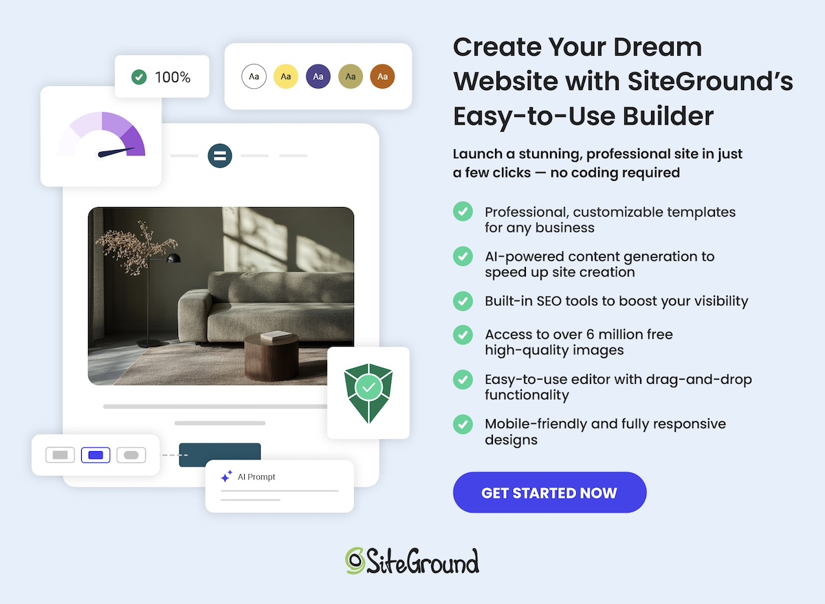
Now, if you’re feeling a little unsure about implementing the technical side of all these elements, then we’ve got good news for you. With the SiteGround Website Builder, you don’t need to worry about coding or complicated setup. It’s designed to help you build professional-looking pages quickly, with all the essential components—navigation, content areas, CTAs, and more—already built in. That way, you can focus on crafting the message (with the help of the built-in AI writer) and guiding your visitors, while the builder takes care of the structure, design, and technical foundation behind the scenes.
Web Page Types to Include for Every Stage
Now that you understand what makes a webpage essential and how its components work together to guide visitors, it’s time to look at the specific types of pages that support each stage of the customer journey. Below, we’ll break down the key page types for awareness, consideration, decision, and retention, and highlight what makes each one effective.
Stage 1: Awareness Website Pages
At the awareness stage, potential customers are just discovering your brand. They might have heard about you through a friend, seen a social media post, clicked on an ad, or found your site via search. They don’t yet know exactly what you offer or why they should care.
So this is your opportunity to change that by making a killer first impression, providing clear value, and guiding visitors toward getting to know your brand further. Your website layout should support this goal by creating a clear, consistent experience that introduces your brand but also gently nudges visitors to take the next step.
Here are a few of the pages that you can leverage to address this early discovery stage.
Homepage
Your homepage is the gateway to your brand and the first step in a longer journey. Beyond introducing your business, it should create context, show value, and make the path forward clear and inviting. Visitors should immediately understand who you are, what you offer, and what they can do next.
Components to include on your homepage:
- A compelling headline that communicates your main value proposition
- A hero image and visuals that capture attention and reflect your brand
- A brief overview of your offerings and unique differentiators
- Clear calls to action that guide visitors to explore services, resources, or products
- Social proof elements like testimonials, press mentions, or trust badges
- A logical layout for easy scanning and navigation
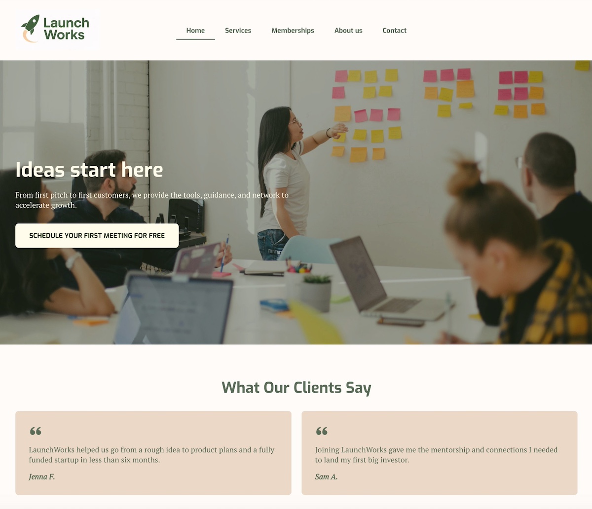
The above homepage nails the hero section with an image of the team in action, creating those ideas that “start here.” A clear button for a free first meeting makes the next step clear, and client testimonials add credibility to the brand’s services.
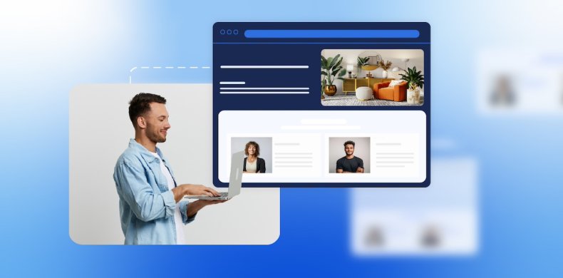
About Page
The About page deepens the connection. It explains why your business or organization exists, what you stand for, and who’s behind it. In doing so, it makes your business feel more personal and gives your brand human depth. Importantly, this page should also lead visitors to take the next step—whether that’s exploring services, reading a blog post, or signing up for a newsletter.
What components to include on your About page:
- Brand story, history, mission, and values
- Team bios and photos to humanize your business or organization
- Behind-the-scenes content or milestones
- Awards, certifications, or achievements
- Calls to action guiding visitors to explore products, services, resources, or signing up
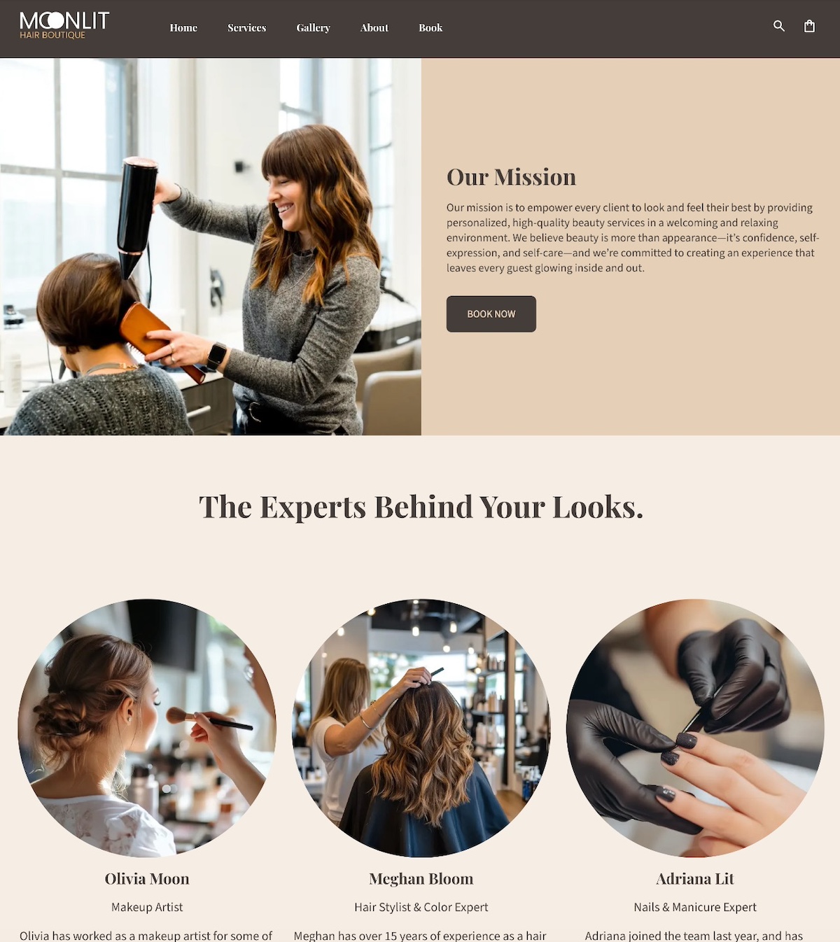
This About page puts the people behind the salon front and center. It’s more than a simple salon, but one with a mission, and experts behind it.
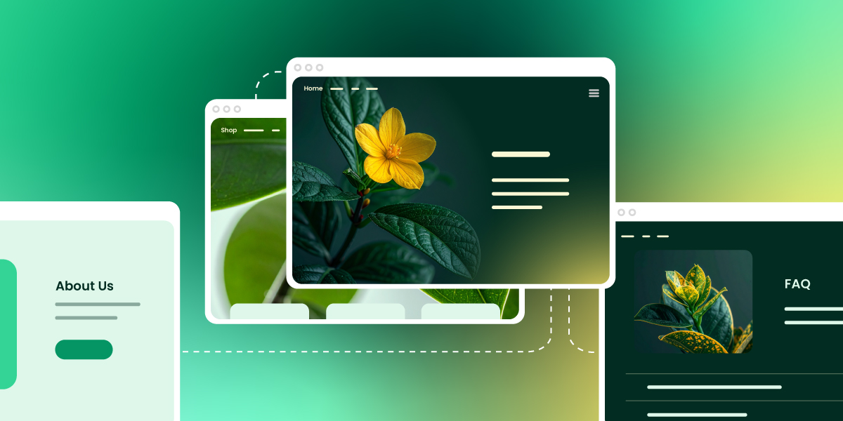
Blog & Resource Pages
Blog and Resource pages educate and provide value, positioning your brand as an authority. They answer early-stage questions, helping visitors understand your space and your expertise.
Elements to include on your Blog or Resource pages:
- Educational articles, guides, or tutorials addressing common problems
- Clear headings and subheadings for easy scanning
- Visuals like images, charts, or videos to support content
- Links to related articles or resources to encourage exploration, which is not only good for SEO, but also for AI overview optimization.
- Calls to action for newsletter signups, downloads, or product pages
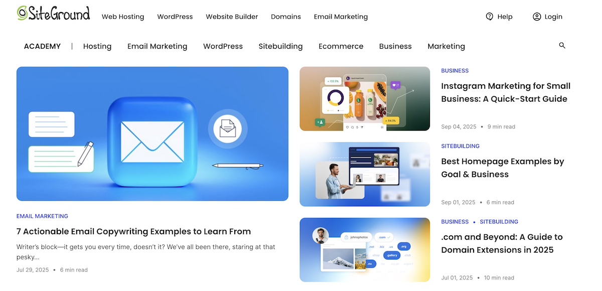
And here you have SiteGround’s Academy, the epitome of a Blog & Resource page. The idea here is precisely as we’ve already defined: to offer extra value and credibility to these areas of business about which SiteGround is an expert.
Stage 2: Consideration Website Pages
At the consideration stage, visitors have learned a bit about your brand and are evaluating whether your products or services meet their needs. This is the middle of the marketing funnel, where they’re comparing options, looking for proof, and deciding whether to take this business-and-customer relationship a step further. Pages at this stage should show value, differentiate your business, and make it easy for visitors to move toward a decision—the next stage. Let’s break down what these website pages might look like.
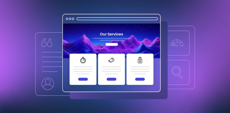
Service & Product Pages
Service and product pages are where you showcase what you offer and why it matters. These pages highlight the features, benefits, and unique value of your product or service, while guiding visitors toward the next step—whether that’s requesting a demo, signing up for a consultation, or making a purchase. While they may include pricing, many businesses also benefit from having a dedicated pricing page for deeper detail, which we’ll cover in the next stage.
Elements to include on your Service and Product pages:
- Detailed descriptions of products or services
- Key benefits and differentiators
- Clear visuals or product images
- Pricing overview (include pricing if it’s simple and builds trust. If pricing is complex or value needs to be shown first, guide users to request a quote, demo, or consultation instead.)
- Calls to action directing visitors to demos, trials, consultations, or purchase pages
- Optional testimonials or mini case studies to reinforce credibility
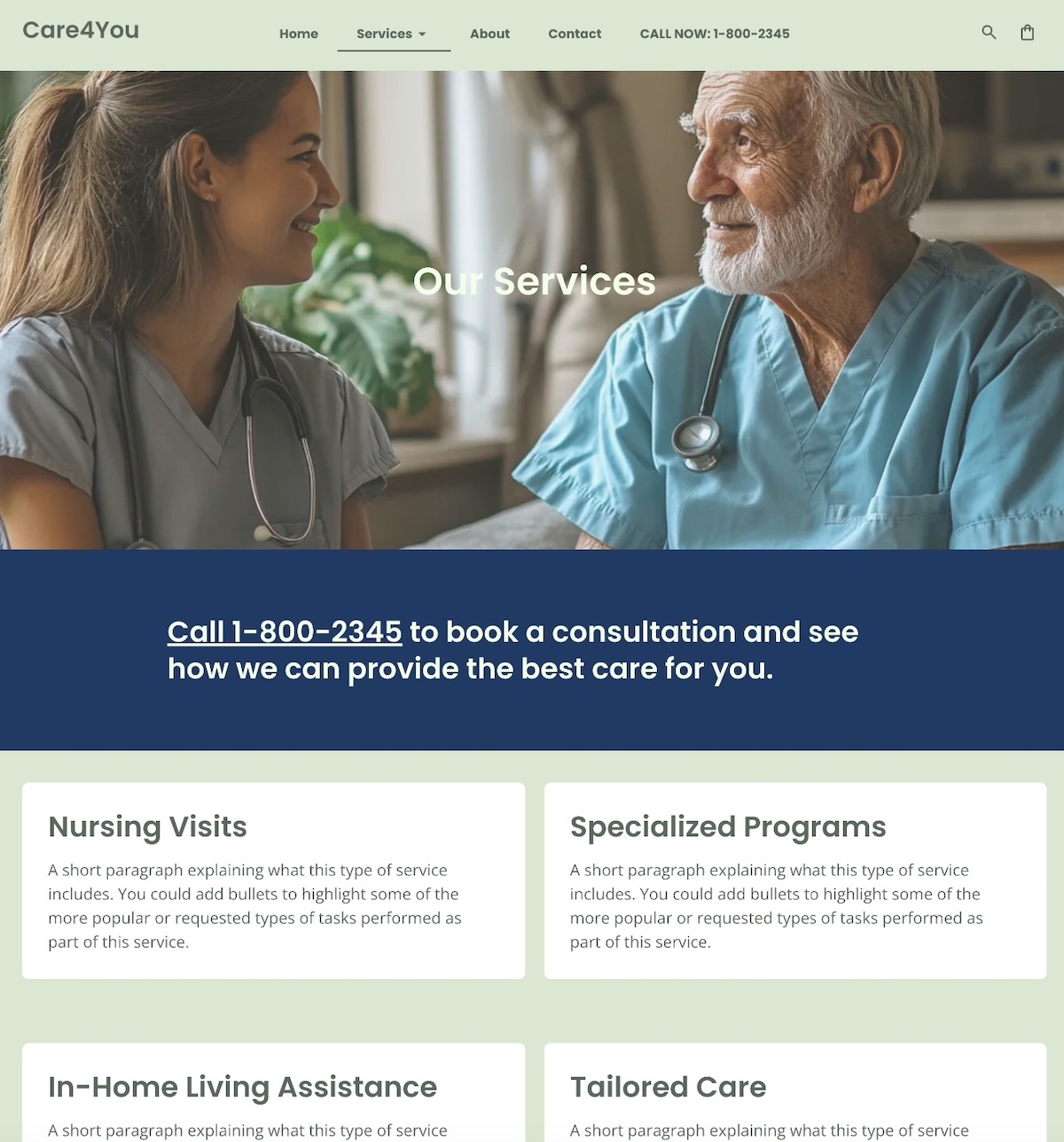
The above Services page is a classic example in that it outlines the different services, and also makes it easy and clear to take the next step by including the phone number in multiple locations on the page.
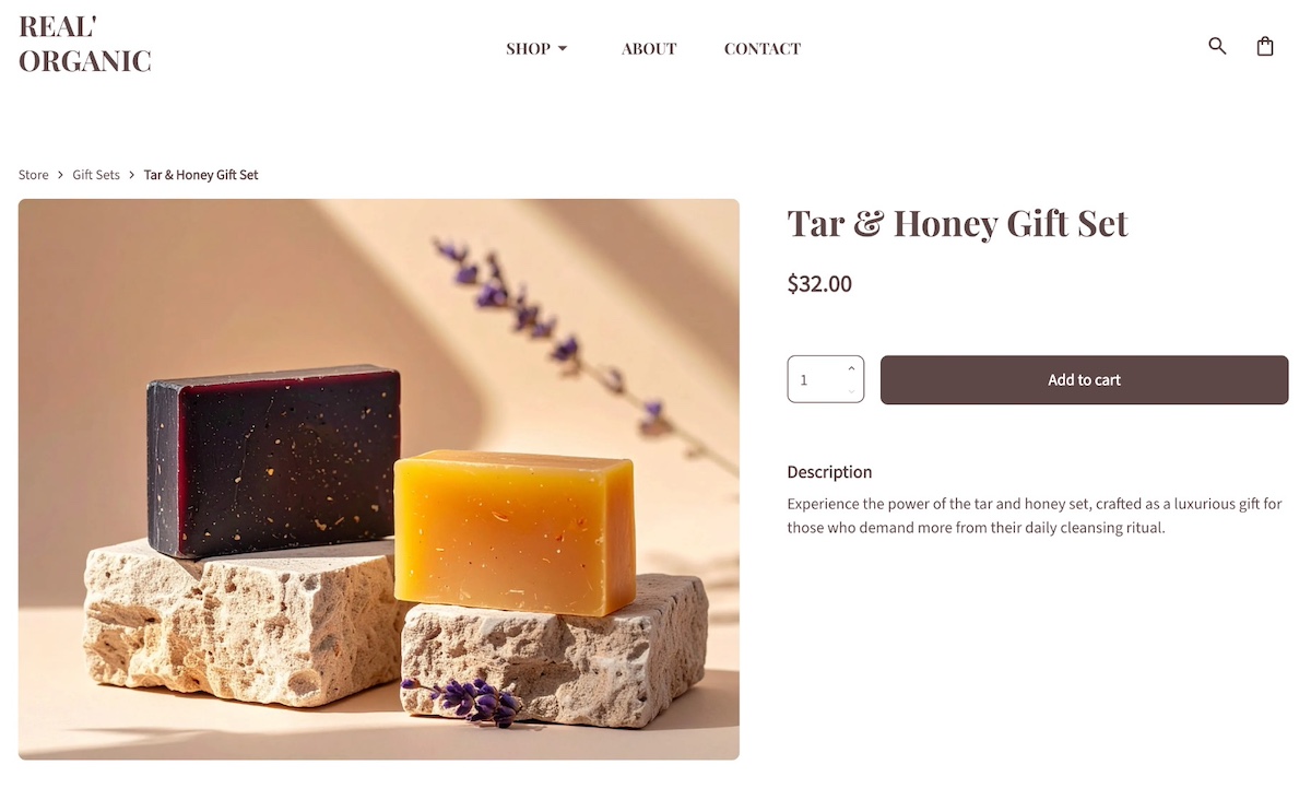
Meanwhile, here is an example of a typical product page, featuring the product name, price, and description. It’s clean, to the point, and makes purchase (regardless of quantity) easy and obvious.
Proof & Trust Pages
Visitors at this stage are evaluating credibility and results. Pages showcasing real examples of your work, happy customers, or other social proof help prospects feel good and certain about choosing your brand.
What to include on your Proof and Trust pages:
- Case studies the demonstrate challenges, solutions, and results
- Client or partner logos
- Portfolio of work or projects
- Written or video testimonials
- Customer reviews and ratings
- Calls to action encouraging contact, demo requests, or product exploration

The above page exemplifies a portfolio page, featuring the award-winning work of the photographer. In that way, it not only demonstrates their work, but acts as social proof via the awards.
FAQ Page
The FAQ page addresses common questions and potential objections before they become roadblocks. Visitors at this stage are seriously considering your product or service, but have last doubts that need to get resolved, and this page fixes that. It reassures them and makes it easier to move toward the next stage of the journey.
Elements to include on your FAQ page:
- Answers to common questions about products, services, policies, or processes
- Clear, concise formatting for easy scanning
- Links to related product/service pages or resources
- Calls to action guiding visitors toward demos, consultations, or purchases
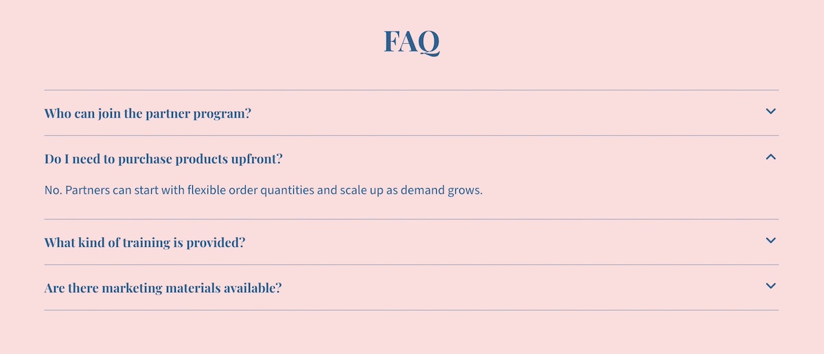
The above FAQ page is quite simple and user friendly, with expandable answer sections. This kind of functionality is especially ideal for an FAQ page, as it allows you to present a substantial amount of text in a more visually pleasing way. Otherwise you risk just having a wall of text, which can be intimidating (or, minimally, boring) for visitors, and drive them away.
If you’re wondering how complicated it is to implement functionality like this, then don’t worry. It’s super easy with the SiteGround Website Builder, which includes built-in FAQ templates that require no coding skills whatsoever. Just add your text and go.
Stage 3: Decision Website Pages
At the decision stage, visitors are ready to take action (finally!). They’ve learned about your brand, explored your offerings, and contemplated your credibility. Pages at this stage should give that final green light by removing friction, providing clarity, and making it super easy for visitors to convert, whether that’s by contacting you, signing up, or completing a purchase.
Let’s break down which kinds of website pages can get this job done.
Pricing Page
A Pricing page deserves its own spotlight because cost is often one of the final hurdles in a customer’s decision-making process. While the aforementioned product or service pages may mention pricing, a dedicated page allows you to present options clearly, compare packages side by side, and answer common concerns. Done well, it builds trust, reduces hesitation, and gives visitors the clarity they need to confidently move forward.
Elements to include on your Pricing page:
- Clear pricing tiers or options
- Features or benefits included in each plan/package
- Comparison charts if relevant
- Calls to action directing visitors to sign up, request a demo, or contact sales
- Optional FAQs addressing common pricing concerns
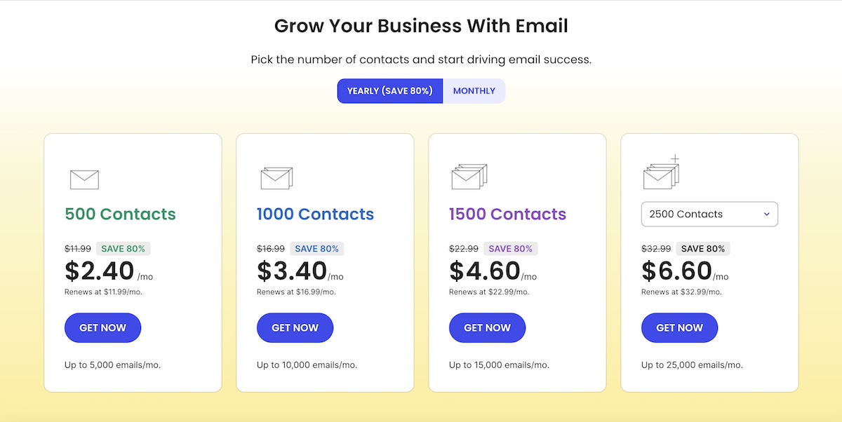
The above is a snapshot of one of SiteGround’s pricing pages, where the different email marketing plans are laid out. As you can see, having one page with compare-and-contrast pricing makes it easier for visitors to make a quick decision and “get now.”
Free Trial/Consultation/Demo Landing Page
These pages are essentially product pages in disguise. They let visitors experience your product or service firsthand, giving them confidence to eventually commit. They should be simple, and focused on driving action.
It’s also worth noting that not all landing pages need to sit within your site’s main navigation. Many are standalone pages, built specifically for campaigns, ads, or special offers. These pages are stripped of distractions and designed with a single goal in mind—getting the visitor to sign up, download, or buy.
Components to include on your Free Trial/Demo/Consult landing pages:
- Clear explanation of what the trial, demo, or consultation entails
- Benefits of participating or signing up
- Minimal form fields to reduce friction
- Calls to action that emphasize urgency or value
- Social proof or testimonials to reinforce credibility
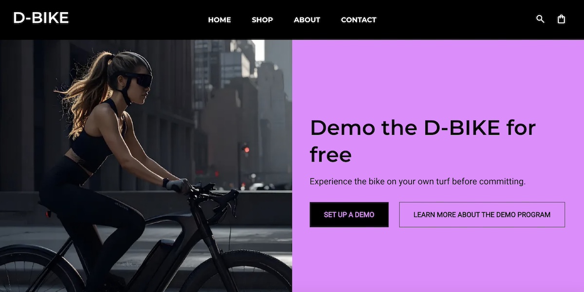
The Free Demo page above gives visitors two options to make the decision easier—they can either sign up for a free demo or learn more about the demo program. This approach meets visitors wherever they are in the decision process, helping guide them more seamlessly toward the next step: making a purchase.
Checkout Page
For ecommerce sites, the checkout page should be fast, simple, and secure, ensuring visitors can complete their purchase without friction. Oftentimes, navigation menus even disappear at this stage in order to avoid distraction, and close the sale.
What to include on the Checkout page:
- Clear summary of items, pricing, and shipping
- Progress indicators for multi-step checkouts
- Security badges and/or trust signals
- Simple, minimal form fields
- Calls to action like “Complete Purchase” or “Place Order”
Stage 4: Retention & Loyalty Website Pages
Once someone becomes a customer, the journey doesn’t in fact end—it shifts to supporting, delighting, and retaining them. Pages at this stage should focus on providing help, strengthening relationships, and encouraging repeat engagement. A strong retention experience not only keeps customers coming back, but also turns them into loyal advocates who recommend your brand to others.
Let’s break down the types of web pages that aid in retention and loyalty.
Support Page
A support page gives customers the comfort of knowing that help is always available. It should be easy to find, and the pathways to answers should be clear (because we all know how frustrating it is when a “support” link sends us in circles).
Components to include on a Support page:
- A knowledge base with guides, tutorials, or FAQs
- Contact options for direct help and even feedback (chat, email, phone)
- Search functionality for quick solutions
- Links to community forums or help centers (if applicable)
- Calls to action that encourage continued use of your product or service
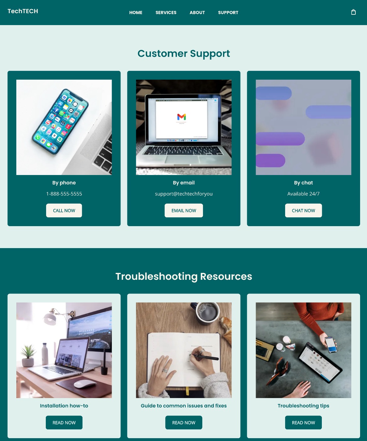
This support page gives curious customers multiple ways to get answers to their questions. They can very clearly reach out to support via various channels, or use resources to help find the answers.
Partners Page
A partners page highlights collaborations, integrations, or affiliate opportunities that build credibility and showcase your brand’s ecosystem. It can also inspire trust by showing that others choose to work with you.
Elements to include on a Partners page:
- Logos or names of partner companies
- Explanations of partnerships or integrations
- Affiliate or referral opportunities
- Links to partner resources or joint offerings
- Calls to action encouraging visitors to explore partnerships or integrations
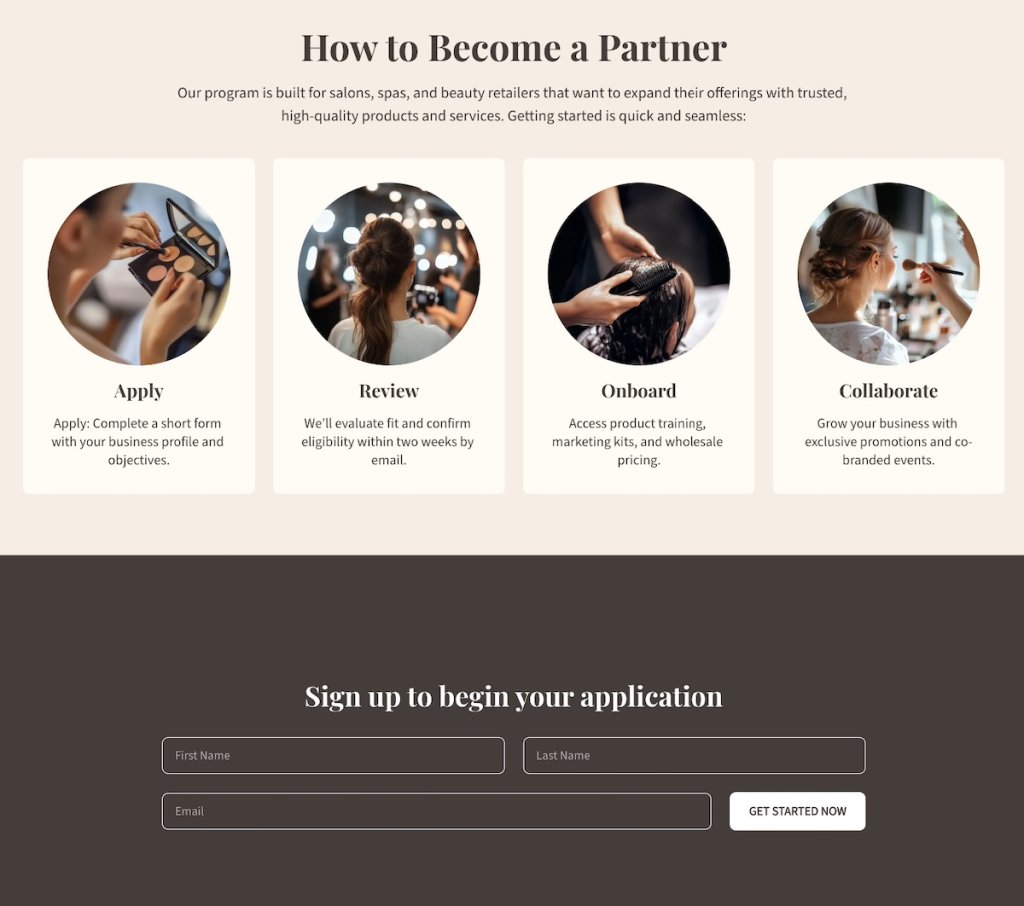
The page above includes a section that clearly outlines the process for becoming a partner, and then makes signing up super easy with the form that follows. This kind of easy-to-understand process removes sign-up doubts and friction.
Loyalty Program Page
Acquiring new customers is important, but maintaining existing ones is often where the real long-term value lies. A loyalty or rewards page gives customers a reason to stay engaged, come back, and keep choosing your brand over others. It not only rewards their commitment but also reinforces that you value their business. This page should convey that value—that you appreciate your customers and want to make sure they stay happy with your brand.
Elements to include on a Loyalty Program page:
- Explanation of loyalty or rewards program benefits
- Easy steps for joining or participating
- Examples of rewards, perks, or discounts
- Calls to action prompting customers to sign up for email marketing
- Optional testimonials from existing program members
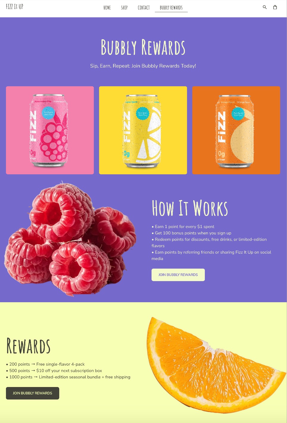
The above Loyalty Program page extends its playful branding to their Bubbly Rewards, making it easy to understand how it works, what the benefit is, and how to join.
When it comes to building loyalty, this is also where you’ll want to lean on a competent email marketing platform. With SiteGround Email Marketing, you can easily connect your loyalty program to automated email campaigns, send re-engagement emails, provide custom offers, and keep customers in the loop long after their first purchase. Paired with a strong loyalty page, it’s a simple but powerful way to turn one-time buyers into repeat customers and brand advocates.
Your Free Website Planning Checklist Build with clarity, launch with confidence
Google reCAPTCHA used. Privacy Policy and Terms of Service apply![]()
Final Thoughts on What Pages a Website Needs
Your website isn’t just a flimsy digital brochure. It has the potential to guide visitors on a brand journey that goes from first click to conversion and beyond. You know by now that each page has a subtle but powerful purpose, whether it’s introducing your brand, building trust, or driving action. And when you structure your site with that in mind, the result is that no website page is a dead end, and every step inches visitors closer to becoming loyal customers.
If you’re ready to bring these website pages to life without the hassle of coding or complex design, the SiteGround Website Builder makes it simple. With professionally designed templates, built-in SEO features, and easy drag-and-drop editing tools, you can create all the essential website pages your business needs—optimized to guide, convert, and retain your visitors.


Comments ( 0 )
Thanks! Your comment will be held for moderation and will be shortly published, if it is related to this blog article. Comments for support inquiries or issues will not be published, if you have such please report it through our official channels of communication.
Leave a comment
Thanks! Your comment will be held for moderation and will be shortly published, if it is related to this blog article. Comments for support inquiries or issues will not be published, if you have such please report it through our official channels of communication.