Website Navigation: How to Design for Conversions, SEO & AI

Website navigation is one of those often-overlooked elements that can seem trivial and yet can make or break a website. Done well, it guides visitors smoothly through your content, drives conversions, and signals to search engines and AI-powered search systems what your site is about. Not done well? It just confuses users, buries important pages, and limits your search engine optimization (SEO) potential.
It’s important, but it doesn’t have to be complicated. In this guide, we’ll cover what website navigation is, why it matters, and everything you need to know to maximize it for conversions, SEO, and AI search.
Key Takeaways:
- Guide visitors effectively: Use clear navigation menus and paths to improve user experience and conversions.
- Keep navigation simple: Limit top-level items, use standard labels, and stay consistent across pages.
- Highlight priority pages: Place high-value pages and CTAs prominently and remove distractions.
- Design for mobile: Use mobile-friendly navigation menus, increase tap targets, and test on real devices.
- Use visual hierarchy: Differentiate key items, group related links, and guide users to important actions.
- Optimize for search and AI: Align navigation with content pillars, use descriptive labels, and support internal linking.
What Is Website Navigation?
Website navigation refers to the menus, links, and structural elements that help visitors move through your site. It can include your main menu, dropdown menus, sidebars, and so on (all of which we’ll tackle below). Together, these elements shape how users explore your content and how easily (or not easily!) they can find what they’re looking for.
Good navigation does more than organize pages, though; it creates a clear path through your site. When users understand where they are and how to get where they want to go, they’re more likely to stay engaged, visit multiple pages, and complete key actions such as making a purchase, submitting a form, or reading more of your content.
Why Does Website Navigation Matter?
Your website navigation plays a central role in three critical areas: user experience, conversions, and search. What does this look like?
- For users: Clear navigation reduces friction—meaning it removes the little moments of confusion, hesitation, or extra effort that make people stop and think, “Wait… where do I go next?” When visitors can instantly understand where to click and quickly find what they need, they stay longer, feel more confident, and experience fewer dead ends.
- For conversions: Website navigation guides people toward high-value pages—product categories, services, or key CTAs—making the path from curiosity to action smooth and intuitive instead of scattered or overwhelming. In the end, this is what shapes your overall customer journey: how people discover, evaluate, and ultimately decide to convert.
- For search: Traditional search as well as AI search systems rely partly on your navigation to understand your website structure. Well-organized navigation menus and internal links help crawlers and AI assistants discover your pages, interpret their importance, and serve the right content in both traditional search results and AI-generated answers. That means better visibility, higher rankings, and more opportunities to be featured in emerging AI-driven search experiences.
In short, website navigation is the framework that supports every interaction on your site. It’s a seemingly small detail with big impact, making your content easier to access, your business easier to trust, and your site more discoverable in both traditional and AI-powered search.
What’s the difference between website structure and website navigation?
Website structure
How all pages, content, and resources are organized
The full architecture behind the scenes
Includes every page and relationship (even those not shown in menus)
Website navigation
How users find and access those pages
The visible menus and pathways (top menu, dropdowns, footer, etc.)
A simplified, user-facing map of the full structure
Types of Website Navigation
So what types of website navigation are we talking about here? Let’s start by addressing that different websites often use a different combination of navigation styles depending on their layout, audience, and content depth. Here are the most common types you’ll see and likely use:
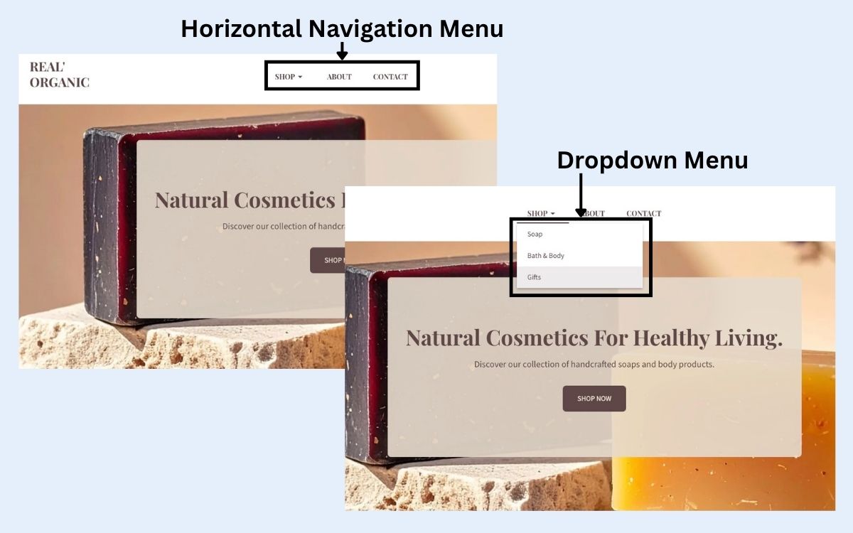
- Horizontal Navigation Menu: This horizontal navigation bar is the classic top-of-the-page menu found on most websites. It’s ideal for highlighting your most important pages and keeping your site organization clean and familiar.
- Dropdown Navigation Menu: Dropdown menus expand from a main navigation item to reveal subpages. They’re useful for sites with multiple categories or layers of content, but they work best when kept simple and clearly labeled.
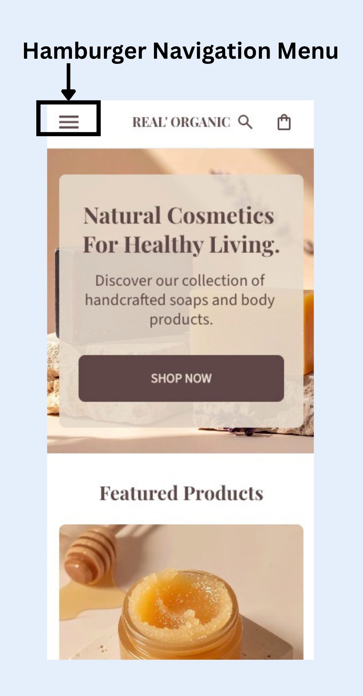
- Hamburger Navigation Menu: This icon-based menu (three stacked lines) is used primarily on mobile. It hides the full navigation menu behind a tap to save screen space. Many modern sites use hamburger navigation menus on desktop as well, though it should be paired with clear cues so users don’t miss key pages.
- Vertical Sidebar Navigation Menu: Often used on blogs, documentation sites, or dashboards, a sidebar menu runs down the left or right side of the page. It helps users browse categories or drill deeper into specific topics.
- Footer Navigation Menu: The footer menu typically includes secondary links, such as legal pages, contact info, FAQs, or additional resources. It’s a useful place to provide access to pages that don’t need to be featured in the main website navigation menu.
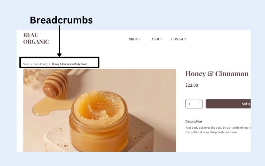
- Breadcrumbs: Breadcrumbs show users the path from the homepage to their current location. They make it easy to backtrack and help both users and search systems understand page hierarchy.
Website Navigation Best Practices for Conversions
We’ve established why website navigation matters, so now it’s time to get down to brass tacks. As you take on website planning, these best practices help you leverage the power of your website navigation to remove friction, highlight priority pages, and create a smoother path to conversion.
1. Keep Navigation Simple and Predictable
While it can be tempting to stack links that point out to every corner of your website, it’s important to remember that simplicity is one of the biggest drivers of conversion-friendly website navigation. Because when visitors don’t have to work to understand your website navigation menu, they’re more likely to browse and engage.
Why keeping website navigation simple works:
People rely on pattern recognition when using websites. If your website navigation looks familiar and predictable, they can move quickly without hesitation. Keeping it as simple as possible is one of the ways to do this.
How to implement simple and effective website navigation:
- Limit top-level items to 5–7. Too many choices create cognitive overload and slow decision-making.
- Stick to standard terminology. Labels like Pricing, Contact, and Shop perform better than clever or branded phrasing that forces users to guess. So unclear labels like “Our Playground” instead of Products, “Drop a line” instead of Contact, or “Treasure Chest” instead of Store are cute, but no-gos if you want your website navigation to truly work.
- Keep your website navigation structure consistent across all pages so visitors never feel disoriented.
The result: Simple, predictable website navigation keeps visitors moving without friction, helping them explore more of your site and increasing the likelihood they’ll convert.
2. Prioritize High-Value Pages
Your navigation should reflect your business goals. That means highlighting the pages that move users closer to conversion, whether that’s a product category, a service description, a booking page, or a demo request.
Why prioritizing high-value pages matters:
Users naturally gravitate toward prominent items. If your most valuable pages sit buried in a dropdown or at the far right of your website navigation menu, you’re missing opportunities.
How to prioritize high-value pages:
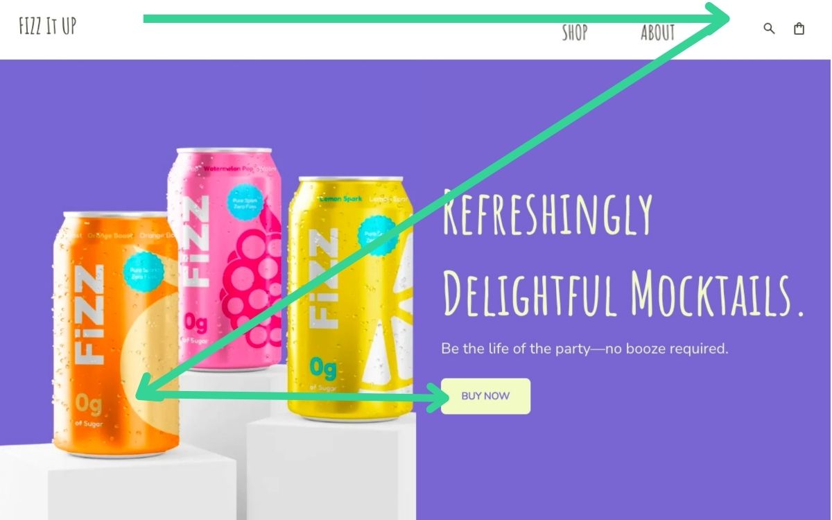
- Place key items at the beginning of your navigation, where scanning patterns (F-pattern and Z-pattern) make them more noticeable. As you can see in the example below, “Shop” is placed straight away, rather than after the search bar or elsewhere.
- Remove or demote less important links so they don’t compete with priority actions.
- Use digital marketing metrics to guide decisions: Which pages already assist conversions? Which pages have high engagement? Which pages do your best customers rely on?
- Highlight critical CTAs in the header, such as Get Started, Shop Now, or Book a Call.
The result: Think of your website navigation as the starting point for your marketing funnel. The easier it is to reach your high-impact pages, the more conversions you’ll drive.
3. Design for Mobile
More than half of web traffic comes from mobile devices, so mobile web design and navigation for small screens is more than just a nice-to-have side project; it actually needs to be top of mind.
Why website navigation matters on mobile:
All these mobile users that are visiting your site simply aren’t experiencing it the same way as desktop visitors. That is, mobile users are usually more impatient (they’re on the go!) and more easily frustrated by poor website navigation. So if your menu is hard to find, difficult to tap, or cluttered, many visitors won’t stick around.

How to implement website navigation on mobile:
- Choose a mobile-friendly menu style, such as a clean hamburger menu or a minimalist top bar.
- Increase tap targets (typically 44px or larger) to prevent accidental taps.
- Test your navigation on real devices to ensure nothing overlaps, breaks, or requires zooming.
- Use a back-to-top button (like seen in the example below) so that users can easily jump back to the website navigation at the top of your page.

The result: A mobile-first approach ensures visitors can browse easily wherever they are, which naturally strengthens your conversion flow.
4. Guide Users with Visual Hierarchy
Even a well-organized menu can underperform if everything looks the same. Visual hierarchy makes your website navigation easier to scan and helps direct attention toward the most important pages and actions.
Why visual hierarchy in website navigation works:
People scan menus quickly—often in seconds. So visual hierarchy helps them identify what matters without overthinking.
How to implement it in your website navigation:
- Differentiate important items through size, weight, or color (while still keeping web design consistent).
- Use whitespace to separate menu items and reduce visual clutter.
- Group related links so users don’t have to analyze where things go.
- Use consistent link styling so visitors immediately recognize what’s clickable.
- Feature priority CTAs (like Start Free Trial or Request a Quote) with subtle visual cues such as buttons or contrasting accents.
In the example below, you can see some of these best practices in action: the importance of the main menu is emphasized by using a bold font; ample white space separates menu items; and hovering over a link changes its color to indicate it’s clickable.

The result: Good hierarchy makes your website navigation intuitive—and intuition leads to faster decision-making, deeper engagement, and more conversions.
Make Navigation Easy with SiteGround
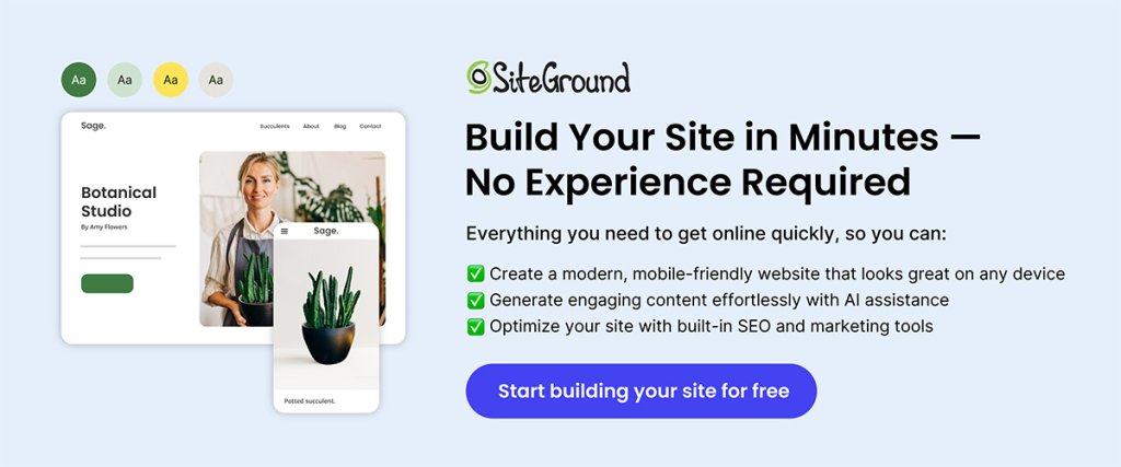
The SiteGround Website Builder takes the headache out of creating menus that follow best practices. It automatically optimizes website navigation for mobile, ensures proper sizing and spacing for taps and clicks, and makes it simple to build intuitive menus that guide visitors—and search engines—exactly where you want them to go. And if you’re selling online, SiteGround Ecommerce extends that same ease to your store navigation, helping customers move smoothly from browsing to checkout without friction.
Website Navigation Tips for SEO and AI
Strong navigation plays a major role in how traditional search and AI search systems crawl, understand, and rank your site. So when your menus clearly reflect your main topics and priority pages, you strengthen both your SEO and GEO, making it easier for your content to be found, interpreted, and surfaced.
What is GEO?
GEO, or Generative Engine Optimization, is the practice of optimizing your content so that it’s not only discoverable by traditional search engines but also well understood and prioritized by AI-powered, generative search systems.
1. Pay Attention to Your Content Pillars
Your navigation should reflect the main topics your website is built around. These content pillars define the big buckets of what your site covers and signal your expertise at a glance. When your top-level navigation aligns with these pillars, people immediately understand what your site is about—and search engines and AI can more easily interpret your core themes.
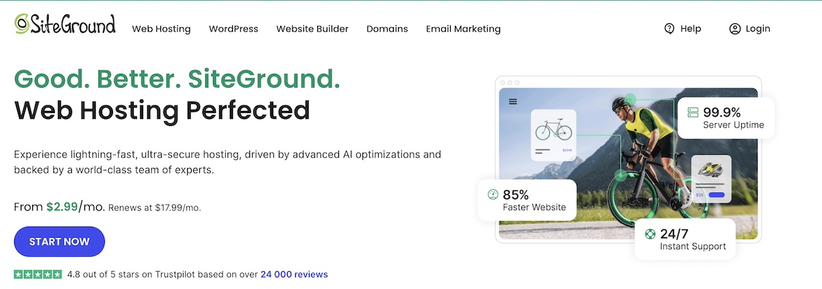
The example above of SiteGround’s homepage shows how top-level website navigation can clearly showcase a business’s content pillars, making it easy for users to quickly find what they need.
2. Build Website Navigation That Reflects Your Site Structure
Your website navigation doesn’t need to show every page. Instead, it should highlight the hierarchy of your main content pillars—the high-level topics your site covers. Think of navigation as a map of your key categories, grouping related content logically without overwhelming visitors, and giving search engines and AI a much clearer sense of your site’s core categories.
To do this, keep menus shallow: aim for important pages to be reachable in two or three clicks, using dropdowns or sections to organize subpages under the right pillars. By focusing on navigation-specific hierarchy rather than full site structure, you create a clean, intuitive menu that helps visitors and search systems interpret your site easily.
3. Use Descriptive, Keyword-Rich Labels
Navigation labels should clearly communicate what your pages are about so search engines, AI systems, and users can accurately classify your content. And while generic menu names (like “Services” or “Resources”) can make sense, consider using descriptive labels such as “Web Design Services,” “SEO Guides,” or “Hiking Gear.” This gives search systems, AI, and visitors clearer expectations.

Using natural, keyword-aligned phrasing also supports traditional search rankings by signaling relevance to search engines, while also aiding AI discoverability, since AI increasingly relies on content that is semantically clear and well-labeled. So at the end of the day, clarity always comes first; labels should be readable and provide enough context for search engines and AI systems to interpret your site correctly.
4. Optimize for Crawlability
Navigation also plays a practical, behind-the-scenes role: it supports your internal linking strategy by reflecting your main content areas. When your navigation is clear and logically organized, it becomes easier to create internal links between related pages in a way that’s consistent and intuitive for both users and search engines.
Here’s what to focus on when it comes to website navigation crawlability:
- Use standard links: Simple HTML links in the main menu, footer menu, and sidebar are easiest for crawlers to follow.
- Link important pages consistently: Reinforce key pages by including them in your top navigation and linking to them where relevant in your content.
- Add contextual links naturally: When navigation is built around clear pillars, it’s much easier to make meaningful in-content links between related articles, guides, or products.
Strong, crawlable navigation supports better discoverability and creates multiple pathways for both people and search engines to understand your site.
Your Free Website Planning Checklist Build with clarity, launch with confidence
Google reCAPTCHA used. Privacy Policy and Terms of Service apply
Common Website Navigation Mistakes to Avoid
Even small mistakes in website navigation can frustrate visitors, tank conversions, and leave search engines and AI systems scratching their heads. And once a site’s navigation is poorly built, fixing it later can be a real headache. That’s why it pays to get it right from the start. To make it crystal clear, here’s a rundown of the most common navigation mistakes you’ll want to avoid.
1. Overcrowded Menus
Too many items in your top-level menu can overwhelm users and make it difficult to find what they need. Keep your navigation concise and prioritize the pages that matter most. Secondary pages can go in dropdown menus or footer menus instead of cluttering the main navigation.
2. Hidden or Inconsistent Menus
Menus that change location, style, or labels across pages confuse visitors. A predictable navigation and website layout helps users know where to look and builds trust. Stick to consistent placement and labeling throughout your site.
3. Vague or Generic Labels
Using vague labels like “Resources” or “Solutions” doesn’t communicate what visitors will find, even though it may feel as though it’s implied. Descriptive, specific labels guide users effectively and give search engines clearer signals about your content.
4. Deep, Confusing Hierarchies
If key pages are buried under multiple layers of navigation, users may never find them—and search engines may have difficulty crawling them. Aim for a shallow, intuitive website navigation structure where important pages are reachable within two or three clicks.
5. Ignoring Mobile Navigation
With most traffic coming from mobile devices, menus that aren’t mobile-friendly can frustrate users and increase bounce rates. Make sure navigation is easy to tap, scroll, and understand on smaller screens. Just as with traditional SEO, this also plays an important part in mobile SEO. And avoid multi-level dropdown menus when possible: they’re difficult to open, close, and scroll through.
6. Neglecting Internal Linking Opportunities
Good navigation should naturally support linking throughout your content. If your navigation isn’t organized around clear content pillars, it becomes harder to link related pages, which can limit both SEO performance and user discovery.
Pro Tip: Reviewing your analytics or doing user testing can reveal exactly where visitors get stuck or drop off. Often, fixing one or two of these common mistakes dramatically improves both usability and search performance.
Start Building and Optimizing Your Website Navigation
Website navigation might feel like a small detail, but as we’ve seen, it touches every part of your site: guiding visitors, boosting conversions, and helping both traditional and AI-powered search systems understand your content. Simple, intuitive menus built around clear content pillars, descriptive labels, and smart linking make your site easier to explore, more discoverable, and more likely to turn clicks into action.
And there’s good news here: You don’t have to be a coding wizard or SEO guru to get it right. The SiteGround Website Builder makes it simple to create menus, organize content, and optimize navigation (for desktop and mobile)—all with best practices built in. It, along with SiteGround Ecommerce, are designed to help your website navigation perform at its best, so that your visitors, SEO, and AI rankings all win.


Comments ( 0 )
Thanks! Your comment will be held for moderation and will be shortly published, if it is related to this blog article. Comments for support inquiries or issues will not be published, if you have such please report it through our official channels of communication.
Leave a comment
Thanks! Your comment will be held for moderation and will be shortly published, if it is related to this blog article. Comments for support inquiries or issues will not be published, if you have such please report it through our official channels of communication.