Chances are, you’ve come across those websites: the ones that look unprofessional, are confusing to use, or simply don’t address what you’re actually seeking. So, as you build your own website, you want to get it right—to create a webpage that reflects your brand’s unique personality, connects with your audience, and drives real action.
We’re going to make that happen by breaking down 10 practical principles to help you design a website that’s not only visually appealing but also strategic, user-friendly, and built to grow your business.
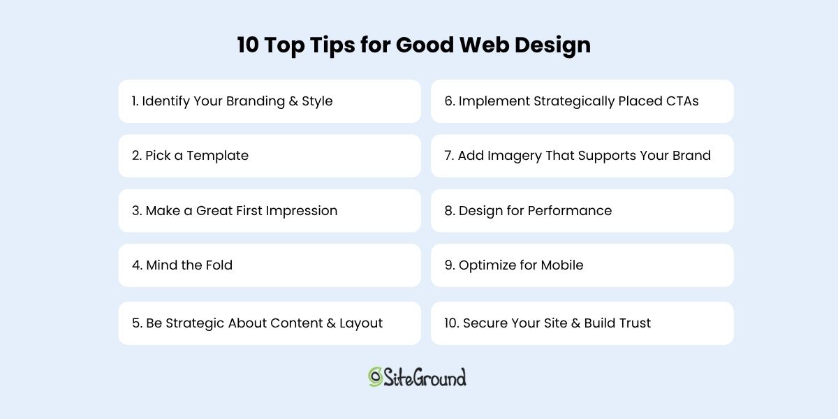
10 Top Tips for Good Web Design
If you’re focusing on just ten key tips to build a strong, effective website, these are the ones to keep top of mind. They cover everything from design basics to strategic layout, branding, and user experience.
1. Identify Your Branding & Style
Before you go down the fun rabbit hole of choosing layouts, buttons, and fancy features, there’s one thing that sets the tone for everything on your site: your brand style. It’s the secret ingredient that makes your website feel professional, put-together, and unmistakably you.
Think of your brand as your website’s personality. Are you bold and creative? Calm and trustworthy? Elegant and refined? The way you answer that will shape the look and feel of your entire site—from your color choices and fonts to the way your content comes across.
Here are a few quick examples to guide your choices:
- Trustworthy and professional: Go for classic, subdued colors like navy, charcoal, or forest green, paired with strong, traditional serif fonts.
- Playful and approachable: Use energetic colors like orange, turquoise, or lime green, and friendly sans-serif fonts with soft curves.
- Elegant and high-end: Consider rich hues like burgundy, gold, or black, with sleek, minimal fonts and lots of whitespace.
- Modern and bold: Bright or unexpected colors—think electric blue or hot pink—can work well with edgy fonts and dynamic layouts.
Not sure what fits your brand yet? That’s totally normal. Start by asking yourself: What do I want people to feel when they land on my site? Then, explore sites you love and notice what pulls you in—the colors, the fonts, the vibe. You’ll start to see patterns, and from there, you can craft a style that feels true to your brand.
The homepage example below does an excellent job of expressing its brand through calming pastel colors, a relaxed font, and cohesive, brand-aligned imagery. The result is a polished, professional look that immediately communicates what this person and their service are all about: peaceful, inviting, and comforting.
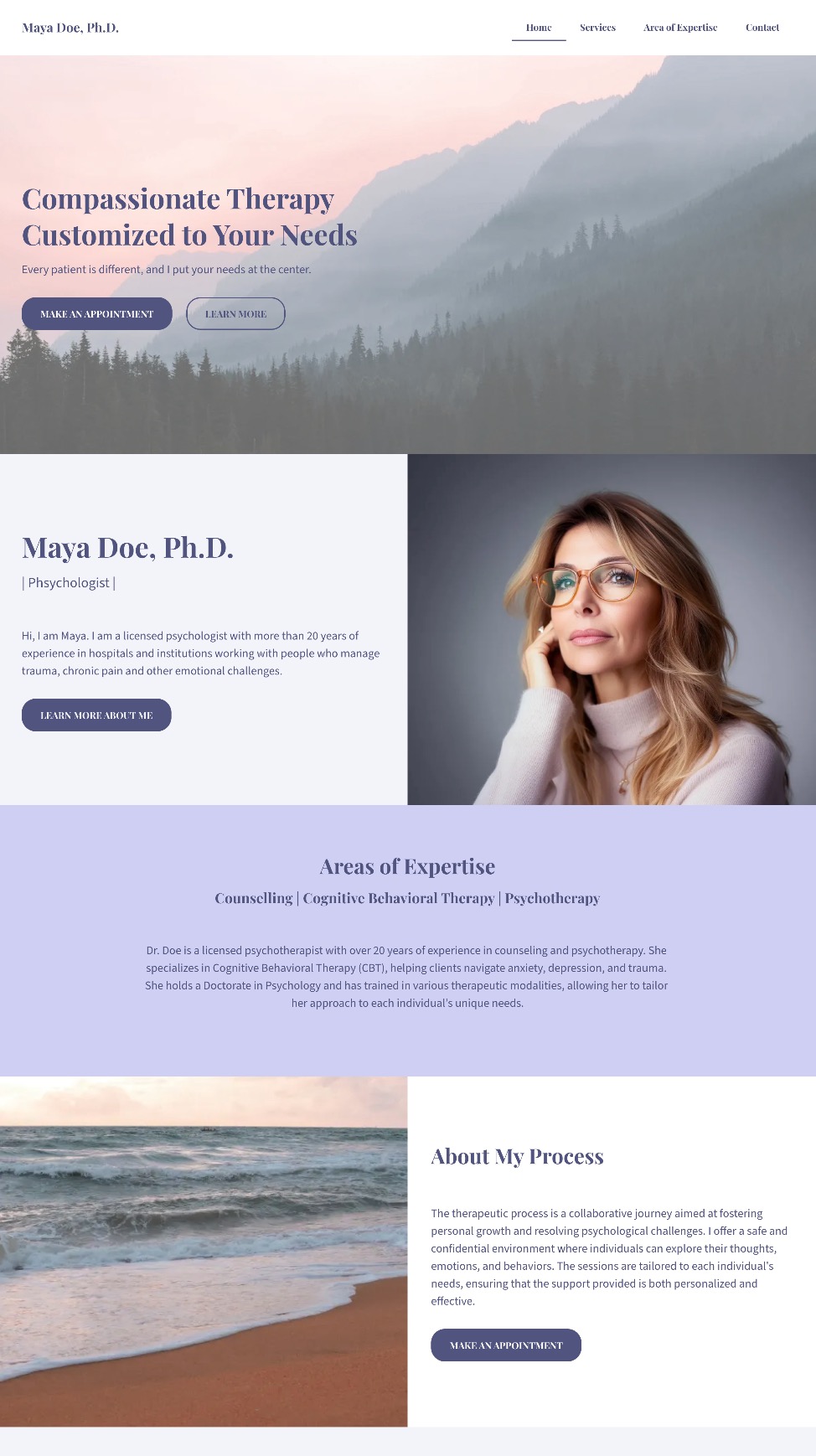
A clear brand style doesn’t just make your site look great—it gives your visitors an instant sense of who you are and what you’re all about. And that’s the kind of first impression that sticks.
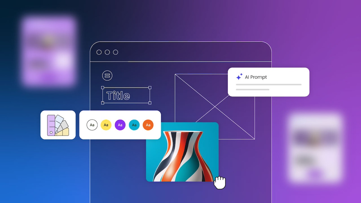
2. Pick a Template
One of the fastest, easiest, and most budget-friendly ways to get your website looking polished is to start with a template. Templates are pre-designed and typically feature the best web design layouts so that you aren’t starting from scratch or guessing what looks good.
And if you’re using the SiteGround Website Builder, you’re in luck. It comes packed with beautifully designed, ready-to-use templates tailored for different types of businesses, blogs, portfolios, and more. These templates are built to look professional right out of the box, and you can easily customize them to match your brand style—colors, fonts, images, layout—you name it.
What’s important here is not to overthink it. Choose a template that closely matches the structure and feel you want for your site. Then, make small adjustments to align it with your branding. The more you try to overhaul the template, the more work you create—and that can sometimes lead to a clunky design.
Also, worth noting, while it can be tempting to really think outside the box with your website layout and design, this is ultimately more likely to just create user frustration. So using a template ensures that you’re sticking to tried-and-true design best practices that will keep users seamlessly moving through your site.
Keep it simple. Start with a template you love, make it yours, and let the SiteGround Website Builder do the heavy lifting.
If you’re building your site with SiteGround, you’ve already got a head start. The SiteGround Website Builder not only includes a wide range of professionally designed templates but it’s fully integrated with powerful hosting, speed optimization, and top-tier security features, so your site won’t just look great—it’ll perform beautifully, too.
Explore SiteGround’s Website Builder and bring your vision to life >>
3. Make a Great First Impression
Your homepage is prime real estate—and the top section (also called the hero section) is where the magic needs to happen. So as you delve into website planning, remember that your homepage is the most important way to grab attention and make visitors feel like they’ve landed in the right place.
Start with a bold, benefit-focused headline. What’s in it for your visitor? Follow it up with a short, punchy subtitle that adds context or reinforces your value. Then seal the deal with a clear call to action—something that invites them to take the next step, whether that’s exploring your products, booking a call, or diving deeper into your content.
Pair your message with a high-quality, eye-catching image that supports your vibe and adds visual interest. Just make sure it doesn’t compete with your text. The image should enhance your message and not drown it out.
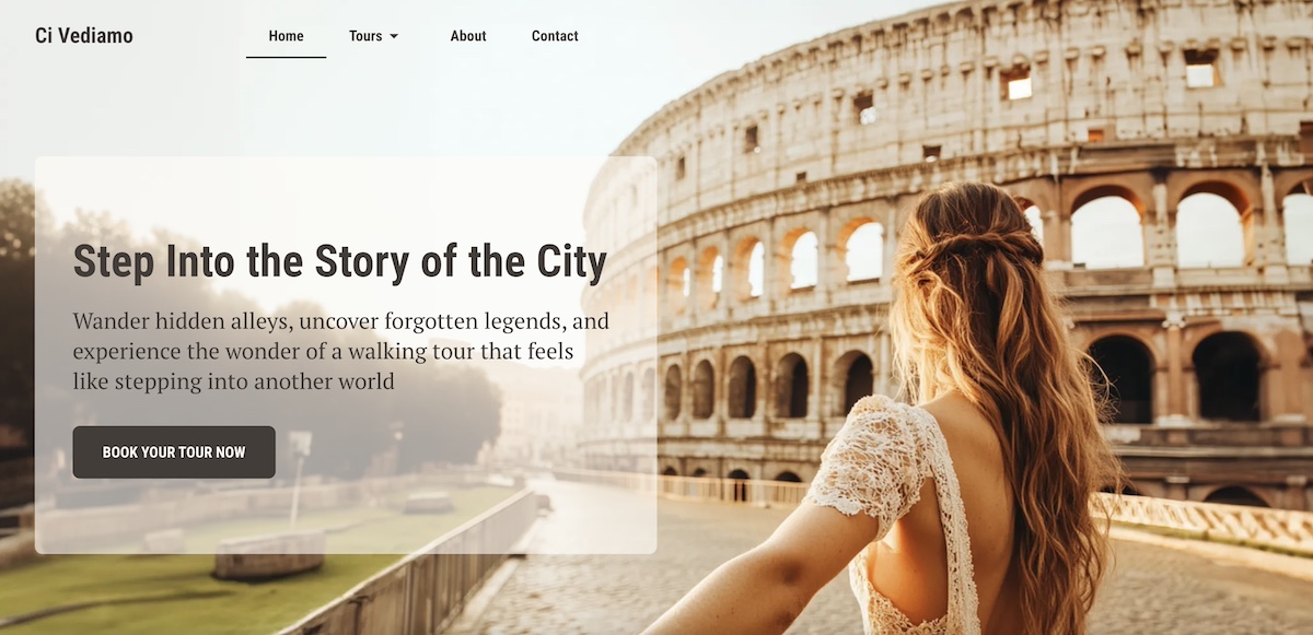
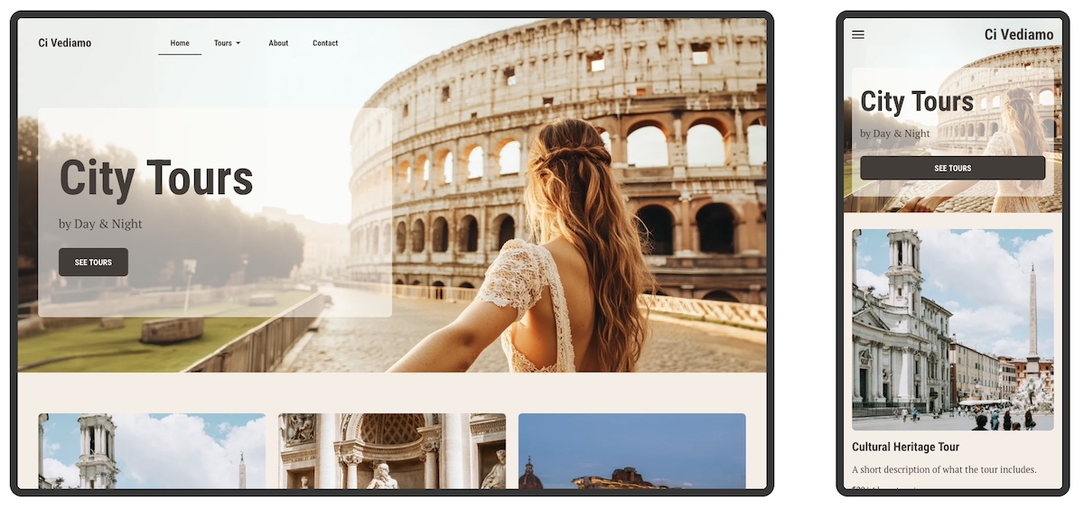
The homepage below captures the spirit of wanderlust with a mesmerizing hero image that instantly transports you. Paired with an evocative headline and a curiosity-driven subtitle, it invites visitors not just to scroll—but to explore. The overall effect is immersive, compelling, and impossible to ignore.
4. Mind the Fold
Here’s a basic rule of good web design: don’t bury the good stuff. The most important content—like your headline, key message, and call to action—should be visible above the fold, meaning it’s the first thing people see without scrolling.
This is super important because what appears at the top of your page gets the most attention. Anything “below the fold” runs the risk of being missed, especially by visitors who are just skimming. That’s why your hero section should be fully visible and thoughtfully designed to quickly communicate who you are and what you offer.
And it’s not just your homepage. Every page on your site should be built with the fold in mind. Whether it’s your About page or a product showcase, make sure the most compelling, need-to-know info is front and center.
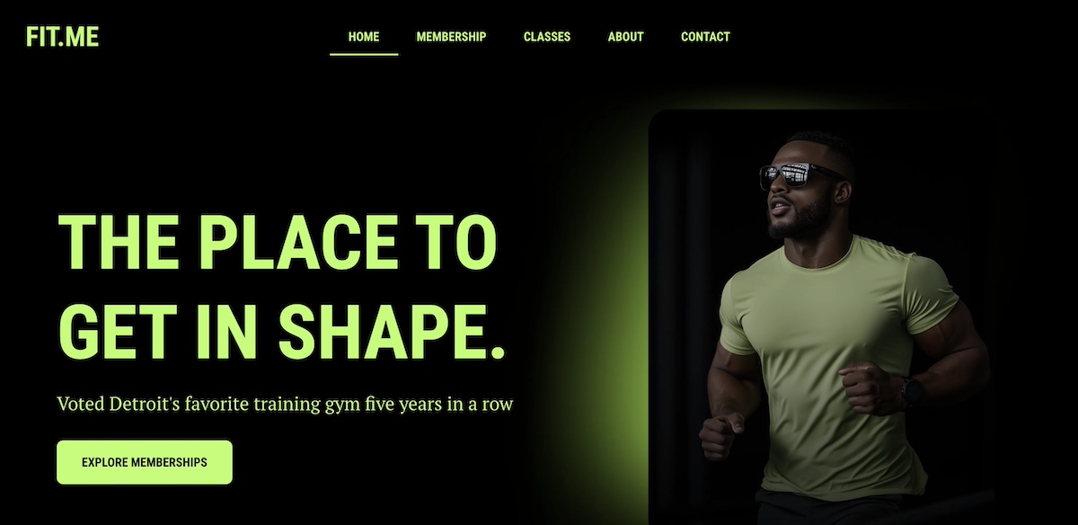
The below homepage makes the most of its above-the-fold space. A bold, eye-catching photo is paired with a strong headline, a clear call to action, and a subtitle that conveys strong social proof. The branding and message are impactful and communicated seamlessly above the fold.
The above-the-fold principle is especially critical when creating high-converting landing pages—those focused, conversion-driven pages that guide visitors toward one specific action. The same rules apply: keep it clean, clear, and captivating above the fold to drive results.
5. Be Strategic About Content & Layout
Every page on your website should have a job to do—whether it’s welcoming visitors, showcasing products, or prompting a purchase. To help each page succeed, you need two key ingredients: clear content and thoughtful layout. This is a foundational principle that should guide how you construct your website.
Let’s take your homepage design as an example. Once you’ve grabbed attention with a strong hero section, the content that follows should back it up. Think: customer testimonials, trust signals, or a quick story that highlights your value. Each section should build on the last, guiding visitors deeper into your message in a way that feels natural—not overwhelming.
To do this well, structure your content with a clear hierarchy. Use headings, visuals, and whitespace to create a smooth flow from one idea to the next. Design elements like color contrast, font size, and section breaks can help your most important messages stand out.
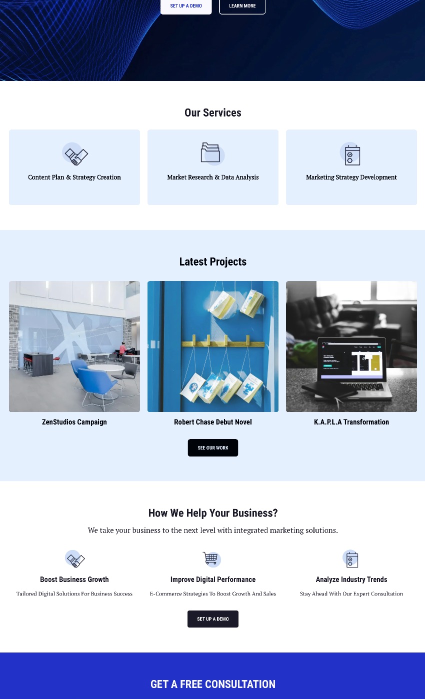
In the below snippet from a homepage, you don’t even need to read the text to see that it is thoughtfully broken out by section with headlines and noticeable calls to action. Zoom in a little more and you’ll see that the sections build on one another, offering various benefits of different services, followed by cleanly explained features.
Again, less is more. Keep each section focused on one core idea, and make sure everything on the page works toward the page’s goal. When your layout and content work hand-in-hand, your website becomes easier to navigate and far more enjoyable to explore.
6. Implement Strategically Placed Calls to Action
Every website needs a tour guide—and that’s exactly what your calls to action (CTAs) are for. Whether it’s “Start now,” “Book a call,” or “Shop the collection,” your CTAs help move visitors smoothly from one step to the next in their customer journey.
But don’t just stick one lonely button at the bottom of the page and call it a day. Instead, sprinkle clear and compelling CTAs throughout your page. Start with the hero section and then continue alongside your content, down your page. Each one should gently nudge visitors forward, whether that’s to learn more, sign up, or make a purchase.
And make sure your CTAs stand out visually, too. Use bold or contrasting colors to draw attention—but stay true to your brand’s aesthetic. For example, if your site has a soft, minimalist vibe, a neon green button might feel more jarring than inviting. Choose CTA colors that complement your overall palette while still catching the eye. Again, a good template will already implement this design best practice.
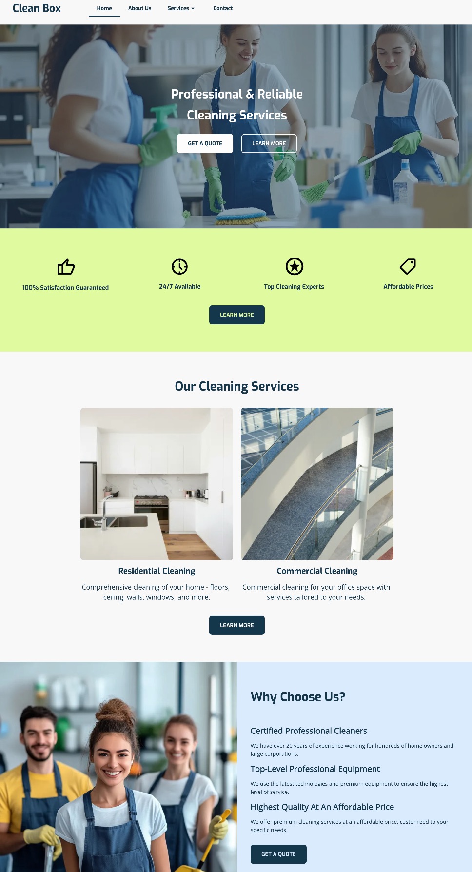
Notice how the calls to action in the below website design not only stand out, but are scattered throughout the page, and the coloring fits in with the business’s color palette. The buttons are noticeable, strategically distributed, and look good.
In short: keep your CTAs visible, actionable, and on-brand. When placed with intention, they’ll help keep your visitors engaged and your site working like a well-oiled machine.
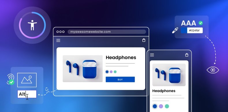
7. Add Imagery That Supports Your Brand
Selecting imagery might seem basic and straightforward, but really images aren’t just decoration—they are a key part of your website’s storytelling. The right visuals can instantly communicate your vibe, highlight your message, and make your pages feel more engaging and less like a wall of text.
So when choosing images, be intentional. Each one should serve a purpose: to reinforce your brand identity, illustrate your products or services, or simply create visual breathing room that makes your content easier to digest.
But what’s important here is to stick to images that match your brand’s style—whether that’s bold and colorful, soft and minimalist, or sleek and modern. Be consistent. And don’t forget about layout: well-placed visuals can guide the reader’s eye and help your page flow naturally.
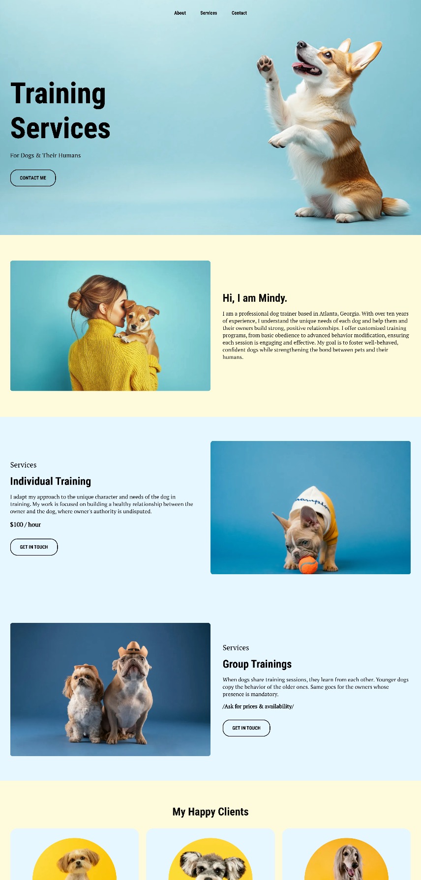
Notice how the below website wins at branding, and especially imagery. Not only are their branding colors and fonts consistent, but their imagery further reinforces that. That is, instead of using random dog shots from the park, the dog images are placed on colored backgrounds that contribute to brand consistency and the overall web design. The photos have also been strategically placed to guide the eye from section to section.
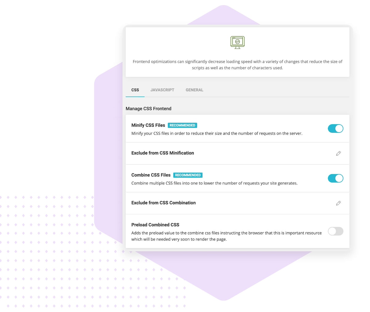
8. Design for Performance, Not Just Aesthetics
You can have the most beautifully designed website in the world, but if it’s slow to load, visitors will bounce before they ever see it.
That’s why page speed is a really big deal. A sluggish site can frustrate users, hurt your search rankings, make your business seem less professional, and, of course, negatively impact conversions. The most common culprits? Oversized images, auto-playing videos, clunky code, and too many unnecessary plugins.
But, thankfully, there are simple ways to speed up your website. Compress your images, minimize unnecessary scripts, and choose a fast, reliable host (like SiteGround!) to keep things running smoothly.
If you’re using WordPress, you can make this extra easy by adding the free-to-use (and very necessary!) SiteGround Speed Optimizer Plugin. And if you’re using the SiteGround Website Builder, then all the top performance-enhancing features are already baked right in.
9. Optimize for Mobile
The reality is that people are browsing your site on all kinds of devices—laptops, tablets, smartphones—you name it. So if your website doesn’t adapt smoothly to different screen sizes, visitors might get frustrated and bounce.
The good news is that sites built with the SiteGround Website Builder come automatically optimized for mobile. That means your site will look great and work perfectly whether it’s on a giant desktop monitor or the smallest phone screen.
Still, don’t just take it for granted—make it a habit to test your site on multiple devices. Check that fonts are readable, buttons are easy to tap, and layouts stay clean and user-friendly no matter the screen. This hands-on approach ensures your visitors get the best experience, wherever they are.
10. Secure Your Site & Build Trust from the Start
First impressions matter, especially when it comes to trust. A website that looks unprofessional or feels unsafe can quickly send visitors running. To create a welcoming and credible site, focus on security alongside clean, cohesive design. Avoid overwhelming your visitors with too many colors or fonts—instead, use a consistent layout that guides users smoothly through your content, as we’ve already discussed.
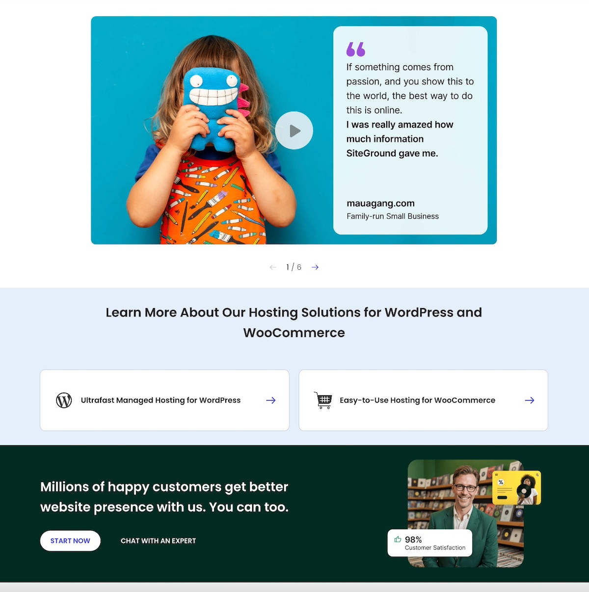
You can also add social proof like testimonials and trust badges, which can further boost your site’s credibility and reassure visitors. Like on SiteGround’s very own homepage, which features customer success stories, as well a section dedicated to sharing that 98% of customers are satisfied. These are strong trust signals that are worth including when planning your web design.
Most importantly, make sure your website is protected with an SSL certificate. While some hosts charge extra for this essential security layer, SiteGround includes SSL for free, giving you peace of mind without added cost. SSL not only safeguards your visitors’ information but also signals professionalism—helping your site make a strong, trustworthy first impression.
And just like with performance, if you’re using WordPress, the no-cost SiteGround Security Optimizer plugin can help patch up front-end vulnerabilities. On the other hand, if you’re building your site with the SiteGround Website Builder, comprehensive security is built in from start to finish.
Website Tips and Tricks: Wrapping Up Your Web Design Journey
So let’s put those less-than-stellar websites in the rearview mirror, because now you’ve got the tools to build your own—one that truly delivers. Nail the basics: define your brand, choose the right template, and optimize for speed, mobile, and security. Do that, and you won’t just end up with a good-looking site, but one that works hard, connects with your audience, and gets the job done.
If you’re looking for a simple, powerful way to bring your website vision to life, the SiteGround Website Builder is the ideal option. It offers easy-to-use templates, automatic mobile optimization, built-in security, and all the tools you need to build a professional site quickly and confidently—no coding required.
This article was originally published in November of 2022, and was updated in June of 2025.


Comments ( 13 )
Jeff Jones
Thank you, great takeaways to start right now with, getting clients to define their primary goal and make sure the home page leads to that, as well to at least one secondary goal for clients who have completed the primary goal. I've got important questions to ask!
Samantha Ellis
I am very thankful to you as your article has given me lots of ideas. Such great information you have shared through this article, it is a really helpful technique. You did a really good job. Thank for sharing. Keep up the good work
JORGE ENRIQUE AGUDELO
This is a great idea SiteGround and What amazing and useful content!!!
jasica
optimized content. Great !!!
Jill
I'm just getting started with building a website, so I appreciate your tips, like sticking to two fonts. I'm the one who tends to add lots of color, different layers of graphics, a thousand fonts, so Less is More.
Website development
I am really impressed that you put together good and useful information on web development tips. Thanks,Keep sharing.
Adam Rees
Indeed, taking customers in mind before even initiating the design process is a must as you need to be in their shoes to learn what they are expecting from you and how can you fulfil that.
iByte Infomatics
Thanks for sharing this informative and inspirational blog.
Leicester Websites
Awesome post, Thank you for sharing web design tips for all developers.
Cloudi5 Technologies
Great Tips.. Thank you for sharing such an informative knowledge..!
Gergana Zhecheva Siteground Team
Glad you like it!
Dan Brag
Great Content!. Thanks to share it.
Ivan Naidenov
Happy to read all of the positive feedback!
Thanks! Your comment will be held for moderation and will be shortly published, if it is related to this blog article. Comments for support inquiries or issues will not be published, if you have such please report it through our official channels of communication.
Leave a comment
Thanks! Your comment will be held for moderation and will be shortly published, if it is related to this blog article. Comments for support inquiries or issues will not be published, if you have such please report it through our official channels of communication.