Visual Hierarchy That Drives Action (+ Examples)
Ever land on a homepage where everything competes for attention? The text blocks, images, and buttons are all shouting at once and it’s hard to know where to focus. That’s what happens when a design lacks visual hierarchy—the principle that organizes what people see first, next, and last. When this necessary visual hierarchy is missing, even truly great content can become completely irrelevant.
And that’s what we’re tackling today. Not just what visual hierarchy is, but how to implement it so that it gets the job done. That is, how strategically laying out and designing your content can actually guide users on a journey, and eventually take action.
What Is Visual Hierarchy?
Visual hierarchy is the strategy behind organizing important elements so people notice—and act on—what matters most. It’s the design principle that determines what users see first, what they notice next, and how they move through a page. Even this very page demonstrates the idea by using headings, buttons, and images in order to make the content more digestible, and to guide the viewer.
At its core, visual hierarchy is about control—not of people, of course, but rather of attention. Every color choice, font size, and block of white space influences how your audience experiences your content. So today we’re going to tease out each of these elements so that you too can apply the same visual hierarchy principles, guiding interested eyes smoothly from headline to call to action, and turning curiosity into clicks, and clicks into those coveted conversions.
Why Visual Hierarchy Matters
Attention spans are short. Users don’t read; they scan. (Chances are, you’re scanning this right now!) In those first few seconds, layout has to communicate what’s important and why a viewer should care. That’s where visual hierarchy becomes a conversion tool, and goes beyond basic design theory.
In simple terms, a strong visual hierarchy helps you:
- Capture attention: Draw users to your most important elements, such as headlines, offers, or calls to action (CTAs).
- Reduce friction: Make it effortless for people to find what they need and act fast.
- Build trust: Consistent visual order signals professionalism and clarity, which boosts credibility.
- Increase conversions: By guiding users along a clear and intuitive customer journey, you make it easier for them to take key actions and complete desired goals.
In other words, clear visual hierarchy isn’t just about making a page look good; it’s how you actually design it to work better.
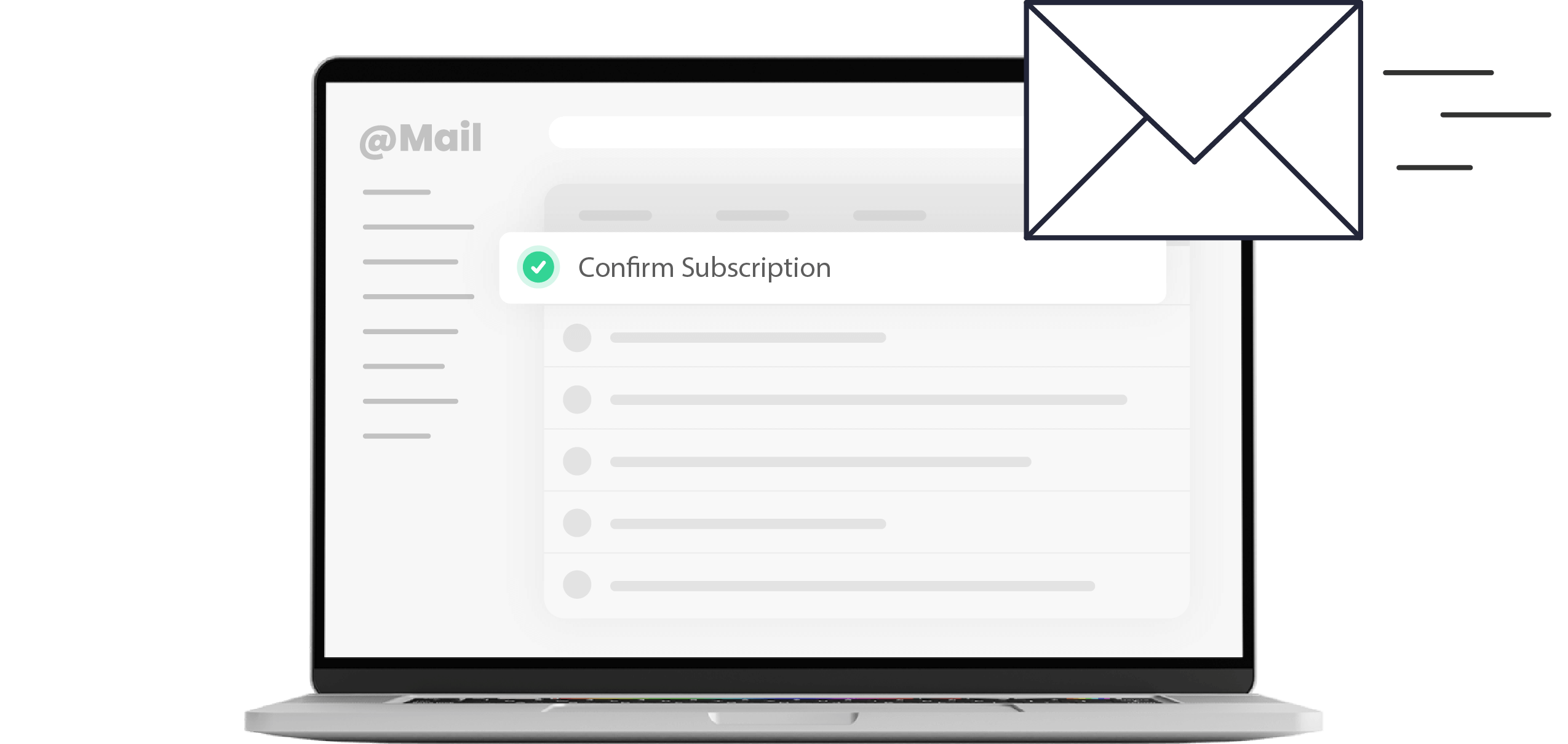
It’s worth noting that these visual hierarchy principles apply not only to websites but also to email marketing, landing pages, and other digital content—anywhere you need to guide attention and drive action.
How to Design Visual Hierarchy That Converts
Designing a visual hierarchy that drives action—like a sign up or a sale or simply moving through your site—starts with understanding how people actually see. That is, users instinctively follow cues like size, color, spacing, and flow to decide what’s worth their attention. So your job is to make those cues intentional by directing their eyes, not distracting them.
Here’s how to create visual hierarchy—step by step.
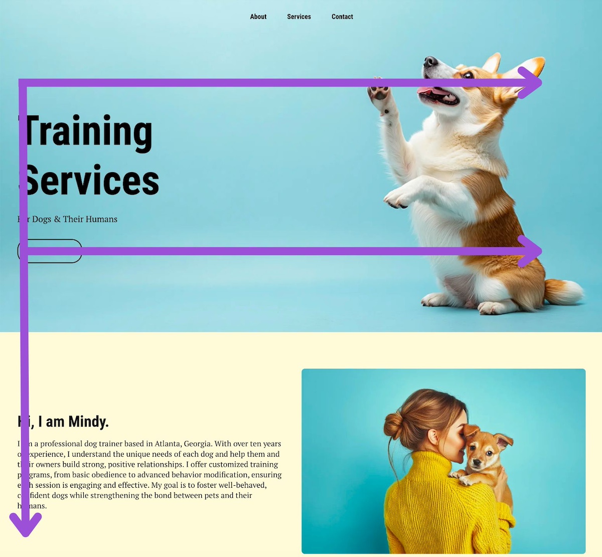
1. Size and Scale: Signal What Matters Most
In visual hierarchy, size matters. Larger design elements naturally draw the eye first, which is why headlines, hero images, and primary buttons often dominate the page. This scale helps users instantly identify what’s most important without needing to think.
When everything is the same size, nothing stands out, and users lose direction. Use contrast in scale to create focus: make your primary call to action noticeably larger than secondary ones, or increase the headline size enough to establish a clear visual anchor.
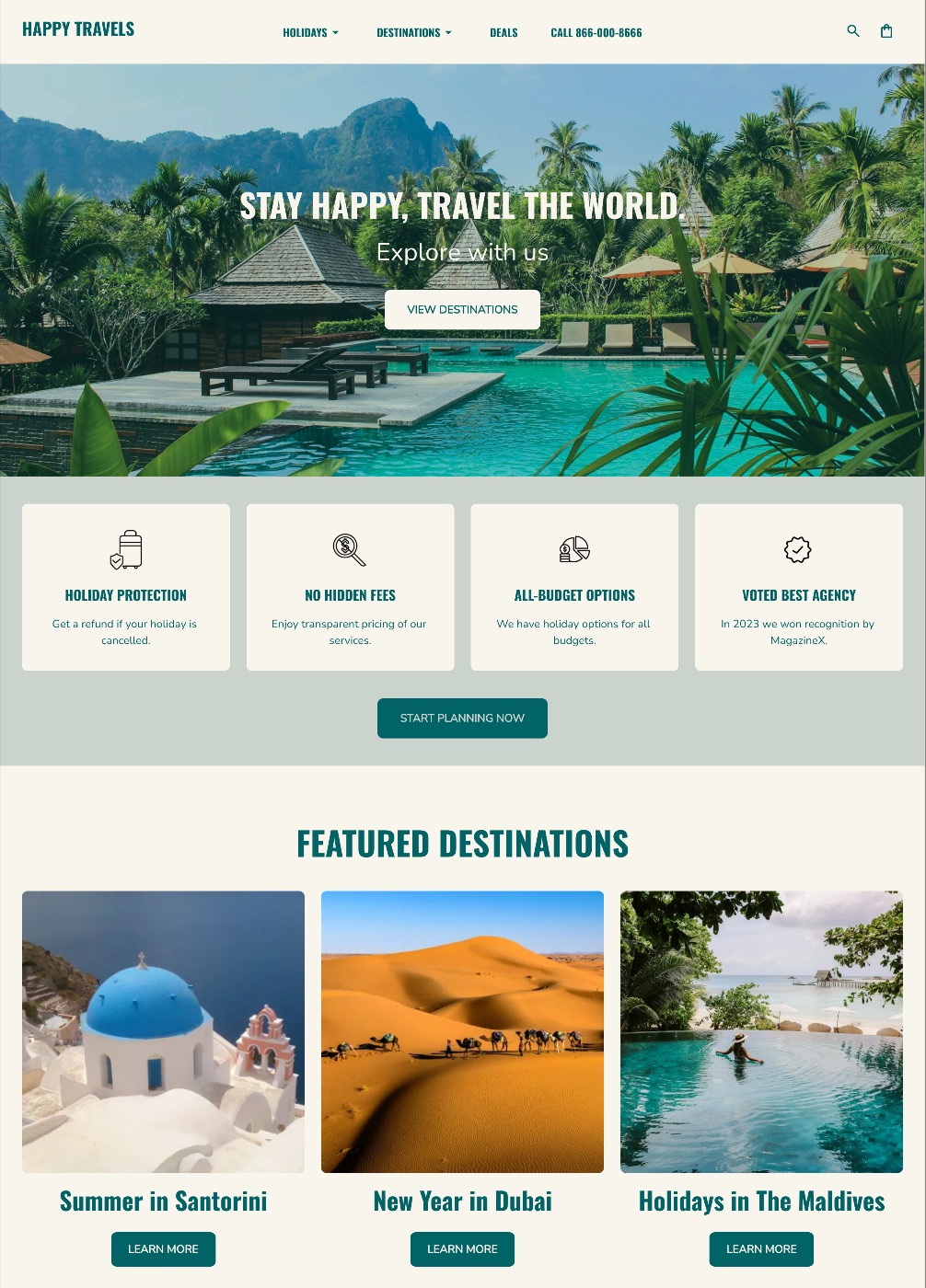
Check out the two homepage design examples below: same content, but one uses a clear visual hierarchy and different sized fonts and icons to take your attention on a journey (you know what to do without even reading the content); the other makes you want to quit before you’ve even started.

2. Color and Contrast: Draw Attention Where It Counts
Color is emotion, brand, and direction all rolled into one. It tells users where to look, what to feel, and what to click. High-contrast design elements naturally command attention, while low-contrast ones recede into the background. This makes color and contrast among the most powerful tools for guiding action.
To accomplish this, choose one dominant color to define your key interaction points (like buttons or links) and use it consistently. Lean on your branding basics to choose the right color, though: that is, don’t just choose a random color, but rather one that aligns with your brand’s color palette.
Surround your dominant color with tones that contrast appropriately—whether neutral, muted, or complementary—so it immediately draws the eye. Likewise, ensure text and backgrounds have enough contrast for easy readability: on one hand, if users have to squint, they’ll scroll away; on the other, it’s an important part of accessible web design.
Tip: Speaking of squinting, try the “squint test,” by blurring or stepping back from your design (go ahead and give it a go with the example above). The design elements that remain visible are what your users will notice first. If your CTA doesn’t stand out, your visual hierarchy isn’t working hard enough. Back to the drawing board.
3. Typography: Prioritize Messaging and Readability
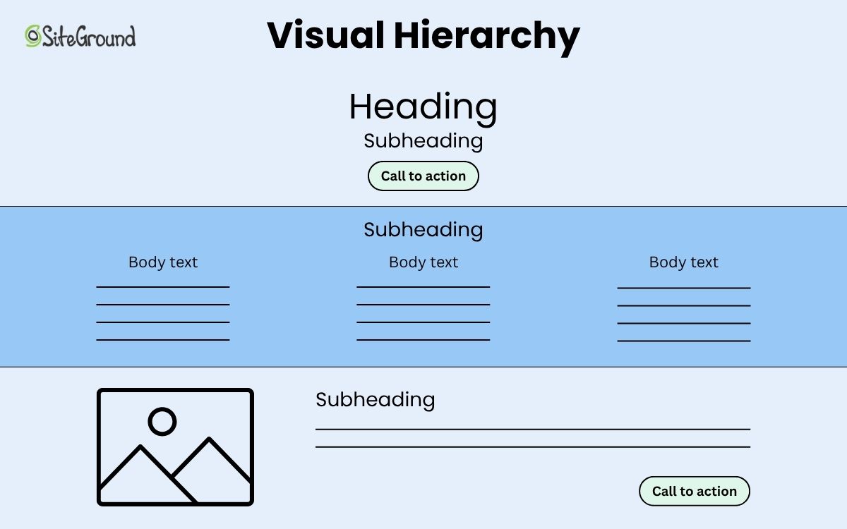
Typography isn’t as simple as just choosing random fonts; the right selection (or selections) create structure and even express your brand’s voice. That’s because a thoughtful typographic hierarchy makes your visuals and message scannable, readable, and persuasive, with the bonus of also reinforcing who you are as a brand.
Use size, weight, and spacing to establish clear levels of importance: headlines should command attention, subheads should support them, and body text should stay quietly legible.
But please don’t stop at structure: choose fonts that reflect your brand personality and complement each other. For example, pairing a bold, modern sans-serif for headlines with a clean serif for body copy can strike the perfect balance between authority and approachability.
And consistency really matters here. Limit yourself to two or three fonts and vary visual hierarchy through weight and size, rather than going bananas with different styles. When your typography looks unified and is implemented strategically via your visual hierarchy, your message will land a lot more successfully.
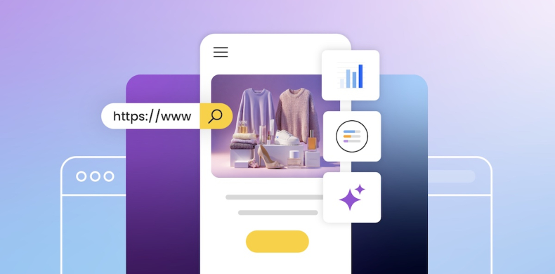
With the SiteGround Website Builder, your visual hierarchy is built right in.
With SiteGround’s Website Builder, getting this balance right is effortless. It comes with pre-selected font pairings that complement each other and color palettes designed to work harmoniously across your site. Together, they ensure that your visual hierarchy—through both typography and color—is consistent, cohesive, and aligned with your brand from the start.
4. Spacing and White Space: Let That Content Breathe
Have you ever noticed how a crowded website design makes website navigation feel a bit exhausting? It’s hard to scan or know what to do next; there’s just too much stimuli. White space, on the other hand, creates a sense of calm and clarity—dare we say, it’s the unsung hero of good design. But, importantly—it’s particularly effective in visual hierarchy when it’s done intentionally.
That’s because thoughtful positive and negative space gives your layout balance, helps users process information faster, and directs focus to what matters most. This clarity in visual hierarchy doesn’t just make your content more digestible—it also improves website retention, keeping visitors engaged longer as they move through the page. So use padding around headlines, margins between sections, and breathing room around CTAs to make each element feel purposeful.
Notice how in the below example the white, negative space effectively becomes part of the design. It’s not empty, forgotten-about white space, but rather intentionally used to give the design, images, and colors space to be taken in.

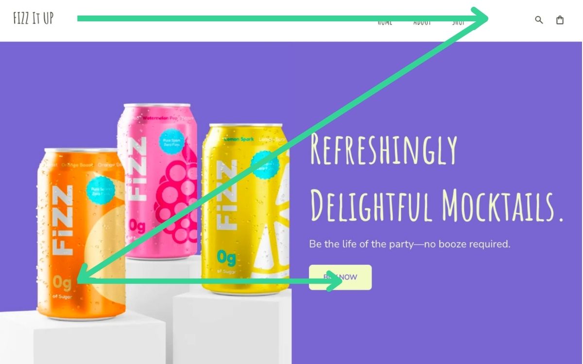
5. Visual Hierarchy Patterns: Follow (or Break) Natural Eye Movement
Eye-tracking studies reveal that people rarely look at a page randomly; instead, their eyes follow predictable paths. These scanning patterns determine where attention lands first, next, and last. By creating with these habits in mind, you can position your most important design elements—like headlines, visuals, and calls to action—exactly where they’re most likely to be seen.
Two of the most common visual hierarchy patterns are:
The F-Pattern
This is most common on text-heavy website layouts such as blogs, articles, or content-rich websites. Users typically start by scanning across the top of the page, move down the left-hand side, and occasionally glance across horizontally again.
To take advantage of this pattern, place critical information like headlines, keywords, and calls to action along the top and left-hand areas. Using bold subheadings can also guide the eye horizontally where needed, ensuring that essential content doesn’t get overlooked.
The Z-Pattern
This pattern often appears on simpler pages, such as landing pages or hero sections with a single clear goal. In this pattern, users’ eyes move in a Z-shaped path: from the top left to the top right, diagonally down to the bottom left, and then horizontally across to the bottom right.
Designers can leverage this pattern by positioning the logo and navigation along the top line, placing the main image or value proposition along the central diagonal, and ending with a call to action at the bottom right. This layout naturally guides the user’s attention toward the page’s primary objective.
Once you understand these default paths, you can break them intentionally by using color and contrast, or asymmetry to redirect attention and emphasize what matters most.
Tip: Test your layouts. Heat maps and scroll maps reveal where users actually look and click, helping you fine-tune for real behavior.
6. Position and Alignment: Create Order and Flow
Good alignment creates structure, balance, and a sense of professionalism that help users take your business more seriously. Misaligned design elements, on the other hand, create visual noise that makes a page feel disorganized, the content seem less strong (even if it’s stellar), and it can impact your overall credibility.
So, for example, take advantage of grids and alignment to create that necessary order. Design elements that line up cleanly guide the eye effortlessly from one area to the next, while deliberate asymmetry can add energy and interest when used with purpose. The goal isn’t rigid symmetry; it’s just intentional flow—that sense that everything belongs exactly where it is.
Notice how in the example below implements that deliberate asymmetry while also staying true to clean alignment. It keeps the page visually interesting without being boring or confusing.
Tip: Revisit your layout zoomed out. If the visual flow feels uneven or your eye gets “stuck” in one area, adjust alignment and spacing until the page feels natural to scan.
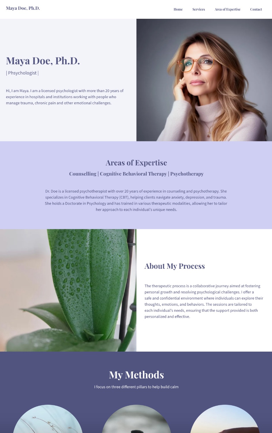
7. Grouping and Proximity: Guide Through Spacing
Proximity is one of the simplest yet most powerful visual hierarchy principles. When related items are placed close together, users instantly understand they belong to the same group. When spacing is inconsistent or unrelated design elements are too close, meaning gets lost—and confusion naturally follows.
Use spacing intentionally to signal relationships:
- Group headlines with their corresponding body text or image.
- Keep website navigation elements evenly spaced to reinforce structure.
- Separate sections clearly, with either space, color, or even vertical and horizontal lines to help users scan without friction.
Proximity also supports hierarchy by organizing visual information in layers and leading the eye from high-level sections to detailed content.
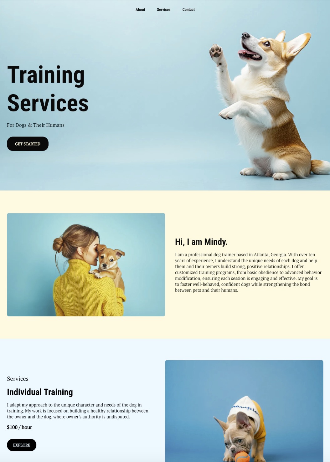
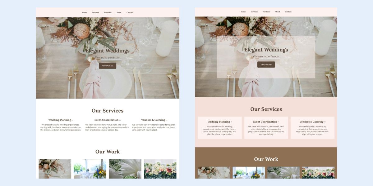
In the example below, you can see how the image on the left without clean spacing and visual grouping makes it so that all the content competes. Whereas the image on the right employs clear grouping and proximity, leading you naturally to logical next steps.
Tip: The squint test works here too. If you can still identify distinct sections and relationships, your proximity is working.
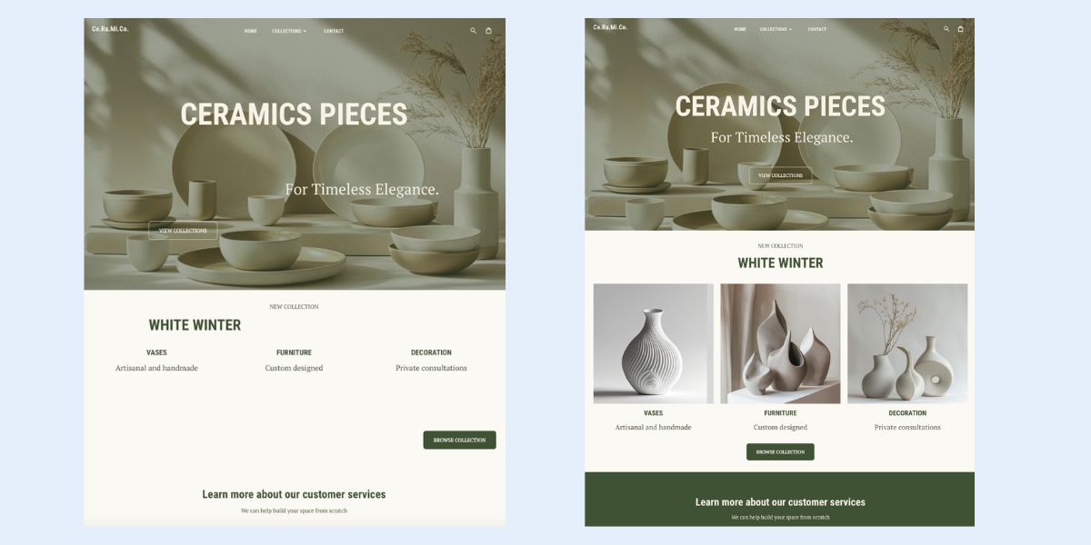
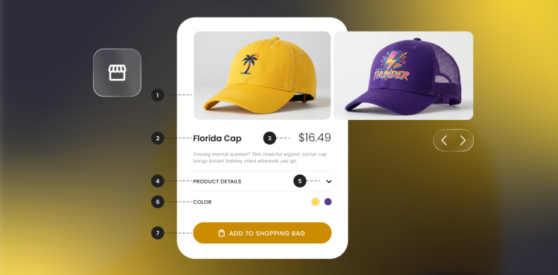
8. Imagery and Icons: Use Visuals That Reinforce Your Message
Images and icons are nice for decoration, but they’re also functional design tools that reinforce your message, evoke emotion, and create instant recognition. The key—as is so often the case with creating a functional visual hierarchy—is consistency. Repeated styles, colors, and placements reinforce the hierarchy and help users quickly understand relationships between important elements.
For imagery:
- Guide attention: Position photos or illustrations near key content or CTAs to draw the eye naturally.
- Signal importance with scale: Larger or more prominent visuals emphasize critical information.
- Maintain cohesion: Consistent color temperature, style, and mood across pages reinforces visual hierarchy and trust.
- Support scanning: Break up dense content to help users process information quickly.
For icons:
- Clarify structure: Use icons to highlight sections, reinforce headings, or show relationships between content blocks.
- Keep scale and spacing consistent: Uniform sizing and alignment maintain visual hierarchy and prevent clutter.
- Direct action: Place icons near interactive elements or steps in the customer journey to guide clicks.
- Use style to create emphasis: A bold or colored icon can draw attention to an important element, supporting your overall visual hierarchy.
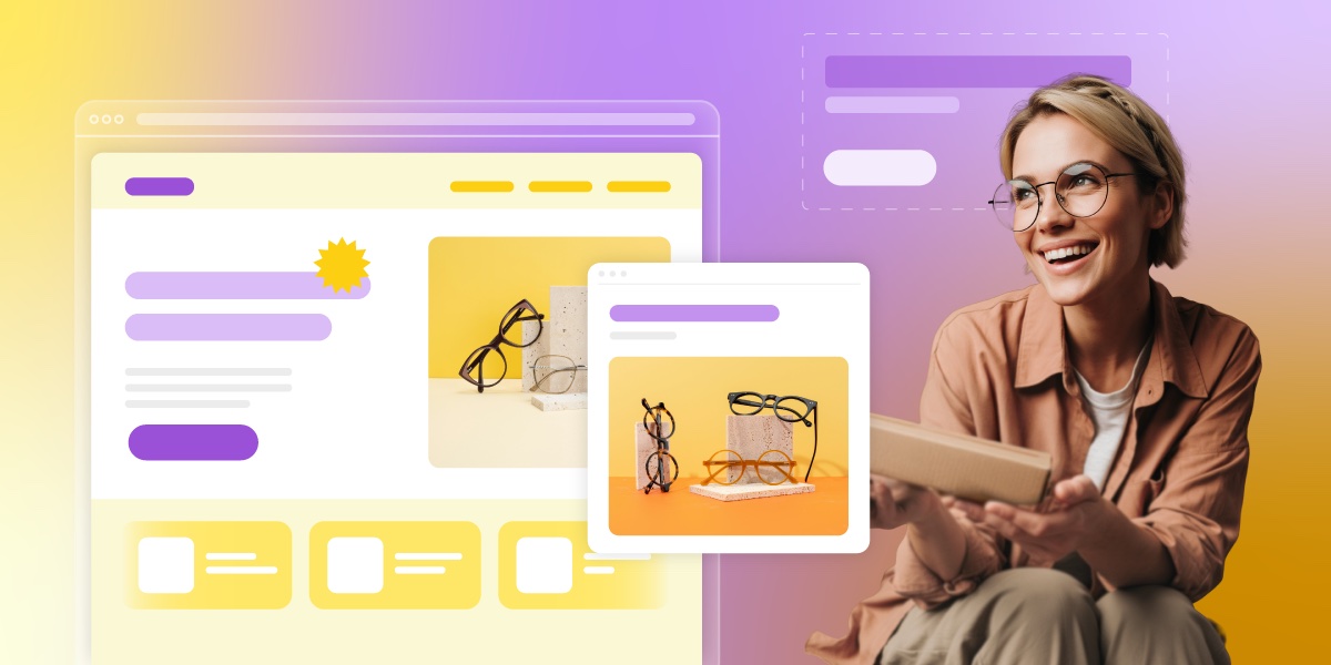
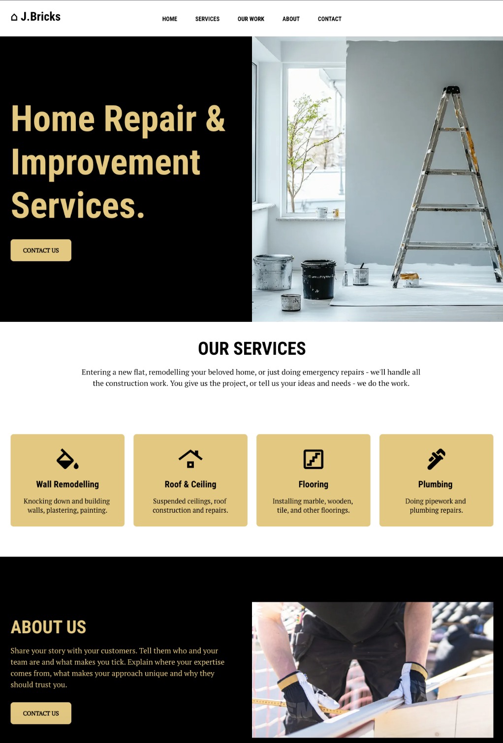
In the example above, you can see how images and icons work together to reinforce the message. Their placement is intentional, and their consistent color and size strengthen the visual hierarchy, creating a natural, seamless flow.
With the SiteGround Website Builder, structure and balance come built in.
The builder automatically applies smart spacing and grouping rules so your layouts stay clean, cohesive, and easy to navigate—no design expertise required. Strategic image placement is also built into the templates, and you can tap into the built-in photo library to quickly find visuals that reinforce your message and bring your content to life.
9. Depth and Layering: Add Focus and Priority
Depth helps create visual hierarchy and guide attention, even in flat design. By layering elements—through spacing, alignment, color and contrast—you can create a sense of visual order that leads users toward what matters most.
Use layering to:
- Highlight clickable or interactive elements through placement or by creating contrast.
- Separate sections using background blocks, gradients, or white space.
- Arrange overlapping text and visuals to create a clear sense of flow and priority.
You don’t need complex effects to create depth either. Subtle differences in scale, background color, or layering can make your web design feel structured and intuitive, helping users understand where to look and what to do next.
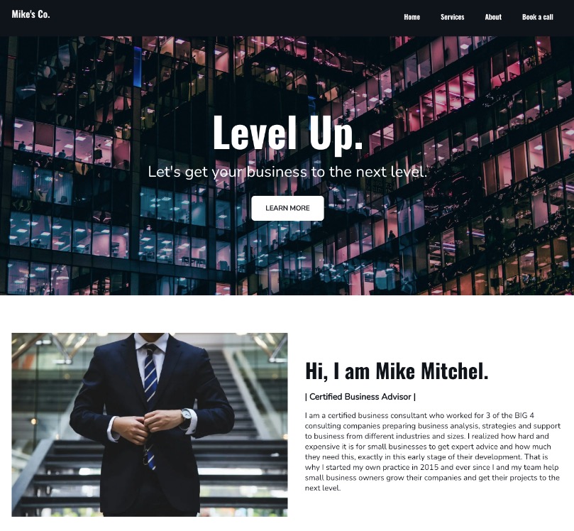
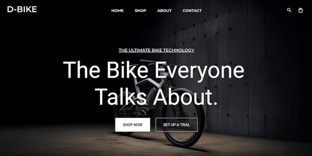
Notice how, in the example above, the website on the right makes it much easier to absorb each section, process the information, and spot the call-to-action button—all thanks to thoughtful layering, color, and contrast.
10. Rhythm and Consistent Styles: Reinforce the Goal
Repetition is what brings harmony and structure to your design. By repeating consistent patterns—whether in typography, color, icons, or spacing—across multiple website pages, you create rhythm. That rhythm builds familiarity, helping users understand your visual hierarchy, along with what’s important and where to act.
Elements you might repeat in your visual hierarchy include:
- Button styles and placement for CTAs across pages.
- Font weights and colors for headings and subheadings.
- Icon shapes or alignment patterns to maintain visual flow.
And this consistency in visual hierarchy does more than improve usability; it reinforces your brand identity. Each repeated element becomes a visual cue that reminds users who you are and what you stand for. Over time, that consistency builds trust and recognition, making your site feel cohesive and intentional.
Tip: Establish a visual “beat.” Just like music, a good rhythm balances variety and consistency—enough to keep users engaged, but never overwhelmed. Like in the example above, there’s a creative consistency that makes the page both visually interesting, but easy to understand.
Visual Hierarchy Mistakes That Kill Conversions
Even if you follow every visual hierarchy principle, it’s easy to slip up. Small missteps can distract users, bury your main message, or make it unclear what action to take next. Here are some of the most common mistakes to watch for so your design works as hard as it looks.
1. Competing Visuals
When everything on a page screams for attention, nothing stands out. Overusing bold colors, large fonts, or busy elements creates noise instead of focus.
- Fix it: Choose one clear focal point per screen—usually your CTA or value proposition—and let supporting elements play a quieter role.
2. Equal-Weight Text
If all headlines, subheadings, and paragraphs look the same, users can’t tell what’s important. They skim and leave before understanding your offer.
- Fix it: Create a clear text hierarchy using consistent font sizes, weights, and spacing. Make your headings visually dominant, and let body text take a supporting role. Look at this article as an example: it consists of a title, headings, subheadings, and even CTAs, all which are different sizes (and even colors). This is intentional and has helped guide your attention.
3. Too Many CTAs
Multiple calls to action with equal prominence can overwhelm users and dilute your conversion goal.
- Fix it: Define a single primary action per page or screen, with secondary CTAs styled more subtly. A clear visual hierarchy should make the next and most important step obvious.
4. Decorative (Not Functional) Design
Using visuals purely for aesthetics—like abstract graphics or background patterns—can draw attention away from what matters.
- Fix it: Every design element should have a job: emphasize a message, guide the eye, or support understanding. If it’s not serving a purpose, simplify or remove it.
5. Ignoring White Space
Crowded designs make users feel overwhelmed and uncertain. Without breathing room, even strong content loses impact.
- Fix it: Embrace negative space. It helps separate sections, highlight certain elements, and create a more confident, conversion-driven layout.
Mastering Visual Hierarchy in Design for Better Conversions
Designing with hierarchy in mind is what turns a collection of visual elements into a clear, engaging experience. From the first glance to the final click, thoughtful use of color, contrast, and typography shapes how users move through your site.
If you’d rather skip the guesswork, the SiteGround Website Builder helps put these visual hierarchy principles into practice. It offers professionally paired font combinations, cohesive color palettes, templates with built-in spacing and grouping rules, and a photo library for finding supporting imagery—so typography and color work consistently across your pages and your visual hierarchy is already set up for you.


Comments ( 0 )
Thanks! Your comment will be held for moderation and will be shortly published, if it is related to this blog article. Comments for support inquiries or issues will not be published, if you have such please report it through our official channels of communication.
Leave a comment
Thanks! Your comment will be held for moderation and will be shortly published, if it is related to this blog article. Comments for support inquiries or issues will not be published, if you have such please report it through our official channels of communication.