Service Pages That Sell—Copy, Design, & Mistakes to Avoid
Your service page isn’t just “another web page” on your site—it’s the one where visitors decide whether to move forward with working with you…or not. If the headline doesn’t hook them, the benefits don’t resonate, or the layout overwhelms, they’ll click away before they even know what you offer. That’s why copy and design are a tag team: the words explain why you matter, and the visuals guide the eye, highlight proof, and make it irresistible to act.
So let’s break this all down in actionable terms so that you can make your service page really work for you and get the job done.
What Is a Service Page?
A service page is a dedicated website page that explains a specific service your business offers. It combines persuasive copy with smart service page design to clearly communicate value, address objections, and guide website visitors toward taking action—whether that’s filling out a form, booking a consultation, or making a purchase.
It’s worth noting that a service page usually focuses on one specific service. This allows you to provide detailed information, show the benefits, outline your process, share proof points, and include a clear, conversion-focused call to action. While some websites also have a main “services” page that lists all offerings, each individual page is what we mean when we talk about creating a high-converting service page.
What’s the difference between a homepage and a service page?
Unlike a homepage, which gives a broad overview of your business, each service deserves a separate page. This lets you dive deeper into the details, fine-tune your message and benefits appropriately, and lead potential clients toward a carefully chosen action.
Before You Start: Get the Message Right
Before writing a single word or toiling over image placements, you need to make sure you’ve got your message dialed. During the website planning process, it’s likely that you defined your unique value proposition (UVP) and target audience, and hopefully woven it into your homepage. So your service page should carry that narrative forward, customizing the UVP specifically to each service.
To orient you in terms of what your service page should cover, ask yourself:
- Who is this service for, and what problem does it solve?
- How does this service support or extend the UVP we’ve already established?
- Why is our solution better or different from competitors?
When you keep your UVP and audience front of mind, your copy and service page design will work together to create a consistent, compelling experience. This kind of thoughtful and targeted messaging reassures visitors, builds trust, and sets the stage for conversion—because a confused visitor rarely converts. A clear and convinced one, on the hand, clicks and keeps going.
Key Elements Every Service Page Needs
Before you start creating, remember that a service page isn’t just about words on a screen. It’s a carefully constructed mix of copy and design elements that work together to inform, persuade, and convert. To make sure your service page does its job, here are the core building blocks to consider including on your service page.
- Headline: The first line visitors see, usually at the top of the service page. It sets the tone and captures attention by stating the main benefit or promise.
- Intro/Subhead: A short opening paragraph or statement that acknowledges the reader’s problem and introduces your solution.
- Service Details & Benefits: The main body of the service page where you describe what the service includes and—most importantly—how it helps the potential client.
- Proof Points: Elements like testimonials, reviews, case studies, or customer logos that show credibility and build trust.
- CTA (Call to Action): A clear, action-oriented invitation telling the reader what to do next, such as “Book a Call” or “Start Your Free Trial.”
- Consistent Branding: Fonts, colors, tone, and imagery that match the rest of your site so the service page feels professional and cohesive.
- Visual Flow: The way the service page is structured and laid out, guiding readers naturally from the problem to the solution, through proof, sales-oriented FAQs, and finally toward action.
Think of these elements as a website checklist for your service page—covering everything from headlines to proof points to CTAs in order to make the page as effective as possible.
Service Page Framework—Copy + Design Working Together
You know the elements you need, but how can you make it all work together to truly convince? Indeed, a high-converting service page requires both compelling copy and thoughtful web design. Here’s a step-by-step approach for making sure your message and layout are as effective as possible.
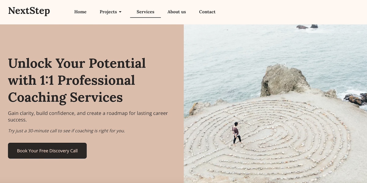
Step 1: Develop a Strong Headline
The headline is the first thing a potential client sees in the website layout of your service page, and it sets the tone for the entire page. A strong headline immediately communicates why your service matters and grabs attention.
- Content tips: Your headline should immediately communicate the main benefit of your service. It should answer the visitor’s question: “Why should I care?” Include your UVP if possible and focus on the outcome for the user. Examples: “Get More Leads with Our SEO Services” or “Secure Your Website in Minutes.”
- Design tips: Make the headline visually prominent with bold typography, clear hierarchy, and placement above the fold. You can pair it with a hero image, video, or background that visually reinforces the benefit.
Step 2: Include an Introduction or Problem Statement
After the headline on your service page, you need to quickly connect with visitors by showing you understand their challenges. This section sets the stage for why your service is relevant.
- Content tips: On your service page, speak directly to your audience’s pain points and show that you understand their needs. Opening with a question, statistic, or brief scenario can make the section relatable. Keep the language clear and concise to maintain engagement.
- Design tips: Use whitespace, supporting icons, or high-quality images to visually illustrate the problem if appropriate. Ensure the section (and entire service page) is scannable and visually inviting, helping readers connect quickly.
Step 3: Outline Service Details & Benefits
Once visitors understand the problem, it’s important for your service page to explain how your service addresses it. This is where you clearly show the value you provide.
- Content tips: Focus on the value your service provides rather than just listing features. Explain how each service component solves a problem or delivers results. Use bullet points, short paragraphs, or numbered lists on your service page to make content easy to scan.
- Design tips: Incorporate icons, diagrams, or images to illustrate key points. Organize the content with subheadings to guide the eye and reinforce the benefit of each service detail.
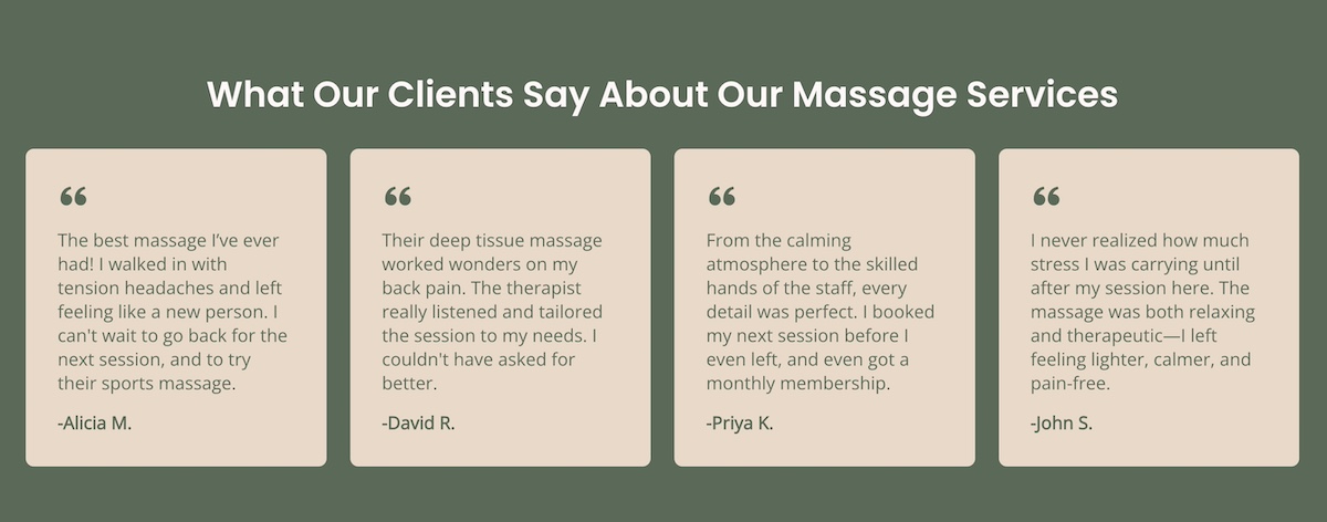
Step 4: Demonstrate Proof Points
Visitors need reassurance that your service delivers on its promises. So including proof points on your service page provides credibility and reduces hesitation.
- Content tips: Include case studies, customer logos, statistics, or social proof such as client testimonials, to establish credibility and reduce hesitation. Specific examples and measurable results can be especially persuasive.
- Design tips: Highlight proof points using boxed quotes, shaded backgrounds, or badges. Arrange them for easy scanning and make them visually distinct without overwhelming the service page.
Pro Tip: Make It Effortless with SiteGround
With SiteGround, creating a service page that both looks great and converts is effortless. Pre-designed sections let you easily add testimonials, spotlight benefits, and showcase your process—no coding or design skills required.
Step 5: Use Strategic CTAs
After showing value and credibility, guide visitors toward action. How to do that? A well-designed call to action turns interest into conversions.
- Content tips: Keep your CTAs clear, actionable, and persuasive. Use specific language like “Book a Free Consultation” or “Start Your Free Trial,” and consider adding microcopy to reduce hesitation, such as “No credit card required.” Include a button in the header, but also repeat CTAs at natural points in the flow of the service page, especially after you’ve explained benefits or shared testimonials.
- Design tips: Make CTAs stand out with contrasting colors, consistent branding, and enough breathing room to be noticeable. Place them strategically—above the fold, mid-page after a proof point, and again near the close—so potential clients are never far from a next step. On mobile, ensure that service page buttons are easy to tap and stay visually prominent without overwhelming the design.
Also important to keep in mind here: consider where the CTA leads. Many service page CTAs naturally direct visitors to a contact page, signup page, or booking form—so make sure the internal link destination matches the action you want users to take.
Once visitors take action through your CTAs, you can keep them engaged with follow-up emails using SiteGround Email Marketing. It makes it easy to generate leads from your service page and send targeted campaigns that nurture prospects and drive conversions. With pre-built templates and simple automation, you can share offers, updates, or helpful resources—all without needing a separate platform.
Common Service Page Mistakes to Avoid
Even with a solid framework, service pages can underperform if certain—and unfortunately common—pitfalls aren’t addressed. Here are the most common mistakes and how to avoid them:
1. Focusing on Features Instead of Benefits
Many service pages list features without showing visitors why they matter. Simply stating what your service does doesn’t communicate value. Instead, highlight the benefits and outcomes that your audience cares about.
For example, rather than saying “24/7 support,” try “24/7 support to ensure your website stays live and your business never misses a lead.”
2. Weak or Vague Headlines
If your headline is unclear or full of industry jargon, visitors may not understand why your service is relevant to them. A strong service page headline should immediately communicate a clear, benefit-driven value proposition. Keep it simple, specific, and aligned with your UVP.
For example, instead of: “Comprehensive Business Solutions for Growth,” which is vague and could mean almost anything, try: “Grow Your Revenue Faster with Our Data-Driven Marketing Strategies,” which clearly communicates the benefit and outcome.
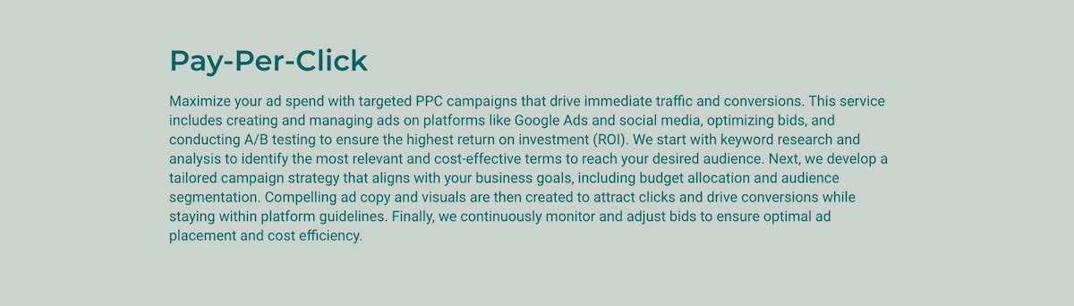
3. Walls of Text & Poor Readability
Dense paragraphs can overwhelm readers, especially online. Break your service page content into short paragraphs, bullets, and subheadings, and use visuals or icons to illustrate key points. This improves scanning, helps visitors digest information quickly, and keeps them engaged.
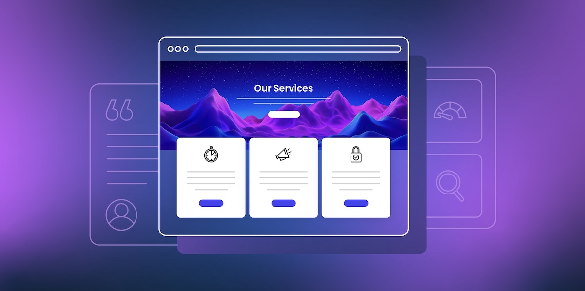
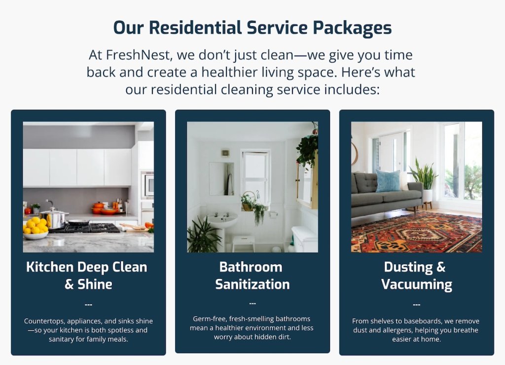
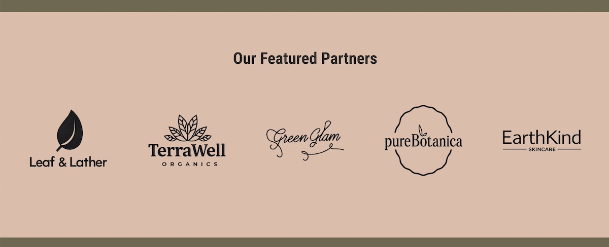
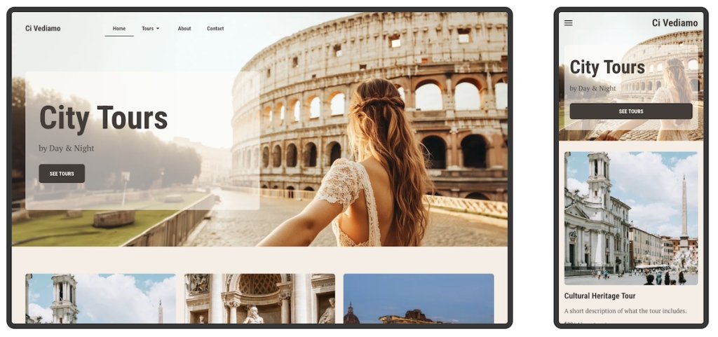
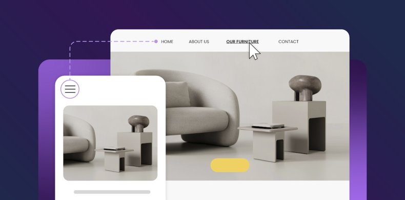
Take a look at the service page examples below. They both communicate the exact same information, but one is more scannable, visually appealing, and effectively pulls you in.
Service Page Example 1:
Service Page Example 2:
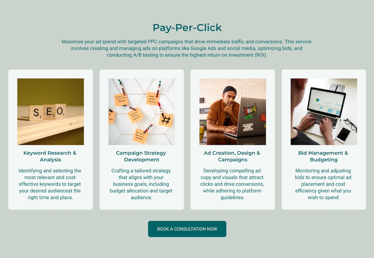
Lest there be any doubt, the clear winner here is service page example 2!
4. Inconsistent Branding
Fonts, colors, and tone of voice that don’t match your homepage or overall brand can make your service page feel unprofessional. Consistency in branding reinforces trust and recognition across the site.
The good news about this is that, if you use a site builder, like the SiteGround Website Builder, it’s super easy to implement unified branding across your site in a click. From fonts to colors, everything plays nicely together, making all your individual pages, including your service page, look instantly professional.
5. Neglecting Proof Points and Social Validation
Without testimonials, case studies, or client logos on your service page, visitors may doubt your credibility. Include specific proof points and highlight them visually to build trust and make your claims more convincing.
6. Ignoring Mobile and Responsive Design
Many pages are designed primarily for desktop and fail to consider mobile users. Whether it’s your service page or your homepage design, make sure your layout, text, images, and CTAs look great on all devices to maintain readability and usability.
Not sure how to make your site and service page mobile responsive? Not a problem. The SiteGround Website Builder automatically does this for you, plus while you’re designing, you can easily preview what your site will look like on different screens.
7. Not Considering SEO Basics
Even a perfect service page may struggle to attract visitors if it’s not optimized for search engines. Follow SEO basics by including relevant keywords naturally in headings, body copy, image ALT text, and the meta description. These simple steps will help your site get recognized by search engines so that you show up in organic search results, thus bringing more online traffic to your business.
Your Free Website Planning Checklist Build with clarity, launch with confidence
Google reCAPTCHA used. Privacy Policy and Terms of Service apply![]()
Build Your Service Page Today
Whether you’re launching a new service or refreshing an existing one, taking the time to craft a thoughtful, conversion-focused service page pays off. When you combine clear, benefit-focused copy with thoughtful design, you can guide visitors from understanding their problem to taking action.
With the SiteGround Website Builder, creating a service page that both looks great and converts is easier than ever. Pre-designed sections make it simple to drop in testimonials, highlight benefits, or showcase your process without the hassle of code or design skills. Every page is mobile-ready by default, and built-in tools make it simple to optimize for SEO, update content, and adjust layouts as your business grows. Plus, when paired with SiteGround Email Marketing, your service pages can seamlessly feed into your digital marketing efforts—capturing leads, nurturing prospects, and turning visitors into loyal customers.

Comments ( 0 )
Thanks! Your comment will be held for moderation and will be shortly published, if it is related to this blog article. Comments for support inquiries or issues will not be published, if you have such please report it through our official channels of communication.
Leave a comment
Thanks! Your comment will be held for moderation and will be shortly published, if it is related to this blog article. Comments for support inquiries or issues will not be published, if you have such please report it through our official channels of communication.