Partners Page Guide: Attract the Right Partners + Examples

Do you already have a partner program, but not a dedicated page to showcase it? That’s a major missed opportunity. A cleverly designed partners page does more than just list logos: it reinforces trust with your customers, helps existing partners feel valued and supported, and invites the right new partners to join your network.
In this guide, we’ll break down what makes an effective partners page, why it’s such a powerful asset for growth, and the essential elements you need to include. Plus, we’ll share partners page best practices and examples to inspire your own.
What Is a Partners Page?
A partners page is a dedicated page on your website that displays your company’s partnerships, but also acts as a gateway for new ones. Usually the partners page will feature noteworthy brands or people you work with, what your partner program looks like, and how interested parties can get involved.
Think of a partners page as accomplishing multiple small business marketing jobs all at once: it’s a credibility booster plus a business development tool. That’s because it shows the outside world that you have trusted collaborations while also inviting new partners to learn about opportunities with your company.
Why Have a Partners Page?
Not every company needs a partners page, but for scaling businesses or those that rely on partnerships—such as SaaS companies, agencies, nonprofits, or ecommerce brands—it can be a really important growth asset that helps you reach your business goals.
Here are the main reasons to have a partners page:
- Build credibility – Feature your partners, customer success, and case stories that demonstrates reliability and trustworthiness to both customers and future collaborators.
- Attract the right partners – A smartly crafted partners page makes it clear who you want to work with and what you offer, drawing in organizations that align with your business goals.
- Clarify your program – Outlining the benefits, requirements, and process saves time for both you and future partners.
- Support brand storytelling – Your partners reflect your values and expertise, so highlighting them strengthens your overall brand positioning.
But, importantly, you’ve got to get all of this right on your partners page! So that’s what we’re here to do today.
Your Free Website Planning Checklist Build with clarity, launch with confidence
Google reCAPTCHA used. Privacy Policy and Terms of Service apply![]()
What to Include on a Partners Page
A strong partners page balances clear messaging with a smart website layout, guiding visitors through the story in a way that feels natural and persuasive. It’s essentially a marketing funnel in a page: you start with high-level credibility (logos, hero section), build interest with benefits and case studies, and end with action-driven elements like forms and calls to action.
A successful partners page should include these elements:
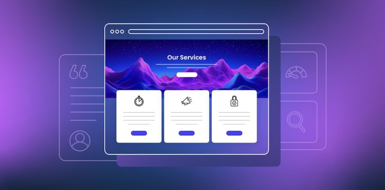
1. Hero Section
You might recall having heard about the hero section as an important—if not the most important—part of your homepage website design. And in fact it’s also a great tool for your partners page design.
As a little refresher, the hero section is the above-the-fold graphic section that gets your strongest message across both visually and verbally. It typically communicates instant value—in this case, of your partnership program. An especially strong hero will combine that clear messaging with visual web design to make an impactful first impression.
Key elements to include in the hero section:
- Headline: A benefit-driven statement that speaks to potential partners (such as “Grow with Us: Join Our Partner Network”).
- Subheadline or short description: A concise explanation of what your program is about.
- Visuals: Branded imagery, an illustration of collaboration, or even a short video.
- Call-to-action (CTA) button: A clear action such as “Become a Partner” or “Explore Benefits.”
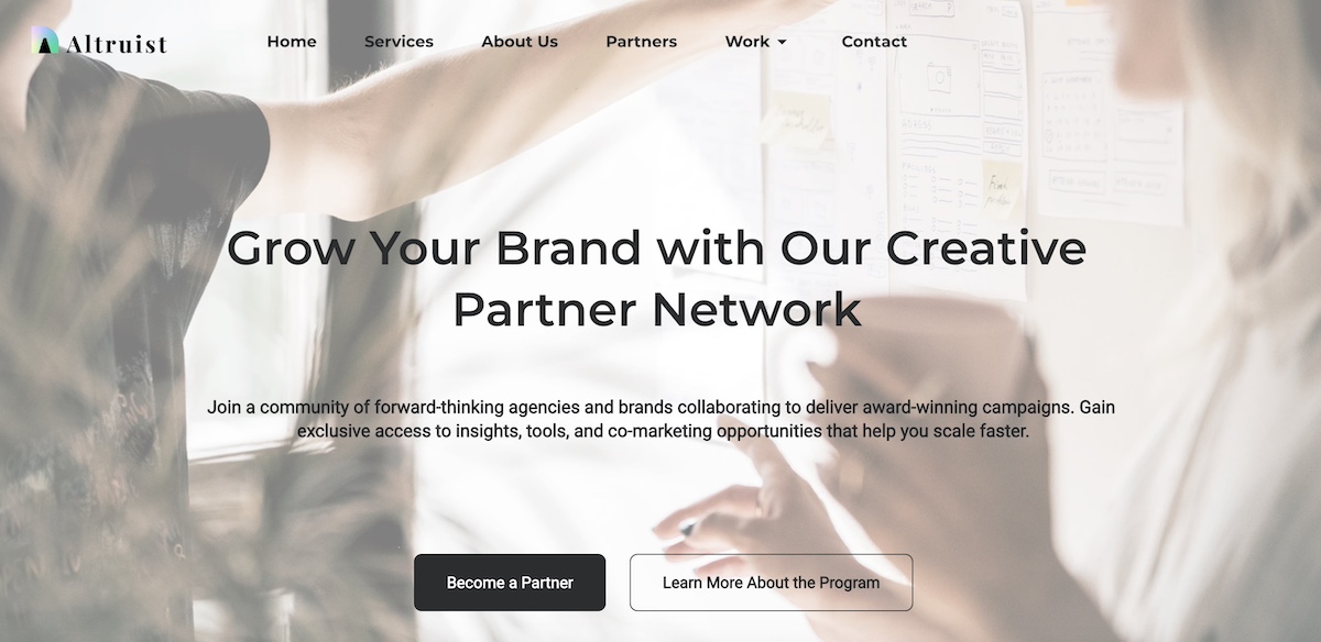
Think of your hero section as a pitch in miniature. It sets the tone for the rest of the page and should quickly answer the question: “Why should I care about this partnership?”
2. Partner Logos
Featuring partner logos is one of the most straightforward ways to build instant credibility for your program and for your brand in general. It shows that respected organizations and businesses already trust you, and by extension others can too.

Best practices for displaying logos:
- Visibility: Place logos high enough on your partners page design so that they reinforce credibility early, often just below the hero.
- Consistency: Use uniform sizing and layout to keep the section visually clean—but avoid altering partner logos in ways that conflict with their brand guidelines (for example, changing colors or proportions).
- Grouping: If you have many partners, consider organizing logos by category or using a carousel/grid layout.
- Linking (optional): You can link logos to case studies, testimonials, or the partner’s website for added depth. If you link to another site, however, be sure to have it open in a new webpage so that you still keep visitors on your site. That said, you may want to avoid the distraction altogether and avoid sending users off to another site.
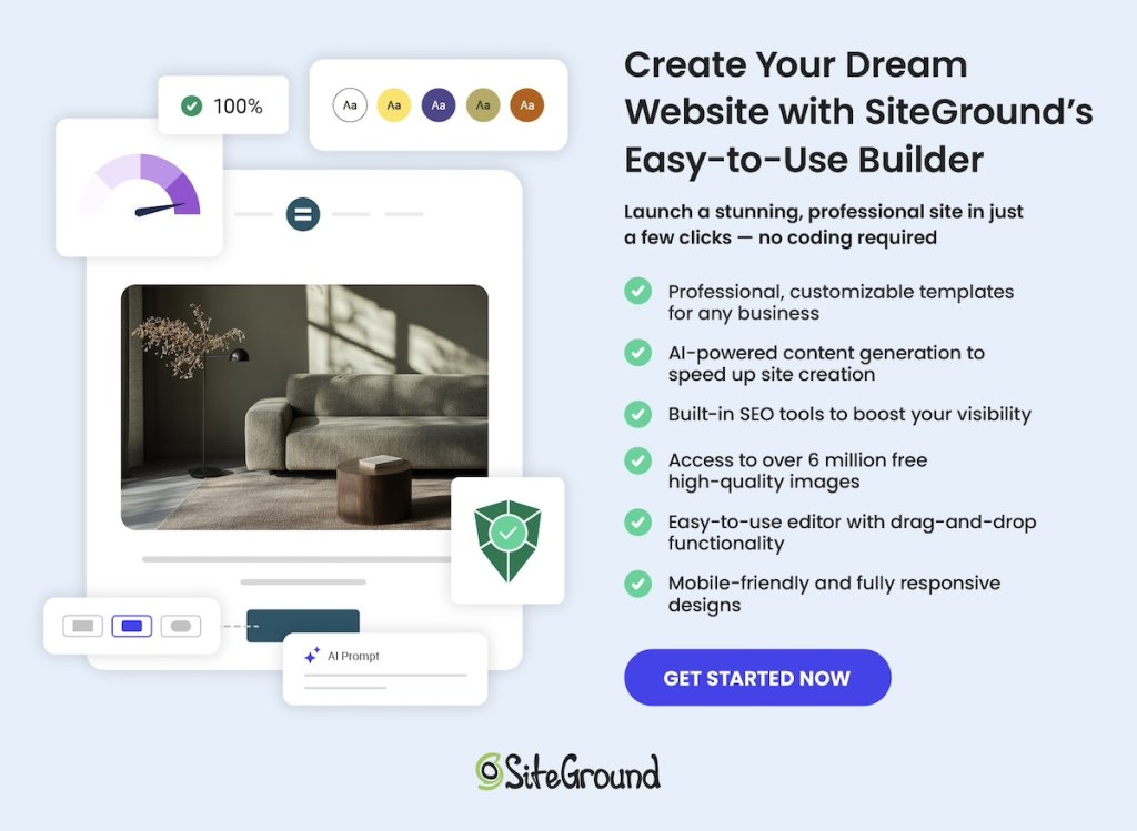
Your partners page deserves a design that’s as professional as your program. With SiteGround Website Builder, you can easily create clean, modern layouts using drag-and-drop, add partner logos, case studies, and CTAs, customize colors, fonts, and imagery to match your brand, and ensure your page is optimized for both mobile and desktop automatically.
Start building a partners page that looks great and converts>>
3. Benefits
This is the section of your partners page design where you make the case for your partnership program. Instead of just describing what the program is, highlight the tangible benefits a partner will gain from joining.
Ways to structure a Benefits section:
- Headlines or bullet points: Make the benefits scannable (think: “Grow revenue together,” “Access exclusive resources,” “Expand your reach”).
- Partner-focused language: Speak to what’s in it for them, not just what your company gains.
- Visual support: Use icons, graphics, or short testimonials to reinforce each benefit.
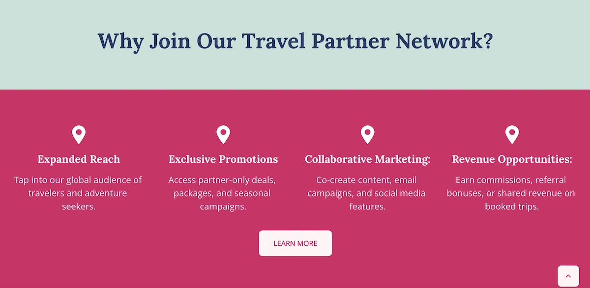
Think of this partners page section as answering the question: “Why should I work with you instead of someone else?” The clearer and more compelling your benefits, the more likely the right partners will self-identify and take the next step.
4. Program Overview
After laying out the benefits, it’s time to get specific. An About the Program section on your partners page explains how your partnership model works, giving prospective partners the clarity and transparency they need to make a decision to move forward.
What to include in the program overview:
- Types of partnerships: For example, reseller, affiliate, integration, or strategic alliances.
- How the program is structured: Tiers, revenue sharing, training, or co-marketing opportunities.
- Expectations: What you provide to partners and what you expect in return.
- Visual aids: A simple diagram or infographic can make a complex program easier to understand at a glance.
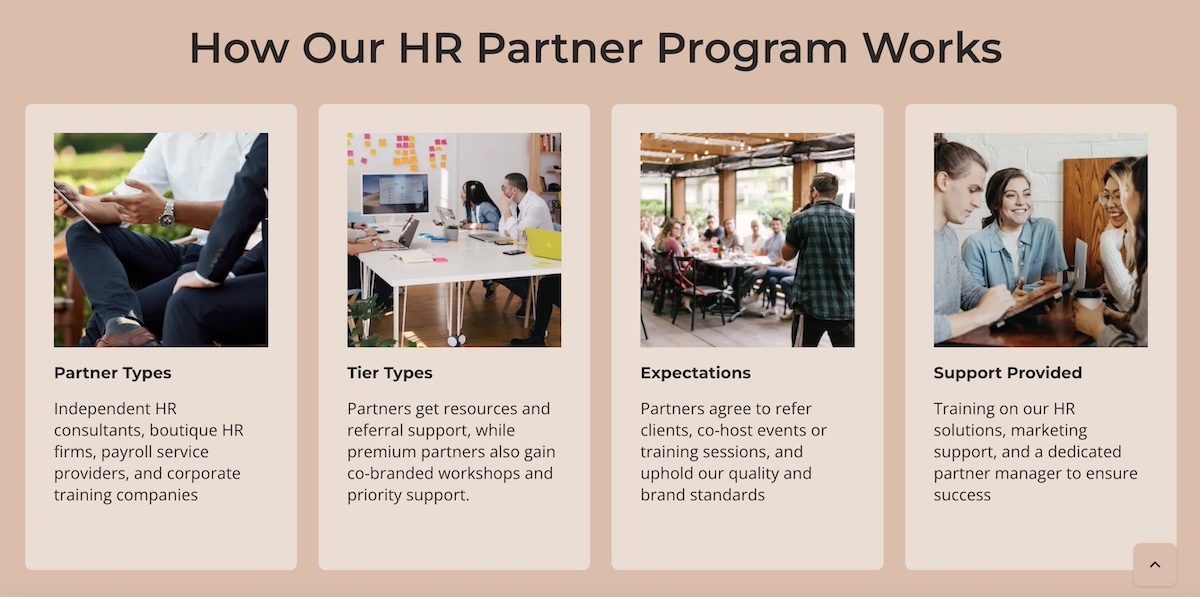
Clarity is the goal here. Think of it like a customer journey: Give the reader enough information to evaluate fit quickly, while keeping the details succinct enough to encourage them to take the next step and learn more.
5. Partner Application Process
Once a possible partner is interested, make it abundantly clear via your partners page design how they can move forward. A How to Become a Partner section does just that, removing friction by outlining the process in a simple, transparent way. Quite simply: set expectations.
Best practices for displaying the partner application process:
- Step-by-step overview: Break the process into 3–4 clear steps (such as apply, review, onboarding, and launch).
- Set expectations: Mention timelines, required qualifications, or additional resources applicants will need.
- Consider providing multiple touchpoints: You can include both a primary CTA (like “Apply Now”) and a secondary one (like “Contact Us”) for those who may need more information first.
- Highlight support: Reassure applying partners that they’ll have guidance through the process, whether from a dedicated partner manager or a resource hub.
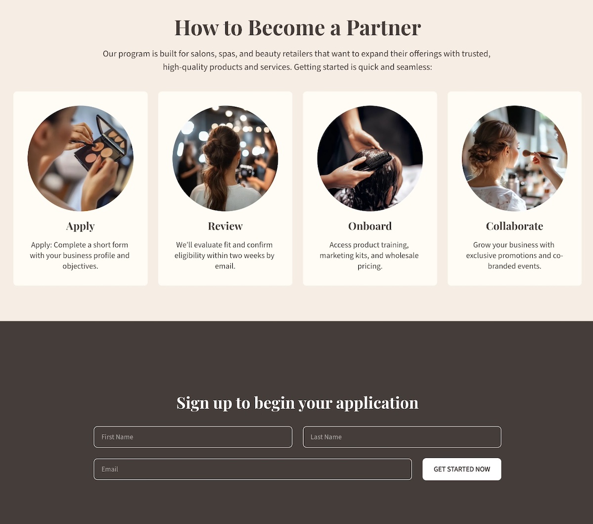
This kind of expectation setting via your partners page helps avoid drop-offs, because when potential partners know exactly what to expect, they’re more likely to follow through.
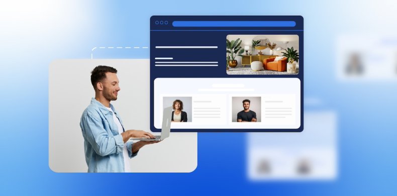
6. Case Studies
Case studies are one of the most persuasive elements of your partners page design. They turn abstract benefits into real-world proof by showing how your program has helped existing partners succeed.
Ways to showcase case studies:
- Spotlight format: Dedicate a short section to a single partner success story with measurable results.
- Carousel or grid: Feature multiple partner case studies with visuals, quotes, and outcomes.
- Mix of formats: Include written stories, video testimonials, or data-driven snapshots featuring existing partners.
When writing case studies, focus on:
- The partner’s challenge before working with you.
- The solution provided through your partnership.
- The results they achieved (revenue growth, increased reach, new opportunities, etc.).
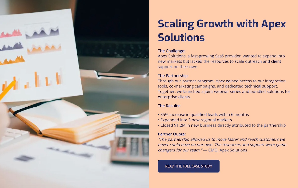
Well-crafted case studies show potential partners that others like them have achieved success with your program.
7. CTAs and Forms
A strong partners page goes beyond informing, and really guides visitors toward action. That’s where calls to action and forms come in. While they work together, each has a different role.
CTAs are about engagement. They should appear throughout the partners page design to capture interest at the right moment and direct visitors to learn more, apply, or contact you.
Forms are about conversion. They turn interest into a commitment by collecting essential details so you can qualify and follow up.
When to use CTAs:
- Early in the partners page design (like in the hero section) to capture top-level interest.
- After benefits or case studies, when the value has been clearly shown.
- For “softer” actions, like “Download our program guide” or “Contact us to learn more.”
- Remember to keep CTAs action-oriented and descriptive, which is also important for website accessibility, as it allows all users to understand the next step.
When to use forms:
- At the point of highest intent, often after explaining the program and its benefits, or how to apply.
- When you want to qualify prospects by segmenting (affiliate, reseller, etc.).
- As the final action step, placed toward the bottom of the partners page design.
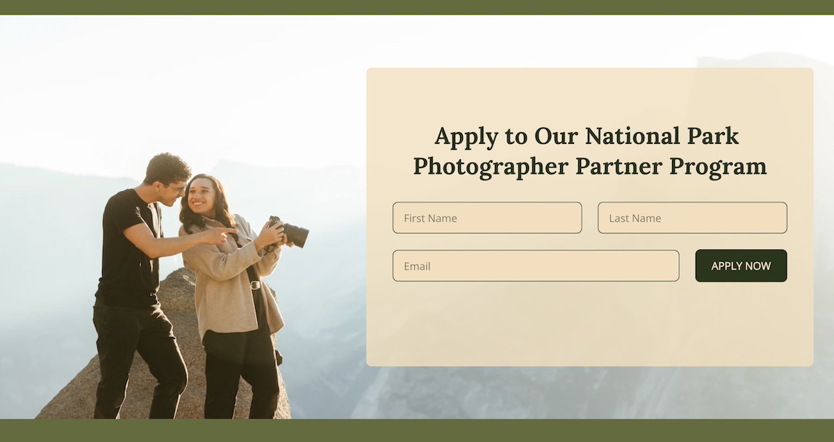
Together, CTAs and forms act as the conversion engine of your partners page. CTAs build that curiosity and momentum, while forms capture the momentum and turn it into qualified leads.
For all the necessary follow-up, you will need a solid email marketing platform in your court. One that’s easy to get going, allows you to segment your lists, send automated sequences, and track performance over time. With SiteGround Email Marketing, you can nurture new partner leads from the moment they sign up—sending welcome sequences, program updates, and tailored campaigns that keep them engaged and moving toward long-term collaboration.
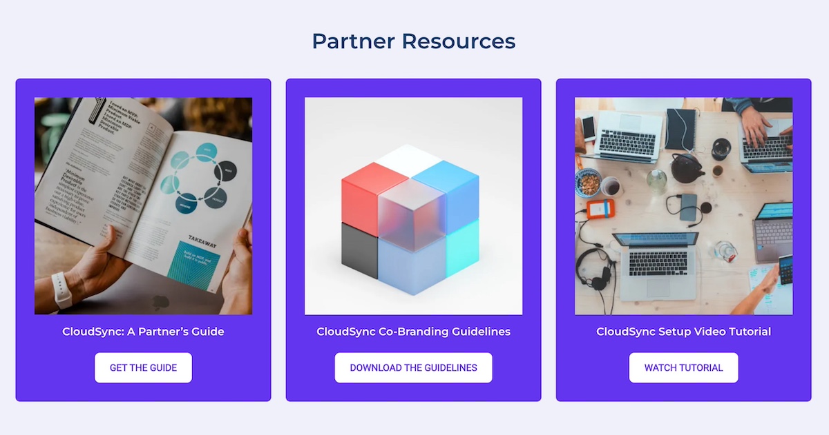
8. Resources
Providing resources helps both potential and existing partners feel supported, while also demonstrating that your partnership program is structured, professional, and built for success. A well-organized resource section works in two important ways: it can help attract the right partners, and also help current partners thrive.
Examples of resources to include:
Guides and playbooks:
- Materials that explain how partners can get started or maximize the partnership.
- Ideal for prospects who are still evaluating the program and want to understand the process.
Marketing materials:
- Logos, co-branding guidelines, banners, or templates.
- Helps partners promote your products/services effectively while maintaining brand consistency.
Training and onboarding content:
- Videos, webinars, or step-by-step documentation.
- Best for new partners to quickly get up to speed and start contributing value.
9. FAQs
An FAQ section is a helpful way to address common questions, reduce friction for prospective partners, and prevent unnecessary back-and-forth before someone decides to apply or reach out.
Consider including questions that cover:
- Program details: Eligibility, partner types, or expected benefits.
- Process questions: How to apply, timelines, or onboarding steps.
- Support and contact information: How to get help if needed.
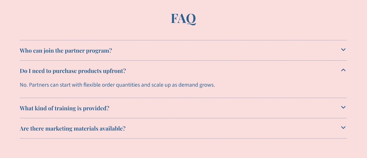
Keep answers brief and scannable, using bullet points or short paragraphs. You can also include links to guides or resources for more detailed explanations.
Best Practices for Partners Pages
Creating a truly successful and well-designed partners page goes beyond just checking the above boxes. It requires a bit more nuance involving structure, web design, and how you communicate your partner program. Following these best practices will help your page attract the right partners and support meaningful collaboration.
Define Your Ideal Partner
Before writing copy or going down the rabbit hole of partners page design, be clear about who you want to attract. Consider factors like industry, company size, business goals, and values. Defining your ideal partner is the starting point for everything else you produce.
Create Messaging that Resonates
Your messaging should speak directly to this potential ideal partner. Focus on the benefits for them, not just what your company gains. Use clear, concise language, highlight success stories, and avoid jargon. If you can nail this messaging, it will enable the right partners to quickly understand the value of joining your partner program.
Keep the Partners Page Aligned with Your Site
Your partners page design shouldn’t feel disconnected from the rest of your site. Make sure it reflects your company’s branding by using consistent colors, fonts, and imagery. At the same time, consider how it fits into your broader website planning—whether through main navigation, as part of your About section, or linked from resources. This alignment helps the page feel like a cohesive part of your site and reinforces the value of your brand and working with you.
Leverage Existing Partnerships
We touched on this before, but we can’t emphasize it enough: leverage your existing partners, as it adds valuable credibility for both customers and for developing new partnerships. Use those logos (with permission), create case studies, and don’t be shy about asking for testimonials. Highlighting successful collaborations demonstrates the credibility of your program and encourages new partners to envision similar results.
Segment and Follow Up
Not all partners are the same, so segment prospects by using forms. That is, if you have, let’s say, a newsletter form on your homepage, you’ll want to be sure to create a unique, segmented form for your partners page. This kind of segmentation allows you to automate your emails and follow up with customized communications with relevant resources.
Build a Partners Page That Works
Surely you are convinced by now that a well-structured and well-designed partners page does more than just rattle off a few points about your program. It’s actually a strategic tool that strengthens relationships, attracts new partners, and builds trust with your customers. And if you get it just right, you won’t just attract partners, but you’ll attract the right partners, making your whole partner program more successful.
And if you want to make building that page effortless, turn to SiteGround’s Website Builder. With drag-and-drop web design, customizable templates, and built-in marketing tools for forms and CTAs, you can create a partners page that looks polished, functions seamlessly, and fits perfectly within your overall website. That way, you can showcase your program and grow your partner network with confidence.

Comments ( 0 )
Thanks! Your comment will be held for moderation and will be shortly published, if it is related to this blog article. Comments for support inquiries or issues will not be published, if you have such please report it through our official channels of communication.
Leave a comment
Thanks! Your comment will be held for moderation and will be shortly published, if it is related to this blog article. Comments for support inquiries or issues will not be published, if you have such please report it through our official channels of communication.