Mobile Web Design Guide: Insider Tips + Examples

If your website still thinks desktop is king, it’s time for a reality check. Today, most people live on their phones—scrolling, tapping, swiping, and deciding in seconds whether to stick around or bounce. So if your mobile website feels slow, cramped, or hard to navigate, you’re leaving clicks, conversions, and even SEO rankings on the table.
That said, it isn’t about shrinking your desktop site or adding a few mobile tweaks. Instead, websites need to be designed to feel effortless, intuitive, and super-fast on small screens—from navigation and touch interactions to performance and real-world testing.
By the end of this guide, you’ll have actionable tips and best practices to create mobile experiences that work smoothly, and drive results.
Key takeaways:
- Mobile isn’t a “version” of your site—it’s the primary experience. Design for phones first, or risk losing users, conversions, and search visibility.
- Great mobile design is about context, not just screen size. Mobile users are distracted, on the go, and impatient—your site needs to adapt to that reality.
- Navigation and touch interactions make or break mobile UX. Clear menus, thumb-friendly buttons, and intuitive flows keep users moving instead of bouncing.
- Speed, accessibility, and performance are non-negotiable on mobile. Fast load times and inclusive design directly impact SEO, engagement, and retention.
- The best mobile sites are tested in the real world, not just in theory. Real devices, real networks, and real users reveal issues no simulator can catch.
Why Does Mobile Web Design Matter?
These days, more than 62% of global web traffic comes from mobile devices. It’s now where your audience lives…it’s become where we all live. As a result, users expect a fast, seamless, app-like experience wherever they land. If your mobile website feels slow, cluttered, or hard to tap on, visitors won’t wait—they’ll bounce. After all, you’d do the same, wouldn’t you?
Here’s why investing in mobile design is essential:
- First impressions happen fast. A confusing layout, tiny buttons, or slow load time can turn potential customers away in seconds—long before they explore your content or make a decision.
- User expectations are evolving. People interact differently on mobile and desktop sites. Mobile websites that don’t feel intuitive, responsive, or enjoyable risk losing trust and credibility.
- Performance affects business outcomes. Beyond engagement, mobile experience impacts conversions, repeat visits, and even search visibility. Google now evaluates mobile first, so a clunky mobile site can directly hit your traffic and rankings.
Mobile Web Design Principles and Insider Tips
1. Design With Mobile as a Priority
First and foremost: start by making mobile design an absolute top priority.
And no, we don’t just mean shrinking your desktop site. No, no. It means you should create your website with mobile top of mind so that the experience feels natural and effortless on mobile screens. Even if you’re designing for multiple devices, when you keep mobile as a priority from the start, it helps ensure your website layout, content, and visuals adapt beautifully for all mobile devices.

This mobile mindset helps you focus on what truly matters: speed, clarity, and usability…all things we’ll get to in a moment. Instead of retrofitting a desktop design later (which, let’s be honest, can be a real pain) you’re building a foundation that works everywhere from the start.
Best practices for creating your website with mobile top of mind:
- Start with your essentials. Identify the content and actions users need most on mobile—like navigation, CTAs, or quick access to products or services.
- Design for simplicity. Clean layouts, readable text, and concise messaging perform best on mobile screens—and, honestly, on all screens!
- Test your visual hierarchy early. Make sure users can find what they need quickly without scrolling endlessly or guessing where to tap.
Pro insight: Google’s mobile-first indexing means search engines primarily crawl the mobile version of your site. So your mobile site should include the same core content as your desktop version; not a stripped-down or limited version. If your mobile website is missing important text, images, or links, it can hurt your visibility, traffic, and ultimately your bottom line. There’s a lot at stake.
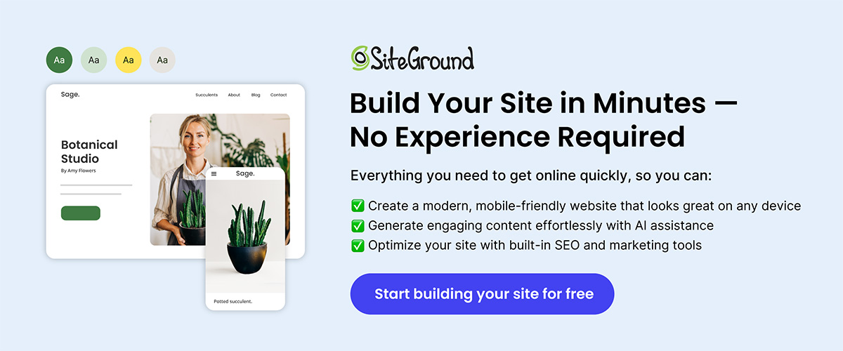
Make Mobile Design Effortless
All of this becomes a whole lot easier with the SiteGround Website Builder. It’s designed with mobile responsiveness baked in from the start — so your layouts, images, and content automatically adapt to every screen size. No extra plugins, no endless tweaking — just a professional, mobile-ready site built right from the first click.
2. Design for Context, Not Just Screen Size
Part of what contributes to the mobile user experience is context. That is, when we’re on our computers, we’re mostly at a desk, indoors, and seated. But of course this is not the case for cell phones. Mobile visitors are often multitasking, scrolling on the go, or working with limited bandwidth. Your design should adapt to their reality, not just their screen.
Best practices for adapting to mobile context:
- Simplify user flows. Reduce unnecessary steps so users can complete their customer journey quickly, even with one hand or limited attention. At the end of the day, this isn’t just good for mobile, but also for overall user experience.
- Make key actions effortless. Include mobile-friendly features like click-to-call buttons, or scroll-to-top options (like seen in the example below).

- Design for varying environments. Assume not everyone has perfect Wi-Fi—use progressive loading and compressed media to keep performance smooth.
- Prioritize legibility. Larger fonts, generous spacing, and contrast-friendly colors make reading easy in different lighting conditions.
- Adapt to intent. Mobile users might browse differently than desktop website users. For example, have you ever googled a site to confirm store hours and ended up lost somewhere in a messy mobile drop-down menu? No one wants that. So make sure local info, store hours, or fast access to services are all super easy to find.
UX Note: Mobile users are often multitasking. Anticipate their context—like quick access to store hours—and you’ll reduce friction and increase engagement.
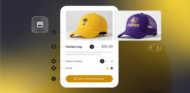
3. Make Mobile Navigation Effortless
Website navigation can make or break the mobile experience. On small screens, users don’t have the patience (or space really) for deep menus or hidden links. Every tap should move them closer to their goal—and easily.
Keep in mind that well-structured mobile navigation feels almost invisible. It’s intuitive enough that users don’t have to stop and think about how to use it.
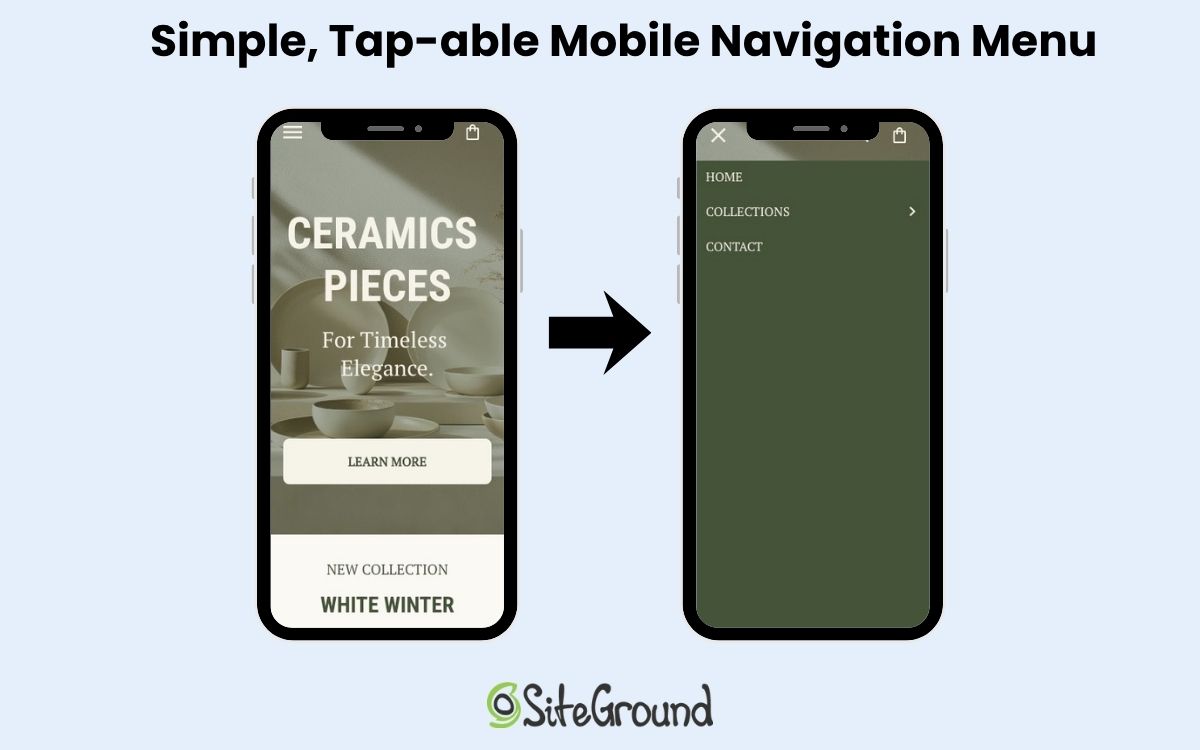
Best practices for mobile navigation:
- Keep key actions visible. Place the most important options—like “Shop,” “Contact,” or “Book Now”—where users can see and reach them immediately.
- Limit layers. Avoid burying key pages three or four levels deep. Two layers are usually the maximum before users give up.
- Use familiar icons & functionality. Hamburger menus for main navigation and other standard icons for actions help users instantly understand what to do.
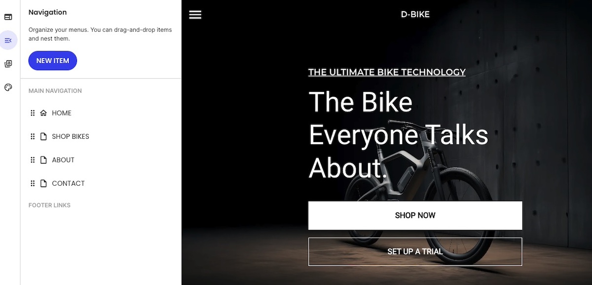
Designer’s Tip: Stick to familiar navigation patterns—hamburger menus, top-level CTAs, predictable labels. Users complete tasks faster when they don’t have to guess where to tap. This is made easy with the SiteGround Website Builder, which automatically integrates a user-friendly hamburger menu to the mobile website design.
4. Design for Touch, Not Clicks
Mobile users interact differently than those on desktop. There’s no cursor, no hover, but instead just clumsy thumbs and fingers poking around on small screens. So website design for touch means rethinking space, positioning, and how users physically interact with your site.
Here’s how to make touch interactions smooth, intuitive, and frustration-free on mobile devices:
- Increase tap targets. Buttons, links, and icons should be large enough to tap without zooming—ideally 44x44px or larger.
- Mind the spacing. Leave enough space between clickable elements so users don’t accidentally tap the wrong one, especially in lists or forms.
- Keep key actions within thumb reach. Most users hold their phones one-handed. Sometimes those phones are tiny; sometimes they’re massive. So that means you’ve got to design so essential buttons sit comfortably in the lower half of the screen.
- Avoid edge clutter. Keep important elements away from the screen edges, where gestures like swiping can accidentally interfere.

Quick Win: Add subtle tap feedback—like color changes or animations—so users instantly know their action registered. It reduces frustration and speeds up task completion.
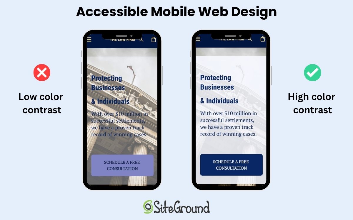
5. Ensure Accessibility from the Start
How much have you thought about accessible web design? It means making your website—whether desktop or mobile—is accessible to everyone. It not only supports inclusivity, but also improves overall usability and even SEO. So it’s worth paying attention to.
Also important to keep in mind, when accessibility is built into your design process early, you avoid costly retrofits later. Your mobile website naturally becomes clearer, faster, and easier for all users.
Best practices for implementing accessible mobile web design:
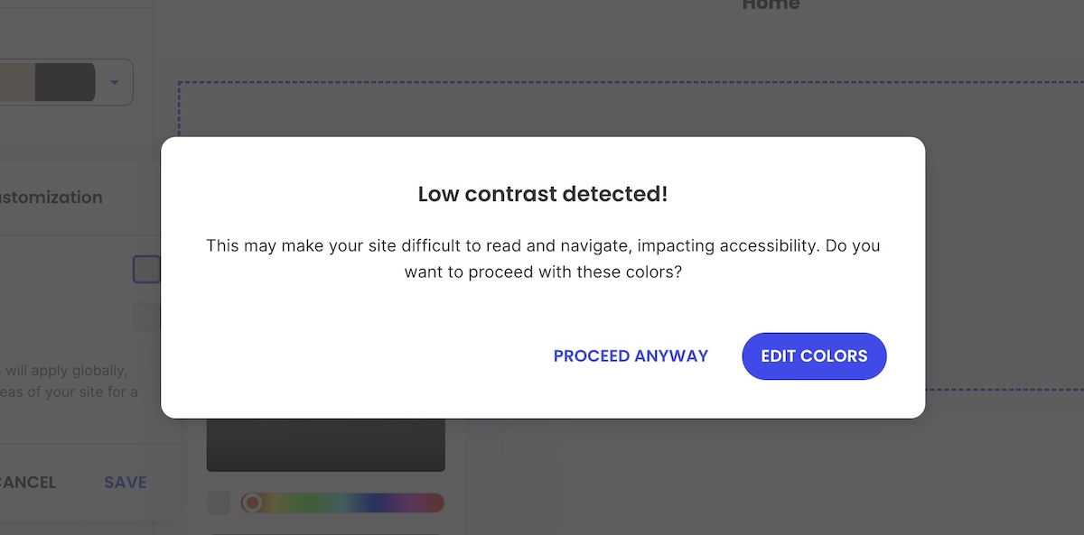
- Use sufficient color contrast. Ensure text is readable against backgrounds—especially outdoors or in bright light.
- Design with scalable text. Allow users to zoom and resize text without breaking your layout.
- Add alt text. These help screen readers interpret images and navigation accurately.
- Don’t rely on color alone. Use icons, shapes, or labels to convey meaning for users with color blindness.
- Ensure keyboard and voice navigation compatibility. Not everyone uses touch; accessibility means multiple ways to interact.
UX Note: Building accessibility from the start improves usability for everyone—and boosts SEO. Alt text, scalable text, and clear contrasts aren’t just nice—they impact rankings and engagement.
6. Prioritize Speed and Performance
Speed is the backbone of great web design—whether that’s for desktop or mobile. A crafty and creative interface won’t land well if your mobile website takes too long to load. And mobile users, who are already probably multitasking, will up and leave in seconds.
So it’s important to keep in mind that every image, animation, and line of code impacts performance. The goal is to keep things light, fast, and responsive no matter the connection.
Best practices for improving website speed and performance on mobile:
- Optimize images. Use next-gen formats like WebP and compress files without losing quality.
- Minimize code and scripts. Remove unnecessary JavaScript and CSS that slow down rendering.
- Implement lazy loading. Defer loading of off-screen images and videos until they’re needed.
- Use caching and a content delivery network (CDN). Store and deliver assets closer to the user to reduce latency.
- Avoid heavy pop-ups or animations. They might look nice on desktop but can stall or lag on mobile (and even on desktop, they can impact performance).
- Test with real mobile devices and connections. Don’t just rely on lab results—test on 4G or even 3G networks to see true performance.

Data Point: Google’s data shows that as page load times rise—especially above 1–3 seconds on mobile—the risk of a visitor leaving increases sharply. Plus, fast-loading mobile websites don’t just keep users happy—they also benefit SEO. Google favors pages that load quickly, meaning your mobile website’s speed can directly impact how high it ranks in search results.
Not quite sure how to make this happen in practice? Much of this is already handled if you’re using the SiteGround Website Builder—from image optimization to caching and fast-loading templates. And if you’re sticking with WordPress, the SiteGround Speed Optimizer plugin can help with many of the same tasks, including image compression, lazy loading, and script optimization, so your mobile site stays fast without extra manual work.
7. Test in Real-World Conditions
Even the most polished design can fall apart once it leaves the ideal lab environment. Real-world testing shows how your mobile site actually performs—in sunlight, on older mobile devices, with spotty Wi-Fi, or one-handed while juggling a coffee.
Best practices:
- Test on multiple mobile devices. Try different screen sizes, operating systems, and browsers—not just your own phone.
- Simulate weak connections. Use throttling tools or real 3G/4G networks to test load times and reliability.
- Check usability outdoors. Bright light, glare, and motion all affect readability and interaction.
- Observe real users. Watch people navigate key tasks. Where do they hesitate, zoom, or scroll too much?
- Test touch and gesture accuracy. Make sure interactive elements respond instantly and as expected.
- Review digital marketing metrics after launch. Track bounce rates, time on page, and conversion drop-offs to spot friction points.
Quick Win: Watch real users interact with your mobile website on actual devices and connections. You’ll uncover issues no lab test or emulation could predict.
Mobile Web Design That Works—Everywhere
It’s surely clear by now: mobile web design should be a top priority. But it’s not just about shrinking a perfectly tweaked desktop site—you need to treat mobile design as equally important from the start, with easy-to-use navigation, touch-friendly buttons and links, fast loading, and more.
Now, this could be a large and even costly task, but the good news is that it doesn’t have to be. The SiteGround Website Builder handles much of the heavy lifting for you. From mobile-adaptive layouts that adjust seamlessly to any screen, to automatically optimized images and fast-loading templates, it takes care of the technical details so you can focus on creating content and connecting with your audience. Responsive navigation, spacing, and tap-friendly buttons are built in by default. And if selling online is part of your plan, SiteGround Ecommerce lets you turn that same mobile-optimized experience into a fully functional store—no extra setup, plugins, or coding required.


Comments ( 0 )
Thanks! Your comment will be held for moderation and will be shortly published, if it is related to this blog article. Comments for support inquiries or issues will not be published, if you have such please report it through our official channels of communication.
Leave a comment
Thanks! Your comment will be held for moderation and will be shortly published, if it is related to this blog article. Comments for support inquiries or issues will not be published, if you have such please report it through our official channels of communication.