Mobile SEO: complete guide to optimizing for mobile-first search in 2026

Over 57% of global web traffic comes from mobile devices, and Google now uses your mobile site to determine your search engine rankings everywhere, including desktop. So if your site looks great on a laptop but falls apart on a phone, that’s a problem.
You don’t need to rebuild everything from scratch, either. Responsive design, fast load times, and content that actually works on a small screen will get you most of the way there. This guide covers the rest — from technical SEO to local search and voice — so you know exactly what to fix and in what order.
Key takeaways:
- Google ranks all pages based on your mobile website — desktop performance is no exception
- Responsive design is the only configuration worth choosing in 2026
- Mobile users scan, not read — structure your content accordingly
- Local mobile searches convert fast — 76% result in a store visit within 24 hours
- Speed is non-negotiable — 53% of visitors abandon a page that takes more than 3 seconds to load
What is mobile SEO?
Mobile SEO is the practice of optimizing websites for smartphones and tablets in order to rank higher in search engine results pages. Unlike traditional desktop SEO, which focuses primarily on desktop user experience, mobile search engine optimization requires a fundamentally different approach that prioritizes mobile user behavior, touch navigation, and the unique constraints of smaller screens.
What’s the difference between mobile SEO and traditional (desktop) SEO?
It differs from desktop SEO in three key ways: how users navigate (touch versus mouse), the conditions they’re browsing in (on the go versus seated), and how Google evaluates your site (mobile version first).
In practice, that means prioritizing fast load times, thumb-friendly design, and content that’s easy to scan on a small screen.
Google looks at your mobile site first
Let’s come back to this important point: since 2021, Google has used mobile-first indexing as its default. This is a big deal, as it means that when Google decides how to rank your pages, it bases that decision on your mobile version — for every device, including desktop.
The takeaway is simple: if your mobile site is slower, thinner, or missing content that your desktop version has, your search rankings take a hit everywhere.
AI features like Google’s AI Overviews are pushing this even further, rewarding content that’s well-structured and easy for both users and algorithms to parse.
Mobile users behave differently
Optimizing for mobile isn’t just about making things smaller. It’s about understanding that mobile visitors:
- Scan, they don’t read — walls of text get skipped
- Expect pages to load instantly — most users leave if a page takes more than 3 seconds
- Want the key information upfront — no scrolling to find what they came for
- Navigate with their thumbs — small buttons and cramped links cause frustration
Get these mobile web design concepts right, and you’re not just improving rankings, you’re turning more mobile visitors into customers.
Why is mobile SEO so important in 2026?
Because your customers are on their phones. And so is Google.
57% of global searches happen on mobile, and over 96% of internet users access the web via their phones. Mobile traffic isn’t secondary anymore; it’s where the majority of your potential customers first encounter your site.
And it’s only growing. Here’s what that means for your business:
2. Mobile commerce is taking over
59% of all global ecommerce sales now happen on mobile — and that share is still climbing. Shoppers are browsing, comparing, and buying on their phones. If your mobile experience is clunky or slow, you’re handing those sales to competitors whose sites work better.
3. Local searches lead directly to customers
76% of local mobile searches result in a store visit within 24 hours. When someone searches “near me” or “open now,” they’re ready to act. Showing up (and showing up well!) on mobile local search directly translates to foot traffic and calls.
4. Speed is non-negotiable
53% of mobile visits are abandoned if a page takes longer than 3 seconds to load. Faster networks and better phones have raised the bar; users expect near-instant load times and leave quickly when they don’t get them.
Mobile site configuration options
There are three ways to configure a site for mobile devices. And hit: one is clearly the best choice. Here’s a quick breakdown:
| Approach | How it works | Mobile SEO verdict |
| Responsive design | One site, one URL — layout adapts to screen size via CSS | ✅ Recommended |
| Dynamic serving | Same URL, but different HTML served based on device | ⚠️ Works, but complex |
| Separate mobile URLs (m.domain.com) | Entirely separate mobile site | ❌ Avoid in 2025 |
Responsive web design

Responsive web design means your site automatically adjusts its layout to fit any screen (phone, tablet, or desktop) without serving different content or URLs. The same page, styled differently depending on the device.
Google recommends it, and for good reason:
- No duplicate content issues — one URL means one set of signals
- Easier to maintain — update content once, it updates everywhere
- Better crawlability — search engines index everything in a single pass
- Consistent UX — visitors get the same experience regardless of device
Dynamic serving
Dynamic serving keeps a single URL but detects the user’s device and serves different HTML and CSS depending on whether they’re on mobile or desktop. It allows for more tailored mobile device experiences, but it comes with real trade-offs:
- Device detection can fail, especially with newer devices, leading to the wrong version being served
- Server-side caching gets more complex since multiple versions need to be stored and managed
- You need to implement the Vary: User-Agent HTTP header correctly, or search engines may not crawl both versions
It can make sense for large sites with very different mobile and desktop functionality, but for most, the added complexity isn’t worth it.
Separate mobile URLs (m.domain.com)
This approach creates an entirely separate mobile site on a subdomain like m.domain.com. It gives you full control over the mobile experience, but the downsides are significant:
- Content has to be maintained in two places, which creates risk of inconsistencies and duplicate content
- Canonical tags and redirects need to be set up carefully, or search engines get confused about which version to rank
- Any site-wide change (navigation, product pages, content updates, website structure, you name it) has to be made twice
This approach is generally not recommended in 2026. Responsive design achieves the same goals with far less overhead.
If you’re starting fresh or rebuilding, the SiteGround Website Builder makes responsive design the default — every site is mobile-ready and fast-loading from day one, no configuration needed.
Mobile SEO best practices
Effective mobile SEO requires attention to several essential optimization techniques that directly impact both search rankings and mobile user experience. These practices form the foundation of successful mobile optimization strategies.
Mobile page speed optimization
Speed isn’t just a nice-to-have on mobile devices; it’s a ranking factor. Google measures mobile performance through Core Web Vitals, with three metrics that reflect how fast and stable your page feels to real users.
Core Web Vitals: the benchmarks to hit
| Metric | What it measures | Target |
| LCP (Largest Contentful Paint) | How fast your main content loads | Under 2.5 seconds |
| INP (Interaction to Next Paint) | How quickly the page responds to input | Under 200 milliseconds |
| CLS (Cumulative Layout Shift) | How much the layout shifts while loading | Below 0.1 |
Miss these thresholds and it can directly hurt your mobile rankings.
Images: the biggest speed win
Images are usually the heaviest assets on a page and the easiest place to make a big impact.
- Convert to WebP — reduces file size by 25–35% vs. JPEG with no visible quality loss
- Size images correctly before uploading — hero images at 800–1,200px wide, in-content images at 400–800px
- Use srcset and sizes so browsers automatically serve the right size for each screen
- Use lazy loading for images below the fold — but not above it, as this is one of the main causes of CLS issues
If you’re comfortable editing your site’s HTML, here’s what a properly implemented srcset looks like:
<img
src=”image-800.webp”
srcset=”image-400.webp 400w, image-800.webp 800w, image-1200.webp 1200w”
sizes=”(max-width: 600px) 400px, (max-width: 1200px) 800px, 1200px”
alt=”Example image”>
JavaScript and CSS
Bloated code slows down mobile pages, especially on weaker connections. The key actions:
- Minify your JS and CSS files
- Remove unused CSS
- Inline critical CSS for above-the-fold content so it renders immediately
- Reduce HTTP requests and enable browser caching
If your site runs on WordPress, our Speed Optimizer plugin handles all of this automatically — no manual configuration needed.
If you’d rather not think about any of this, the SiteGround Website Builder takes care of it for you by default — fast-loading pages, optimized images, and clean code, all without touching a single setting.
Mobile-friendly content design
Getting people to your page is only half the battle. If your content is hard to read or navigate on a small screen, they’ll leave. Here’s what to get right:
Text and typography
- Minimum font size: 16px — anything smaller and iOS will auto-zoom, which breaks your layout and frustrates users
- Keep paragraphs short — mobile users scan, they don’t read top to bottom
- Use clear heading hierarchies (H2s, H3s) to break up content and help users jump to what they need
Tap targets
- Buttons and clickable elements should be at least 48×48 pixels
- Leave enough space between links and buttons — cramped tap targets lead to accidental clicks and a poor experience, especially for users with larger fingers
Content structure
- Lead with the most important information — don’t make users scroll to find what they came for
- Use bullet points, numbered lists, and subheadings to make content easy to scan
- Prioritize your key calls to action above the fold
Pop-ups and ads
Avoid anything that blocks the main content on mobile devices. Google actively penalizes pages where pop-ups or interstitials make content hard to access right after arriving from search. If you use them, they must be easy to dismiss and must not cover the main content.
Pro tip: Mobile-friendly design and accessible web design overlap more than you’d think. Minimum font sizes, sufficient color contrast, clear heading structure, and tap targets large enough for a thumb are also the foundations of an accessible site — one that works for users with visual impairments, motor difficulties, or cognitive differences. Getting these right doesn’t just help your mobile SEO; it makes your site usable for everyone, which should be an important part of your SEO strategy.
Technical mobile SEO elements
The next few elements are more technical in nature — they involve code, configuration files, and markup that lives behind the scenes. If you’re using the SiteGround Website Builder, a lot of this is already taken care of for you, so feel free to skip ahead to the next section. If you’re managing your own site, want to improve WordPress SEO, or are working with a developer, here’s what to check.
Viewport meta tag
The viewport tag tells mobile browsers how to scale and display your page. Without it, browsers default to a desktop layout — tiny text, horizontal scrolling, broken design.
If you’re using the SiteGround Website Builder or a top WordPress theme like Astra, this is already handled for you — no code needed. If you’re using a custom or lesser-known WordPress theme, it’s worth double-checking that the tag is present in your header.php file.
For everyone else, make sure this is included in your <head>:
<meta name=”viewport” content=”width=device-width, initial-scale=1″>
Common mistakes to avoid:
- Fixed-width values (e.g. width=1024) — forces a desktop layout on mobile device screens
- Omitting initial-scale=1 — causes inconsistent zoom levels across devices
- user-scalable=no or maximum-scale=1 — prevents users from zooming, which is an accessibility issue and can hurt rankings
Structured data
On mobile search, rich results (star ratings, FAQ dropdowns, price info) take up more screen space than on desktop. That makes structured data one of the highest-leverage technical wins for mobile visibility and click-through rates.
You can use schema types that match your page’s intent:
- FAQPage — for blog posts, service pages, support content
- LocalBusiness — for “near me” searches
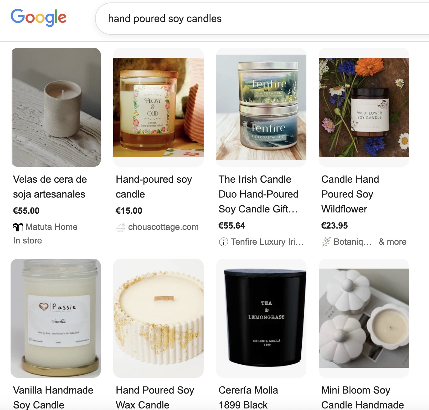
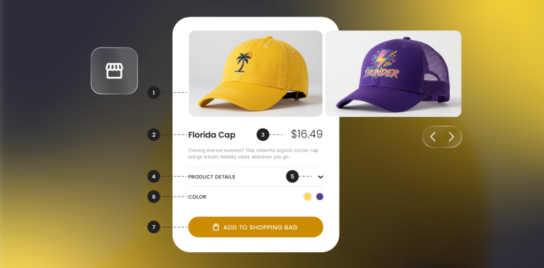
- Product — for ecommerce and transactional pages (which helps Google surface your products as seen below)
Google’s preferred format is JSON-LD. Here’s a simple FAQ example:
{
“@context”: “https://schema.org”,
“@type”: “FAQPage”,
“mainEntity”: [{
“@type”: “Question”,
“name”: “How does mobile SEO improve rankings?”,
“acceptedAnswer”: {
“@type”: “Answer”,
“text”: “Mobile SEO helps your site rank higher on smartphones and tablets by optimizing load speed, user experience, and mobile-first indexing readiness.”
}
}]
}
Pro tip: Always validate your markup with Google’s Rich Results Test or Schema.org’s Validator before publishing. You can find the full list of supported schema types here.
Sitemaps
A sitemap helps search engines discover and index every important page on your site — especially useful for large or newly launched sites. Submit yours through Google Search Console to make sure your mobile content gets crawled efficiently.
Robots.txt
Your robots.txt file controls what search engines can and can’t crawl. On mobile, the most common mistake is accidentally blocking files that are needed to render your pages — CSS, JavaScript, fonts, and images.
If Google’s Smartphone crawler can’t access these, it can’t see how your page actually looks on mobile devices, which leads to usability errors and ranking drops.
Pro tip: If you’re using a JS-heavy framework like React, Angular, or Vue, make sure your JavaScript is fully crawlable. Use Google Search Console’s URL Inspection tool or run a Lighthouse test to confirm your dynamic content renders correctly for Googlebot.
As mentioned before, if this all feels like a wee bit more than you even want to think about, then don’t worry. The SiteGround Website Builder automatically implements viewport meta tags, structured data for product pages, submits your sitemap for you, and generates a robots.txt file. So let’s move right along without a worry.
Mobile user experience optimization
Good mobile SEO isn’t just about technical settings; it’s about making your site genuinely easy to use on a small screen. These are the areas that matter most.
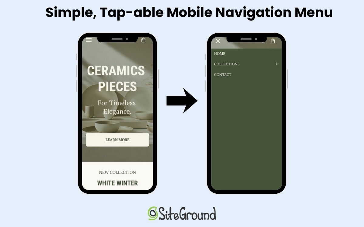
Navigation
Most mobile users navigate with their thumbs, so the easier your navigation is to reach and use, the better.
- Keep website navigation simple and shallow — the fewer taps to get somewhere, the better
- Make sure your menu button is clearly visible and easy to tap
- Avoid burying important links in dropdowns or secondary menus
Forms
Every extra field on a mobile device form is friction. Keep them as short as possible, and make the experience as effortless as you can:
- Only ask for what you actually need
- Use the right keyboard for each field (numeric for phone numbers, email keyboard for email fields)
- Make the submit button large, clearly labeled, and easy to tap
Visual hierarchy
Mobile device screens have limited space, so what you put above the fold matters a lot. Lead with your most important content and calls to action, and resist the urge to cram too much onto the screen at once. A focused page with a thoughtful visual hierarchy converts better than a busy one.
Button and link spacing
Tightly packed links and buttons lead to accidental taps and frustration. Make sure clickable elements have enough breathing room between them — this ties back to the 48x48px tap target minimum covered earlier in the content design section.

Local SEO for mobile users
Mobile local searches have high commercial intent. That is, someone searching “locksmith open now” or “coffee shop near me” is ready to act. That’s why local SEO is so very important. Here’s how to make sure your business shows up when it counts.
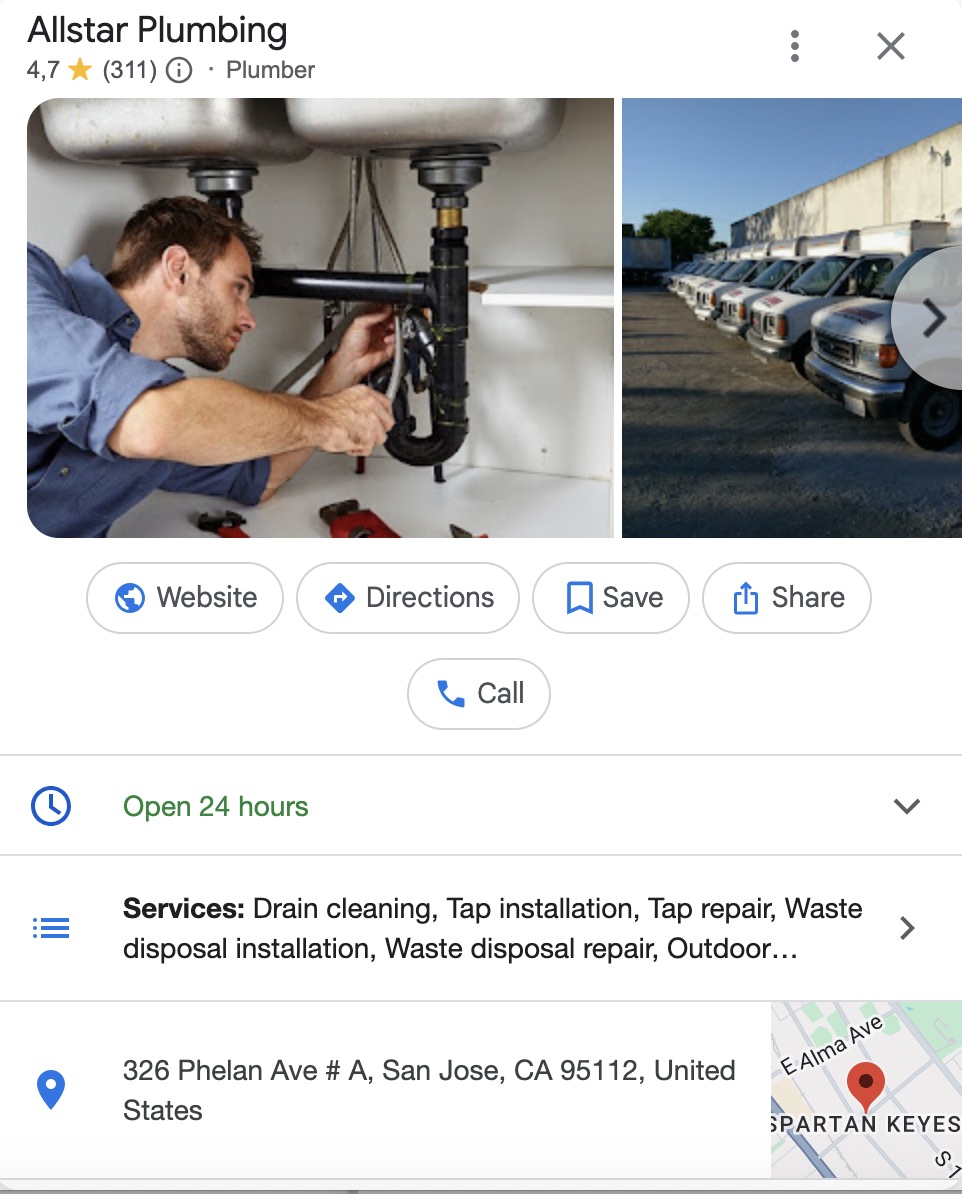
Google Business Profile
Your Google Business Profile (GBP) is often the first thing a mobile user sees before ever visiting your site. Keep it complete and accurate:
- Correct business hours (including holidays)
- Up-to-date phone number and address
- High-quality photos of your location, products, or team
An incomplete profile loses customers to competitors who’ve put in the work.
NAP consistency
Your Name, Address, and Phone number must be identical across your website, GBP, and any other directory listings. Inconsistencies confuse both search engines and users — and can quietly drag down your local rankings.
“Near me” keyword optimization
Mobile users search with location in mind, even when they don’t type a city name. Capture that intent by weaving local phrases naturally into:
- Page titles — “Plumber in [city] | 24/7 Emergency Plumbing Services”
- Meta descriptions — “Fast, affordable plumbing in [city]. Book a same-day visit from certified professionals near you.”
- H1 headings — “Plumbing Services in [city] and Nearby Areas”
- Body content — mention your location and service area naturally throughout the page
If you serve multiple locations, create a dedicated landing page for each area, and don’t try to rank one page for everywhere.
Pro tip: Add this to your SEO checklist: Search for your own business on mobile using terms like “near me,” “open now,” or your service + city. Verify whether you appear in the map pack, organic mobile search results, and AI snapshots. If you’re missing from any of them, it’s a signal that your GBP, local schema, or on-page content needs attention.
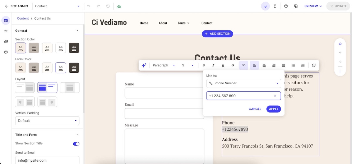
Click-to-call and click-to-directions
Make it as easy as possible for mobile users to take the next step. A tap-to-call button and a direct link to Google Maps directions remove friction at the exact moment someone is ready to reach out or visit. That directly impacts calls, walk-ins, and conversions.
Voice search and mobile SEO
Optimizing for conversational queries requires targeting question-based keywords that match how people naturally speak when using voice search. Voice searches tend to be longer and more conversational than typed queries, requiring content that answers specific questions in natural language.
What to do to optimize for voice search:
- Focus on featured snippet optimization
- Add structured data
- Cover long-tail keywords
Featured snippet optimization helps capture voice search results since many voice assistants read featured snippet content as answers to voice queries. Structuring content to directly answer common questions and using proper heading tags increases the likelihood of earning featured snippets.
Structured data markup (which we covered above) provides search engines with structured information about common questions and answers, improving the chances of appearing in voice search results. This markup format aligns well with the question-and-answer nature of many voice queries.
Long-tail keyword targeting for natural language queries helps capture the more conversational style of voice searches. These keywords often have lower competition and higher intent, making them valuable for both voice search optimization and general mobile SEO strategy.
Mobile SEO testing and monitoring
Once your mobile optimizations are in place, these four tools will help you track performance and catch issues before they affect rankings.
| Tool | What it’s for |
| Google Search Console | Flags mobile usability issues — text too small, tap targets too close, content wider than the screen |
| Google PageSpeed Insights | Measures Core Web Vitals with real user data and gives specific recommendations to improve them |
| Chrome DevTools | Simulates different mobile devices during development so you can spot responsive design issues without a physical device |
| Google Analytics 4 | Tracks how mobile users behave on your site — conversion rates, bounce rates, and how their patterns differ from desktop users |
Check Search Console and PageSpeed Insights regularly, not just when something breaks. Catching a usability issue early is far easier than recovering lost rankings after the fact.
The future of mobile SEO in 2026
Mobile SEO is changing fast. AI Overviews, voice results, and smarter ranking signals are all reshaping what it means to show up on mobile devices. But the sites that benefit most aren’t doing anything exotic. They’re quick, easy to use, and built around what their visitors actually need.
The SiteGround Website Builder gets you there by default — responsive design, fast-loading pages, and all the technical groundwork handled for you, so you can focus on your business instead of your code. And if you’re selling online, the built-in SiteGround Ecommerce tools are optimized for mobile too, so your store works as well on a phone as it does anywhere else.
Mobile SEO FAQs
The four main types of SEO are on-page SEO, off-page SEO, technical SEO, and local SEO. On-page SEO focuses on optimizing content and elements on your website, like keywords and headings. Off-page SEO builds your site’s authority through backlinks and external signals. Technical SEO ensures your site is fast, crawlable, and easy for search engines to index. Local SEO helps your business appear in location-based searches, using tools like your Google Business Profile and local listings.
Mobile-first indexing means search engines like Google use the mobile version of your content for indexing and ranking, rather than the desktop version.
Responsive design means your website automatically adjusts its layout and content to fit different screen sizes, providing a consistent experience across devices.
Yes, page speed is a key ranking factor. Slow-loading pages lead to higher bounce rates and lower rankings, especially on mobile connections.


Comments ( 0 )
Thanks! Your comment will be held for moderation and will be shortly published, if it is related to this blog article. Comments for support inquiries or issues will not be published, if you have such please report it through our official channels of communication.
Leave a comment
Thanks! Your comment will be held for moderation and will be shortly published, if it is related to this blog article. Comments for support inquiries or issues will not be published, if you have such please report it through our official channels of communication.