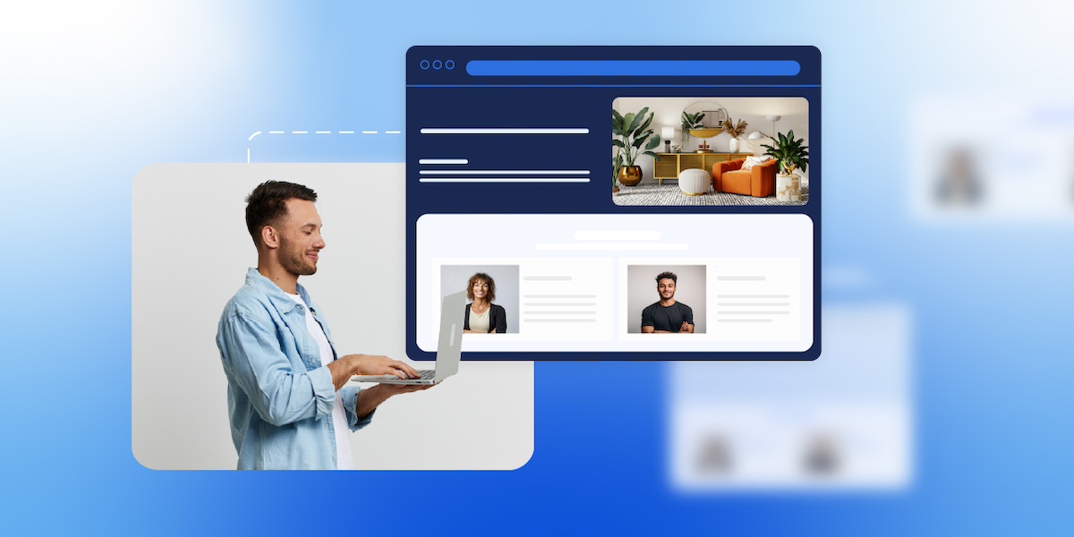
Crafting a just-right homepage can feel a bit like trying to catch lightning in a bottle. It needs to look great, clearly communicate your message, and guide visitors exactly where you want them—all without overwhelming or confusing anyone. No small task. Luckily, you don’t have to reinvent the wheel. By studying homepage examples from a variety of businesses and goals, you can uncover design tricks, ideas, messaging strategies, and calls to action that really work.
In this article, we’ll walk you through some of the best homepage examples, organized by business type and purpose, so you can see what successful sites are doing right. Whether you’re aiming to generate leads, up your ecommerce sales, or showcase a personal brand, these examples will generate inspiration and help clarify your own homepage goals. Plus, we’ll highlight key takeaways for you to keep in mind as you design a homepage that’s not just beautiful, but that gets the job done.
Best Website Homepage Examples
Let’s jump right in and look at the best homepage examples, which are organized by business type and primary goal, such as selling a product, booking a service, or generating leads.
As you plan your website, these examples can help you better understand the purpose of your own homepage and how to shape your design, messaging, and calls to action accordingly.
Homepage Examples for Lead Generation
When focusing on lead generation, it helps to study how other homepages guide visitors toward action. Via these examples, you can see how clear messaging, strategic layout, and strong calls to action capture leads and move them along and nurture leads effectively.
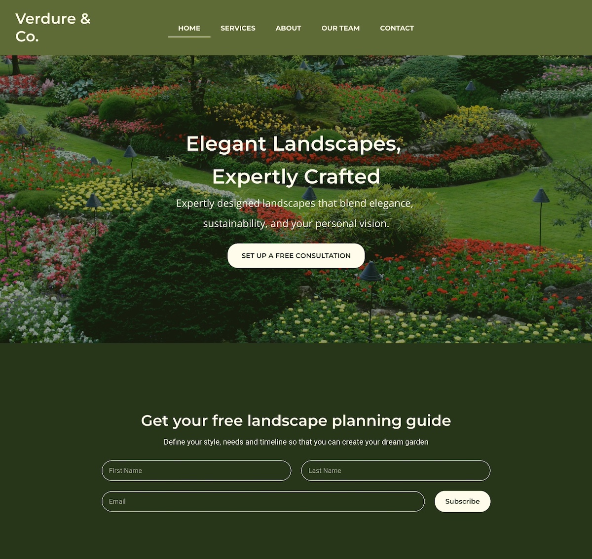
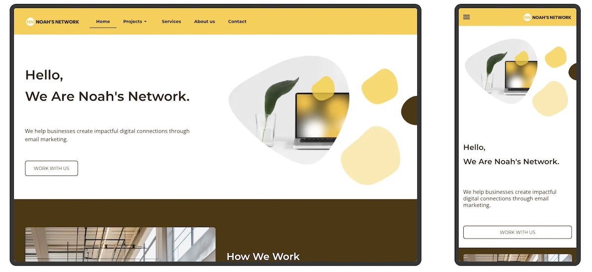
1. Notice that the homepage example below captures attention with an eye-catching photo that highlights their core message: expertly crafted landscapes. Worth noting, they prioritize email lead generation by offering a free planning guide right upfront. This approach allows them to attract interested leads and nurture them through strategic email marketing.
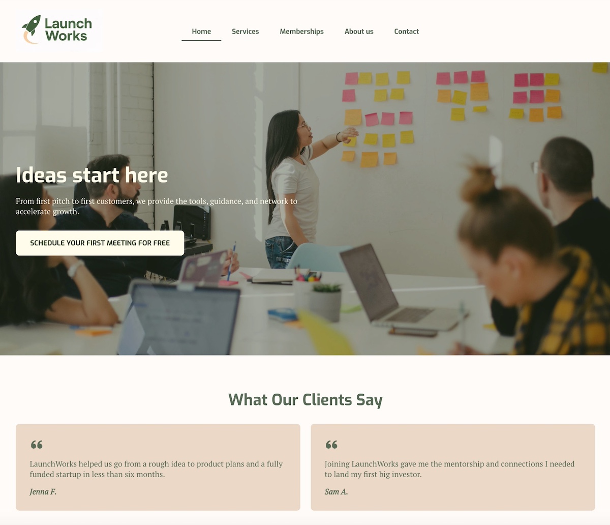
2. The below homepage stands out with a bold headline and subtitle that prominently highlight the business’s value and benefits. A clear call to action—which is action-based but also spotlights value (it’s free!)—is to the point and super effective. Then they follow their hero section with strong social proof via unmissable testimonials, adding credibility to their offerings.
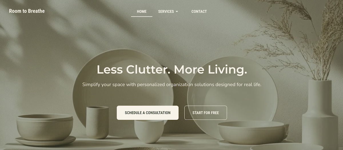
3. The homepage below uses clear, compelling calls to action (CTAs) targeted at different stages of the buyer journey. Visitors who are ready to make a decision can request a consultation, while those just beginning to explore can get started for free. By including these CTAs, they implement an effective lead generation tactic: to collect emails so the conversation can continue.
Pro tip: For all of these lead-generating homepage examples, it’s smart to segment leads based on which CTA they click. For instance, leads who choose “Schedule a consultation” can go into one list, while those who click “Start for free” go into another. This way, you can tailor your messaging more precisely based on where each lead is in the customer journey.
Want to make segmentation simple? SiteGround’s built-in Email Marketing tool makes it easy to create targeted lists, send personalized emails, and track performance—all from your SiteGround dashboard. It’s a powerful way to nurture leads with the right message at the right time.
Homepage Examples for Ecommerce Stores
Ecommerce homepages have a unique challenge: they need to showcase products, communicate value, and drive purchases—all in just a few seconds. The best examples strike a balance between eye-catching design, clear product presentation, and strategic calls to action that guide visitors toward buying or exploring more. Let’s take a look at a couple of homepages that do this especially well.
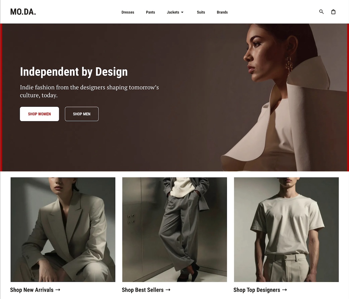
4. This site offers clear pathways to help customers find exactly what they’re looking for—whether it’s men’s or women’s items, new arrivals, or best sellers. The navigation menu, header, and just below the hero section offer many ways for site visitors to find just the right next step.
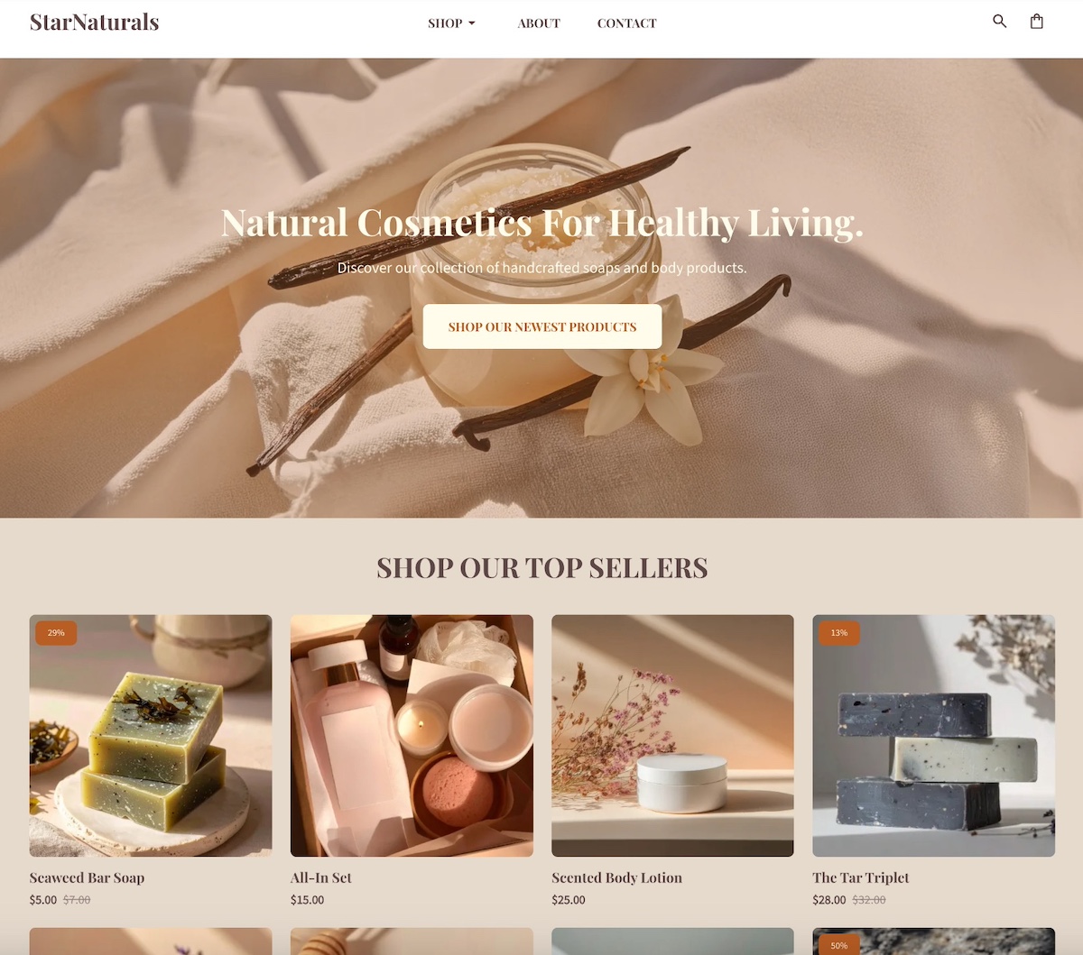
5. This site keeps it simple and effective with a single compelling image and a clear and prominent call to action. More specific product links are neatly organized in the navigation menu under “shop” for easy browsing. Plus, in the post-hero section, they include a gallery of top products for instant ideas and shopping.
Homepage Examples for Personal Websites & Portfolios
Personal websites and portfolios should showcase your unique brand and voice. These examples demonstrate how clear messaging, distinct copy, and striking visuals can appeal to visitors while also highlighting your work and personality.
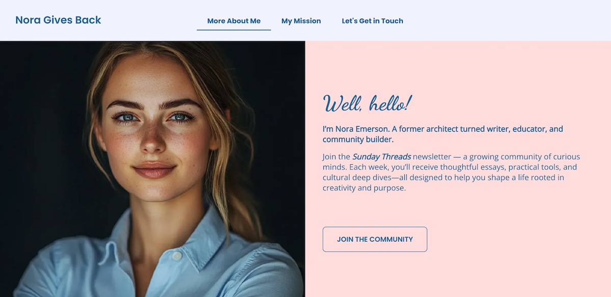
6. You’ll notice that personal webpages often take a slightly different approach. Impressive above-the-fold messaging and imagery is still important, but they’re focused more on personal photos and bios. You’ll notice this on the homepage below, which features a friendly photo and heartfelt introduction that invites you to join her community and newsletter. The story and personal appeal make it hard not to want to “join the community.”
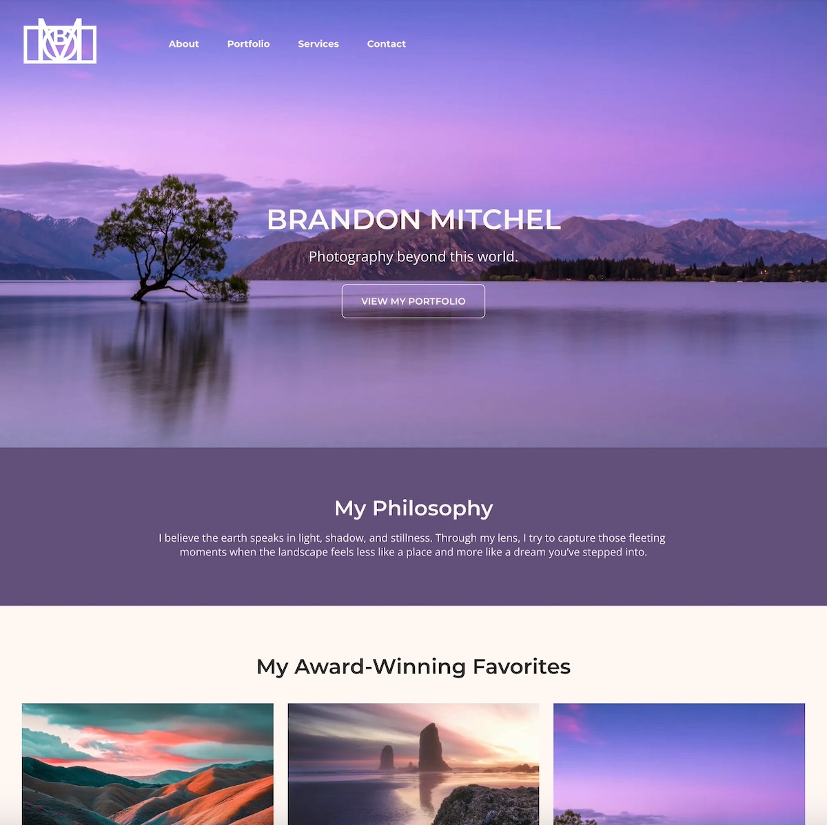
7. The below homepage example instantly pulls you in with its evocative hero image. It’s simple, captivating, and in just a few brief words captures what this site is all about: the ethereal photography. Below that, the photographer strengthens the message by sharing their personal philosophy, followed by a portfolio of imagery. The overall result is a quick and compelling sense of what drives this person’s work, and what they have to offer.
Homepage Examples for Service-Based Businesses
For service-based businesses, a homepage should quickly communicate value and build trust. The examples below highlight how strong messaging, service benefits, social proof, and appealing design can guide visitors to take action.
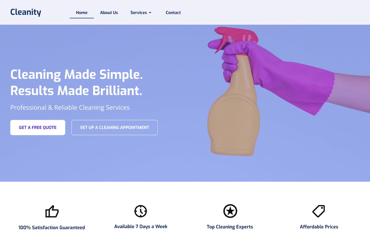
8. This homepage example stands out with a color-popping hero image and short-but-sweet headline that clearly communicate what the company does. And taking the next step is simple no matter where you are in the customer journey—you can either get a free quote, or jump right in and schedule. Below the hero section, they highlight key features that make their business worth using, helping visitors understand the brand’s true value.
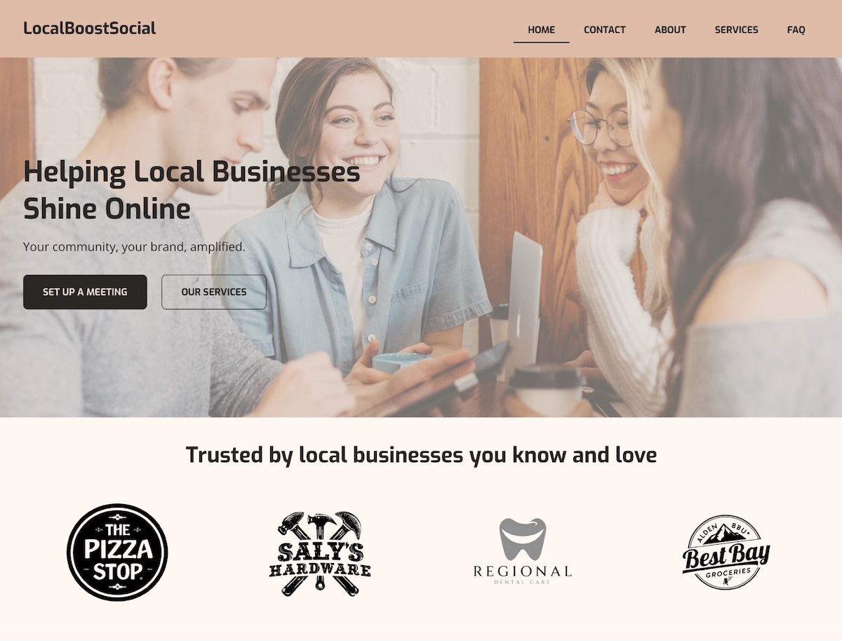
9. This homepage example opens with a friendly photo, intentional brand colors, a clear headline, and strong calls to action. Notably, because they focus on serving local businesses, the section below the header features client logos. This leverages the credibility and recognition of those businesses while strengthening their own brand—a form of social proof that’s especially powerful in a local community.
Key Takeaways and Best Practices from Top Homepage Examples
Hopefully you’ve gravitated toward some of these examples and discovered a few features you’d like to include in your homepage. As you give shape to your homepage design, here are some important takeaways you want to keep in mind from our examples.
Clear Purpose and Goal
Every great homepage starts with a clear objective. Whether it’s selling a product, collecting leads, or building credibility, your homepage should make its purpose obvious within seconds. Visitors should instantly understand what your business does and what action they’re expected to take.
Strong Above-the-Fold Content
The content users see before they scroll is crucial. Use this space to grab attention with a concise headline, value proposition, and a clear CTA. As you can see in the above examples, a compelling hero image can reinforce your message and draw users in.
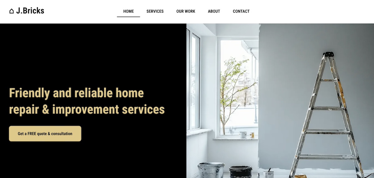
When it comes to effective above-the-fold design, the website below wins. It’s extremely basic and totally gets to the point with a straight forward value proposition, and a specific and enticing call to action.
Pro tip: many of these same techniques also form part of landing page best practices. It’s all about really nailing your hero section, value proposition, and CTAs.
Intuitive Design and Navigation
An important way to lower your bounce rate and keep users engaged is by creating a well-structured homepage that uses visual hierarchy to guide the eye and make content easy to scan. Keep navigation simple and predictable. Use clear headings, consistent spacing, and logical flow to help visitors find what they need quickly.
Clear and Compelling CTAs
Calls to action should stand out visually and align with your page’s goal. Use action-oriented language (“Get Started,” “Book a Demo,” “Shop Now”) and place CTAs strategically throughout the page to guide users toward conversion.
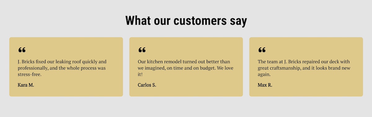
Trust Signals
Build credibility with testimonials, reviews, partner logos, certifications, or guarantees. Even a simple “As seen in” bar or customer quote can go a long way in making new visitors feel confident in your brand.
Fast Loading
Page speed directly affects user experience and conversion rates. Optimize images, use clean code, and choose a reliable hosting provider to ensure your homepage loads quickly across all devices.
One of the easiest ways to improve page speed? Start with high-performance hosting. SiteGround’s infrastructure is built for speed, security, and reliability—plus, if you’re starting from scratch, the built-in SiteGround Website Builder makes it simple to design a sleek, homepage without sacrificing performance.
Consistent Branding
Your homepage should reflect your brand’s identity—visually and verbally. Use consistent colors, fonts, tone of voice, and imagery to create a cohesive experience that feels trustworthy and professional.
Optimized for Mobile
With more users browsing on mobile devices, a responsive, mobile-friendly design isn’t optional. Make sure buttons are easy to tap, text is readable, and content stacks well on smaller screens without losing functionality.
With the SiteGround Website Builder, for example, we do this for you automatically. All websites are automatically optimized for mobile so that they not only look good, but work well.
Benefits of Drawing Inspiration from Homepage Examples
As you explore these homepage examples, it helps to understand why drawing inspiration from them can be so valuable. Here’s what to look for and what to keep in mind as you take notes for your own site:
- Clarify Your Page’s Purpose: Seeing how other websites define their goals—whether it’s driving sales, capturing leads, or sharing information—can help you pinpoint the main objective of your own homepage.
- Understand Best Practices: Homepage examples reveal how successful sites organize content, guide visitors, and encourage action—giving you a clearer sense of what works.
- Inspire Creative Ideas: A range of visual styles, messaging tones, and layouts can inspire you to find a look and feel that matches your brand identity.
- Save Time: Examples give you a starting point, helping you avoid design paralysis and focus your efforts more efficiently.
- Enhance User Experience: Learning from great design helps you create a homepage that’s intuitive, welcoming, and conversion-friendly.
- Define Your Website Layout: Different businesses require different website layouts. Understanding all of the above will help you determine what works best for your own webpage and to achieve your specific goals.
From Homepage Examples to Action: Start Designing with Purpose
By now, you’ve seen just how much a great homepage can do—build trust, guide visitors, and drive real results. The best homepages aren’t the flashiest; they’re the clearest, most purposeful, and easiest to navigate. Whether your goal is to generate leads, make sales, or simply show off your work, let these examples be your creative fuel. Take what works, leave what doesn’t, and start shaping a homepage that feels like you—and gets the job done.
Not sure where to start? The SiteGround Website Builder makes it surprisingly easy to bring your homepage vision to life. With beautiful templates, design simplicity, and built-in speed and mobile optimization, it’s the shortcut to a professional-looking site—without the usual headaches.


Comments ( 0 )
Thanks! Your comment will be held for moderation and will be shortly published, if it is related to this blog article. Comments for support inquiries or issues will not be published, if you have such please report it through our official channels of communication.
Leave a comment
Thanks! Your comment will be held for moderation and will be shortly published, if it is related to this blog article. Comments for support inquiries or issues will not be published, if you have such please report it through our official channels of communication.