Ecommerce website design ideas that convert browsers into buyers
High-converting ecommerce website design isn’t about how impressive your store looks, but rather about how easily shoppers can move from browsing to buying. The most effective sites reduce friction, guide attention, and build trust at every step, from the homepage to checkout.
This guide breaks down practical ecommerce website design ideas that actually drive sales, with clear examples across your homepage, navigation, product pages, and checkout, so you can see what to change and why it works.
Key takeaways:
- Conversion beats aesthetics – High-performing ecommerce websites prioritize clarity, speed, and usability over looking fancy or flashy.
- Reduce friction and build trust – Streamline navigation, speed up load times, and use social proof early to keep visitors engaged.
- Homepage clarity matters – Use a clear hero section, prominent categories, and Z-pattern layouts to direct attention and simplify decisions.
- Product pages close the deal – Show multiple product angles, highlight prices and promotions early, use real scarcity, and make CTAs impossible to miss.
- Checkout should be frictionless – Enable guest checkout, remove distractions, and keep CTAs sticky on mobile to reduce abandonment.
- Design for mobile first – Prioritize thumb-friendly layouts, legible product grids, and large tap targets to boost mobile conversions.
What makes good ecommerce website design?
Good ecommerce website design is about making it easy for shoppers to find what they want, trust what they see, and buy without hesitation. In fact, some of the highest-performing ecommerce sites (take Amazon, for example), prioritize usability over visual polish, focusing on clarity, speed, and frictionless purchasing rather than all the fancy aesthetics.
Three principles underpin almost every design decision that actually makes a difference:
1. Shoppers scan, they don’t read. Your visitors are not sitting down with a cup of tea to carefully read your homepage (if only!). They’re skimming. Their eyes jump to images, prices, buttons, and bold text. This is why visual hierarchy matters — your layout needs to guide the eye to the right information in the right order, because if shoppers have to hunt for it, most won’t bother.
2. Friction kills conversions. Every extra click, every unnecessary form field, every moment of confusion is a small reason to leave. The best ecommerce designs don’t just look good; they remove obstacles. The path from “I want this” to “I bought this” should be as short and smooth as possible.
3. Trust is earned in seconds. A shopper who lands on your store for the first time knows nothing about you. Within a few seconds, your ecommerce website design is already communicating whether you’re credible or not. Consistent branding, professional imagery, reviews, and clean layouts all reinforce credibility before a single word of copy is read — and it all starts the moment your page loads.
These principles sit at the heart of effective ecommerce website design, no matter what products you sell. They’re the lens through which every good design decision is made.
Why site speed is a design decision
Fast performance is a core part of ecommerce website design, not just a technical detail. A Deloitte and Google study found that a 0.1 second improvement in load time leads to an 8.4% increase in ecommerce conversions. Slow pages don’t just frustrate visitors; they signal an unprofessional experience before your design has had a chance to make an impression.
SiteGround Ecommerce is built with speed baked in, so your store loads fast for every visitor without you needing to do anything extra. Faster pages, better first impressions, more sales.
Take the Quiz: Discover Your Ideal Website Builder Quickly identify which builder type is right for your goals, skills, and long-term plans.
Google reCAPTCHA used. Privacy Policy and Terms of Service apply
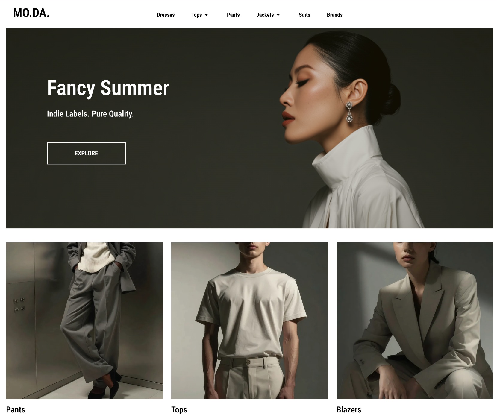
Homepage design ideas
Your homepage design is often the first impression of your ecommerce website design. Here’s how to make it count.
Let the Z-pattern guide your hero design
The hero section is the large visual area at the very top of your homepage — the first thing visitors see when they land on your page. It’s your most valuable real estate.
Most shoppers won’t scroll far. Engagement drops sharply once visitors move below the fold (the point where they have to start scrolling), which means content lower down the page is content many shoppers simply won’t see. So your hero needs to do real work: communicate what you sell online, why it’s worth buying, and what to do next.
There’s no single correct layout, but the Z-pattern, as shown in the homepage example below, is a reliable starting point. On visually led pages, the eye travels in a Z shape (across the top, diagonally down, then across the bottom) so placing your CTA along that path means it lands exactly where attention naturally goes.
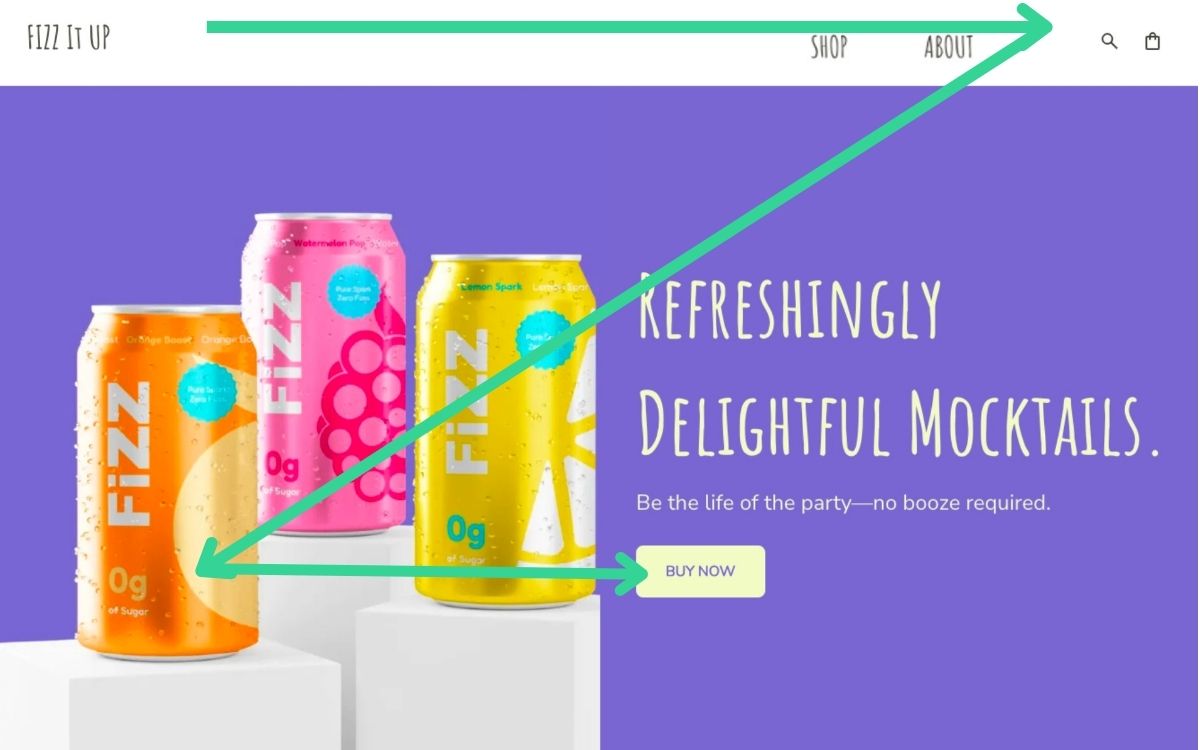
Centered hero layouts and split-screen image-and-text formats work well too. The principle is the same either way: give the eye a clear path and make the next step obvious.
The idea: A single, high-quality hero image paired with a one-line unique selling proposition and one primary CTA button. Resist the urge to add multiple competing links or banners. One clear next step always outperforms three vague ones.
Why it works: You’re meeting the scanner where they are. A clean hero with a clear CTA gives the eye a path to follow, and a decision that’s easy to make.
Let social proof do the selling
Small businesses often put social proof, such as reviews, at the bottom of the homepage, in the footer, or on a dedicated testimonials page. This is a missed opportunity. Trust signals work hardest when they appear at the moment a visitor is deciding whether to stay or go, which is near the top of the page, not the bottom.
The idea: Add a simple social proof strip near your hero. This could be a star rating with a review count (“4.8 stars from 1,200 customers”), a row of press logos, or a short pull quote from a real customer. On product pages, display star ratings and review counts prominently near the price, before the description.

Why it works: Trust signals placed near your primary CTA reduce hesitation at exactly the right moment. A visitor who sees strong social proof before they’ve scrolled anywhere is far more likely to keep exploring, and a shopper who sees reviews next to the price is far more likely to buy.
Make your categories instantly obvious
If you sell more than one type of product, your homepage needs to help visitors self-select quickly. A shopper looking for a specific category shouldn’t have to dig through your navigation just to shop online for what they need.
The idea: Feature three to four category tiles prominently on the homepage, with clear labels and strong images. They should either be visible without scrolling, or immediately below the hero at most.
Why it works: This is about cognitive load: the mental effort required to make a decision. The more a visitor has to think about where to go next, the more likely they are to give up and leave. Clear categories remove that friction and route shoppers toward what they actually want.
Online store structure and navigation design ideas
Good ecommerce website navigation is the backbone of a store that converts. It’s how shoppers move from curiosity to purchase, and when it’s unclear, confusing, or cluttered, they leave. Your website structure should make the ecommerce journey effortless so that site visitors can find what they’re looking for, orient themselves at any point, and take the next step without having to think too hard.
Keep your navigation simple and honest
The temptation with ecommerce navigation is to show everything upfront. More categories means more products visible, right? In practice, the opposite is true. Too many options in your top navigation creates decision fatigue. Shoppers freeze, scan without clicking, and bounce.
The idea: Limit your main website navigation to your most important categories — typically five to seven at most. If your catalog is large, use a clean dropdown rather than a sprawling mega menu. If it’s small, a simple flat nav works best. Every navigation item should describe exactly what’s behind it; clever labels might feel on-brand but they slow people down.
Why it works: Clear, simple navigation reduces the mental effort required to explore your ecommerce store. Shoppers who can orient themselves quickly are far more likely to keep browsing, and far more likely to buy.
Make search visible for larger catalogues
For stores with more than a few dozen products, search is often the fastest path to purchase. A shopper who knows what they want shouldn’t have to browse through category pages to find it, but if your search bar is hidden, small, or hard to find, they won’t use it.
The idea: Place your search bar prominently in the header, visible on every website page. On mobile, use a recognizable magnifying glass icon that expands into a full search field on tap.
Why it works: Shoppers who use site search have already told you what they want: they’re further along in the buying process and far more likely to purchase. According to an eConsultancy study, site search users converted at 4.63% compared to the site average of 2.77%. Making search easy to find captures that high-intent behavior before it turns into frustration.
Use breadcrumbs to keep shoppers oriented
Breadcrumbs are the small navigation trail that shows a shopper where they are in your online store (for example, Store > Bath & Body > Honey Body Scrub, as seen below). They’re easy to overlook in the ecommerce website design process, but they play an important role in keeping visitors oriented, especially those who land directly on a product from a search engine.
The idea: Add breadcrumb navigation to all category and product pages. Keep them simple, clickable, and positioned above the product.
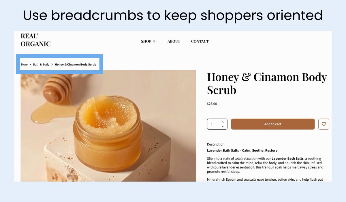
Why it works: Shoppers who feel lost in a store leave. Breadcrumbs give them a clear sense of where they are and an easy way to step back without hitting the browser’s back button, reducing bounce and encouraging further exploration.
Shorten the path to purchase
Every click between a visitor landing on your online store and completing a purchase is an opportunity to lose them. A well-structured ecommerce website gets shoppers from discovery to checkout in as few steps as possible.
The idea: Audit your click depth — how many clicks does it take to get from your homepage to a completed purchase? Three to four is a reasonable target. If your catalog structure requires more than that, look at where you can create shortcuts: featured products on the homepage, direct category links in the navigation, and prominent CTAs on category pages that bypass unnecessary browsing steps.
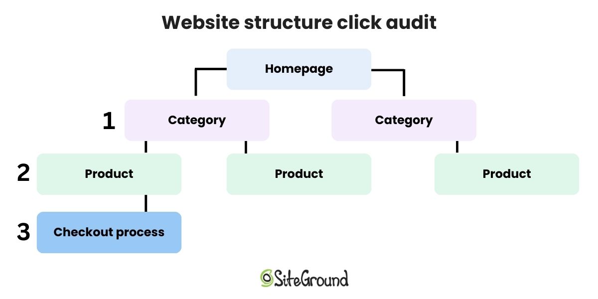
Why it works: Friction compounds. Each additional step in the path to purchase introduces a new opportunity to abandon. A leaner ecommerce website structure keeps momentum going in the right direction.
Building your store with SiteGround Ecommerce
Setting up clean, intuitive site structure doesn’t have to be a technical challenge. SiteGround Ecommerce comes with the key navigation and structure features built in, including an easy-to-manage navigation menu, automatic breadcrumb navigation on category and product pages, and a built-in search bar so shoppers can always find what they’re looking for. Conversion best practices like these are organized logically from the start, without you needing to figure it out from scratch or hire a developer to make it work.
Product and listing page design ideas
If the homepage gets visitors interested, the product page is where ecommerce website design turns interest into purchases. These ideas will help you close the deal.
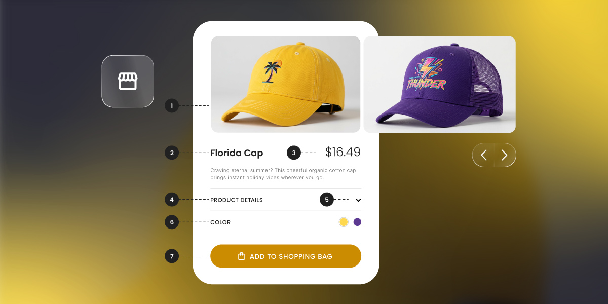
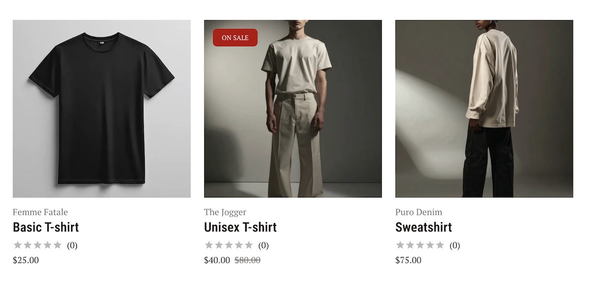
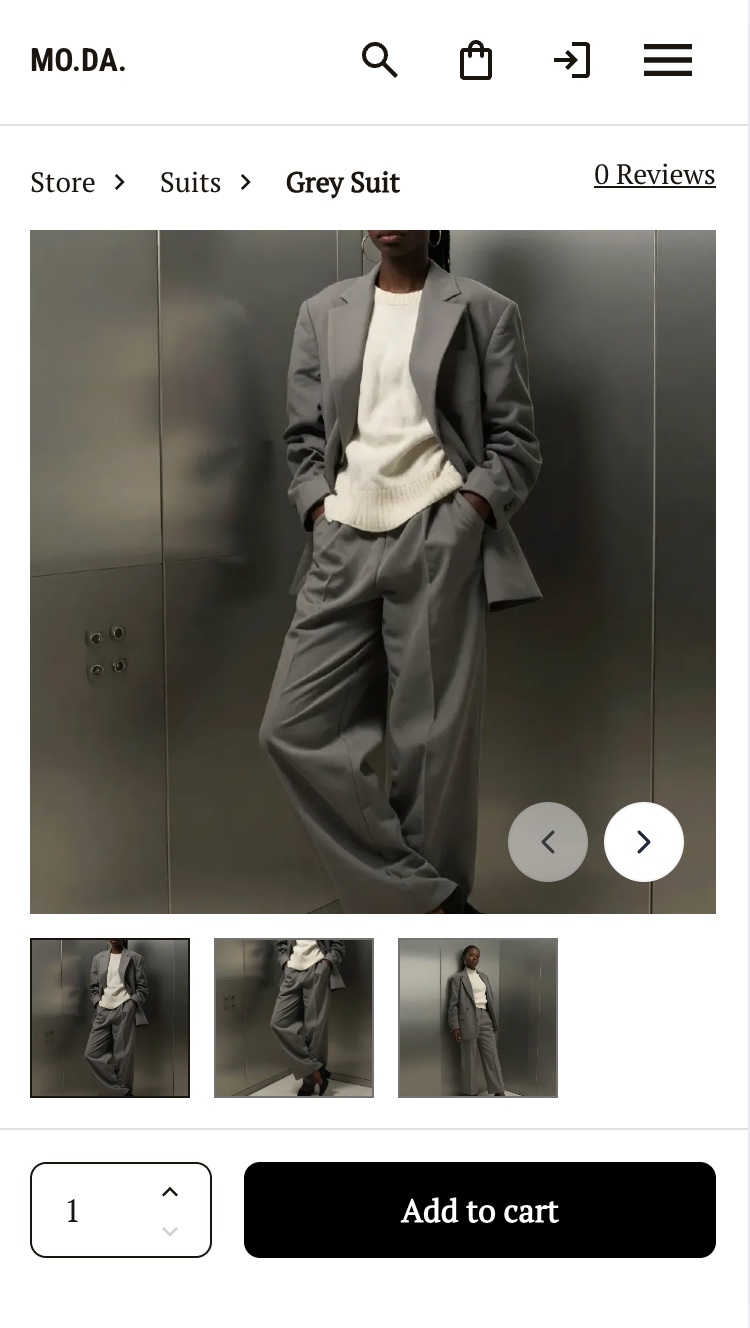
Show the product from every angle
Online shoppers can’t pick up your product, turn it over, or hold it up to the light. The closest you can get to replicating that experience is giving them as many visual angles as possible. 56% of users’ first actions on a product page are to immediately begin exploring product images — that’s before reading the description, checking the price, or doing literally anything else.
The idea: Use a minimum of three angles for every product — front, back, and detail or lifestyle. On your listing (grid) pages, enable a hover image so that a second product photo appears when a cursor moves over the product thumbnail.
Why it works: Uncertainty is one of the top reasons people abandon carts. When a shopper isn’t sure exactly what they’re getting, they hesitate. More images reduce uncertainty, and uncertainty is the enemy of conversion.
Put price and promotions where eyes land first
Price is one of the first things shoppers look for. If they have to scroll past a description, a gallery of images, and three bullet points to find it, many won’t bother. They’ll go back to Google and find an online store that makes it easier.
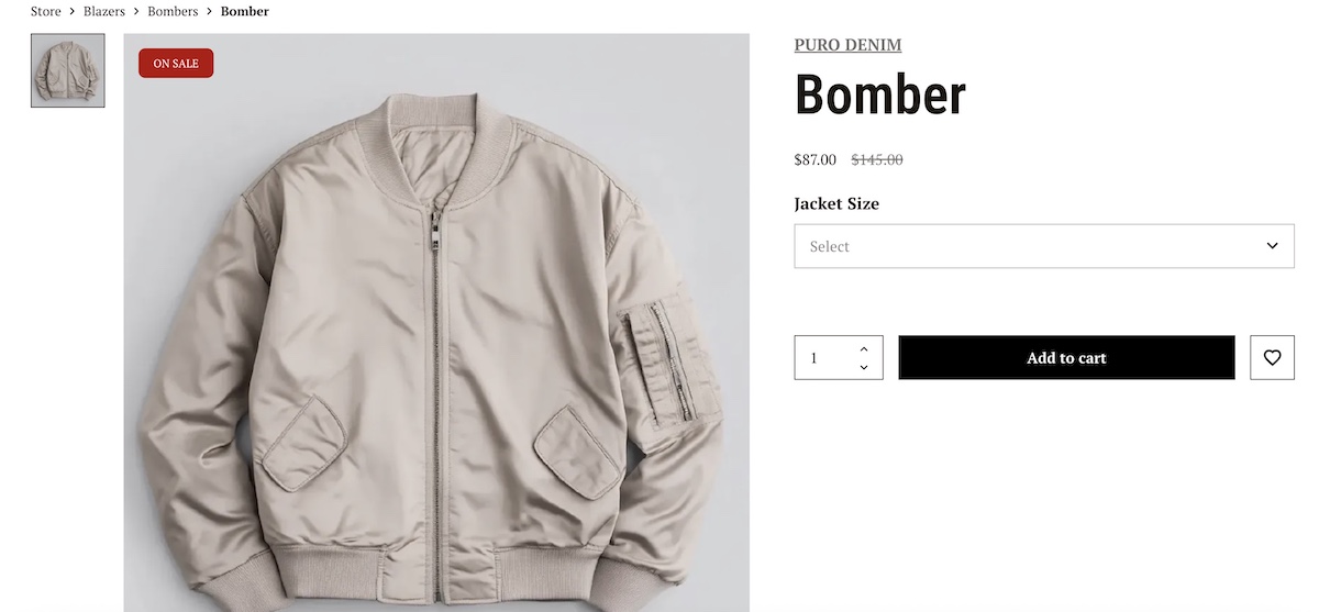
The same logic applies to promotional labels. A “sale” tag that’s buried below the fold isn’t doing its job. This kind of signal is meant to create interest and urgency, and they only work if they’re seen early.
The idea: Place your price and any promotional labels (sale, low stock) at the top of the product page. On listing pages, make sure pricing and promo badges are visible without any interaction.
Why it works: Shoppers are scanning for specific information. Put the things they most want to see at the top, and you reduce friction at one of the most critical points in the buying decision.
Use scarcity signals (but keep them honest)
Scarcity is one of the most powerful psychological triggers in ecommerce. “Only 13 items left” creates a sense of urgency that a discount alone can’t replicate, as it introduces the fear of missing out entirely, not just the fear of paying more later.
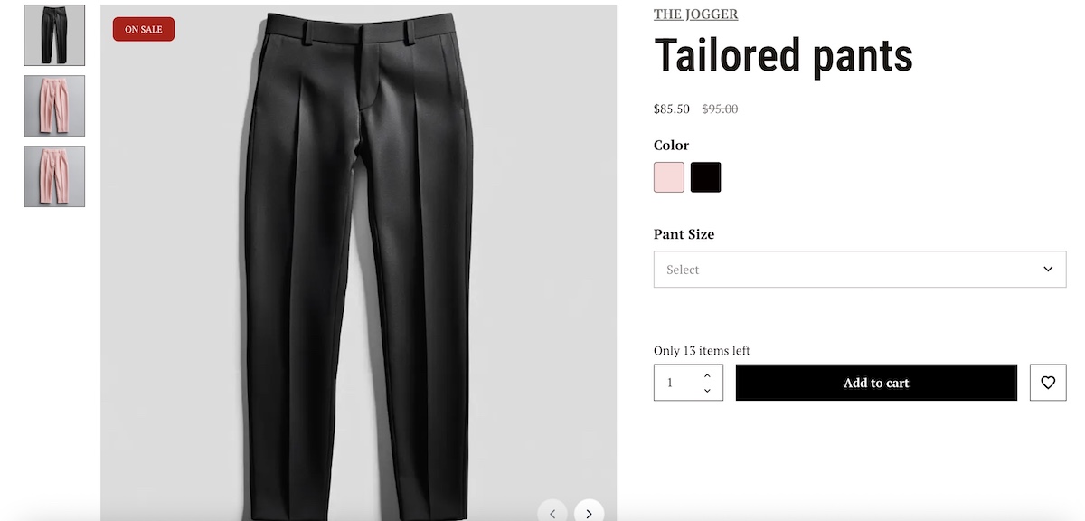
The caveat is important, though: fake scarcity destroys trust. If a product has been “almost sold out” for six months, shoppers notice. And once trust is gone, it’s very hard to earn back.
The idea: Display real low-stock labels when inventory genuinely is limited. If you have a time-sensitive promotion, a simple countdown or end-date label is equally effective.
Why it works: Real scarcity creates urgency without requiring a price cut, and urgency shortens the decision-making window. Just make sure it’s real.
The good news is that keeping it real doesn’t require any manual work. SiteGround Ecommerce automatically displays sale badges and stock levels based on your actual inventory, so your scarcity signals are always accurate and always up to date.
Make your CTA impossible to miss
Your “Add to cart” button is the most important key element on the product page. Everything else (the images, the description, the reviews) exists to build the case for clicking it. So why do so many online stores bury it in a sea of visual noise?
The idea: Your CTA button should be high-contrast, meaning its color stands out on the page. It should sit above the fold, before any scrolling is required. Remove competing elements from the area immediately around it, such as links, banners, and secondary buttons dilute attention.
Why it works: Button contrast is consistently one of the highest-impact, lowest-effort wins in ecommerce A/B testing. A button that stands out visually gets clicked more. That’s it. That’s the whole insight.
Getting your product page layout right takes time — unless it’s already done for you. With SiteGround Ecommerce, pages are structured around conversion best practices by default, with image galleries, prominent pricing, review display, and high-contrast CTA placement built in. So instead of second-guessing where to put things, you can focus on what really matters: your products.
Checkout design ideas
You’ve done the hard work of convincing someone to buy. The checkout is where it can all fall apart, and often does. These ideas reduce the risk of losing that hard-earned sale at the final hurdle.
Offer guest checkout (don’t force an account)
Almost one in five shoppers abandon their order simply because they don’t want to create an account. Think about it from the customer’s perspective: they’ve decided to buy, they’re ready to pay, and then they’re told they have to create a password and confirm their email address first. It’s annoying friction at the worst possible moment — and we’ve all probably been there.
The idea: Make guest checkout the default or the most prominent option on your checkout page. You can always invite customers to create an account after the purchase is complete (you know, when they’re already happy and have nothing to lose).
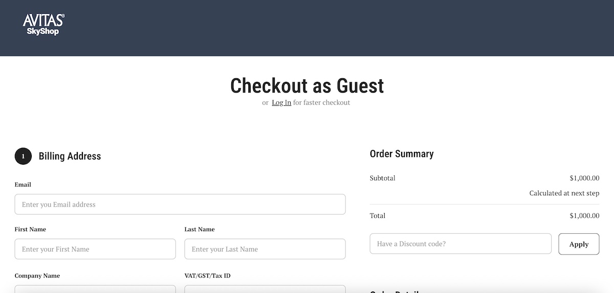
Why it works: Removing mandatory registration eliminates one of the most common drop-off points in ecommerce. Fewer barriers at checkout means more completed purchases.
Keep the CTA sticky on mobile
On mobile, checkout can feel long and form-heavy. If your “Continue to payment” button is only visible at the top of the page, a shopper who’s worked their way through the form has to scroll all the way back up to complete the purchase. Many won’t bother.
The idea: Implement a sticky CTA bar at the bottom of the screen on mobile checkout, so the final action is always within reach no matter how far the shopper has scrolled. Bonus: include a scroll-to-top button that makes it extra easy to go back to the top of the page.
Why it works: The fewer steps between intent and action, the higher the conversion rate. A sticky CTA removes a small but real piece of friction at the exact moment shoppers are most ready to buy.
Strip the checkout page back
Your checkout page has one job: get the shopper from “I want to buy this” to “I have bought this.” Every element on that page that isn’t directly related to completing the purchase is a potential distraction, and potentially an exit.
The idea: Remove your main navigation, promotional banners, sidebar content, and any non-essential links from the checkout. The shopper should have nothing to look at except the path to completing their order.
Why it works: More elements on a checkout page means more opportunities to leave. A stripped-back checkout keeps the focus where it needs to be and significantly reduces abandonment at this critical stage.
Mobile-first design ideas
According to Statista, smartphones accounted for over three-quarters of retail site visits in the US in 2024 — yet desktop, generating just 23% of traffic, represented 31% of all purchases. The gap isn’t about screen size. It’s about mobile web design. Most online stores were built for a cursor and a keyboard, not a thumb and a small screen. Yours doesn’t need to be one of those stores.
Design for how people actually use their phones
On a desktop, every part of the screen is equally accessible. On a mobile device held in one hand, that’s not true. The top corners of the screen are the hardest to reach for mobile users, while the lower-center area is the most natural resting zone for the thumb. If shoppers can’t easily see or tap your CTA, they won’t.
The idea: Audit your mobile layout with thumb zones in mind. Your primary CTA (most importantly the “Add to cart” button on product pages) should sit in the lower half of the screen where it’s easy to reach without repositioning your hand. Consider a sticky “Add to cart” bar that follows the user as they scroll through product images and descriptions, so the action is always visible.
Button size matters here too — both Google and Apple recommend a minimum tap target size of 44×44 pixels, which helps ensure buttons are easy to tap without mis-clicks. (This is also an important component of accessible web design.)
Why it works: Ease of use is a conversion factor. If tapping the most important button requires an awkward stretch, some users simply won’t bother. Small ergonomic adjustments can have a measurable impact on mobile conversion rates.
Simplify your product grid on mobile
A three-column product grid might look clean on desktop, but, on mobile, it produces tiny images, unreadable text, and tap targets so small that mis-clicks become a regular occurrence. Frustration at this stage sends shoppers elsewhere.
The idea: Use a one-column grid layout on mobile, with large tap targets and enough white space between items to make browsing comfortable. Product names and prices should be legible without zooming.
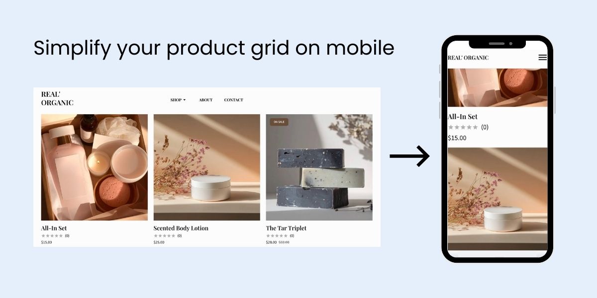
Why it works: A grid that’s easy to browse encourages exploration. A grid that requires squinting and precision-tapping encourages leaving. Simplicity at the browsing stage keeps shoppers engaged long enough to reach the product page.
Ecommerce website design: Get started now
You made it to the end, which means you’re serious about building a store that actually sells, not just one that looks good in a screenshot.
The ideas in this article aren’t complicated. Put the important things where eyes go. Build trust early. Remove friction at every step. Make the “buy” button impossible to ignore. These aren’t secrets; they’re fundamentals that get overlooked when everyone is busy chasing the next piece of design inspiration instead of focusing on what actually drives sales.
If you’re starting from scratch or starting over, SiteGround Ecommerce has all of this covered. Product pages, checkout, mobile optimization, site speed: it’s all handled out of the box, so you can skip the guesswork and get straight to selling. Your job is to know your products. Ours is to make sure the design doesn’t get in the way.
FAQs
Yes — and it’s more accessible than it’s ever been. Modern website builders like the SiteGround Website Builder include ecommerce functionality built in, with templates and layouts designed around conversion best practices. You don’t need to know how to code, hire a web designer, or start from a blank canvas. Most first-time sellers can have a functional, good-looking store live within a day or two.
For small ecommerce businesses and first-time sellers, the right ecommerce platform is one that handles the hard stuff for you. SiteGround Ecommerce is built with conversion best practices baked in — product pages are structured for high-intent shoppers, checkout is optimized to reduce abandonment, and your store automatically adjusts for mobile without any extra work on your end. Fast, secure hosting is included, so your pages load quickly out of the box. And because everything — your store, your hosting, your design tools — lives in one place, you’re not stitching together separate services or paying multiple subscriptions just to get started.
Professionalism in ecommerce website design comes down to the fundamentals covered in this article, and not how much you spend. Keep your website layout clean and uncluttered, place your most important information where eyes naturally land, and make sure your CTA button stands out. Use high-quality product images shot from multiple angles, display reviews prominently, and make sure your online store loads fast. Meanwhile, consistent branding goes a long way toward making a store feel considered and trustworthy. None of this requires a designer or a big budget — just attention to the basics that most online stores overlook.
It depends on where your biggest drop-off point is, but for most stores, one of the highest-impact, lowest-effort changes is fixing your CTA button. Make it high-contrast, position it above the fold on your product pages, and remove competing visual elements from around it. It’s a change most stores get wrong, and one that tends to show results quickly.


Comments ( 0 )
Thanks! Your comment will be held for moderation and will be shortly published, if it is related to this blog article. Comments for support inquiries or issues will not be published, if you have such please report it through our official channels of communication.
Leave a comment
Thanks! Your comment will be held for moderation and will be shortly published, if it is related to this blog article. Comments for support inquiries or issues will not be published, if you have such please report it through our official channels of communication.