Ever opened an email and instantly cringed at the font? Maybe it was a bright purple script or something wildly hard to read. It might work for Uncle Jim’s road trip updates—but definitely not for marketing or business. When it comes to professional emails, choosing the best font for email makes a big difference.
Most people don’t think twice about fonts—until it’s time to send a real campaign. Suddenly, you’re asking: What are the best fonts for email that actually look good and render properly across inboxes?
Just like subject lines or email CTAs, font choice is one of those small details that can impact your email marketing and how your message is received. In this article, we’re breaking down the best fonts for email, including what to use, what to avoid, and how to keep your design clean and readable.

Why Font Choice Matters in Email
It might seem like a small thing, but your font choice speaks volumes. Before anyone reads a single word, the look of your email sends a message—about your business, your professionalism, and how much attention you pay to detail.
Pick the wrong font, and your email might feel clunky, off-brand, or just plain hard to read. But choose well, and you instantly boost clarity, trust, and visual appeal. It’s a subtle design choice that has a not-so-subtle impact.
What are Email-Safe and Web-Safe Fonts?
Now that we’ve established that font choice matters, let’s clear up a common point of confusion: the difference between email-safe and web-safe fonts.
Email-safe fonts
These are a rather limited group of standard fonts known to display consistently across major email clients like Gmail, Outlook, and Apple Mail. That’s because they are pre-installed on most devices and supported by all major email clients without needing to be loaded from the web.
So if you want to be absolutely certain as possible that your exact fonts show up in your emails, then email-safe fonts are a good option. These fonts include Arial, Tahoma, Georgia, and Geneva, just to name a few.
Web-safe fonts
That said, if you want to get a little more original, that’s where web-safe fonts come in. These fonts are widely supported across most browsers and devices, making them great for websites, where design flexibility is higher. Unlike email-safe fonts, web-safe fonts are not system-installed, meaning they need to be loaded from an external source. This process is known as font hosting.
Font hosting
When it comes to email marketing design, font hosting works by including a reference to a font file—typically hosted on a service like Google Fonts—directly in the email’s HTML. Most modern email platforms, like SiteGround and others, handle this automatically behind the scenes, so you don’t need to manually add the code.
If the recipient’s email client supports web fonts, it will download and display the custom font as intended. If it doesn’t, the client will simply ignore the hosted font and use the fallback font defined in the CSS, ensuring your email still looks clean and readable.
All of this is to say, when it comes to choosing your fonts, it’s important to think about how they will actually show up for the reader. It’s all about finding the sweet spot between brand style and technical reliability. And when you choose a competent email marketing platform—like, say, SiteGround Email Marketing—this technical side is already taken care of for you.
The Dos—What Makes a Good Email Font?
Now that you know how to make sure your fonts show up, it’s time to nail down a few simple guidelines. These “dos” and “don’ts” can help you choose fonts that help your message look sharp and readable, and stay out of the spam folder. Then, stick around for our list of top font examples to find what works best for you.
Choose Something Easy to Read
This might sound obvious, but it’s often overlooked. Fancy fonts might feel fun or unique, but if your reader has to squint or pause to figure out what you’re saying, you’ve lost them.
So when it comes to body copy in particular, stick with clean, simple fonts that are easy on the eyes—especially on smaller screens. Your font should help your message, not compete with it.
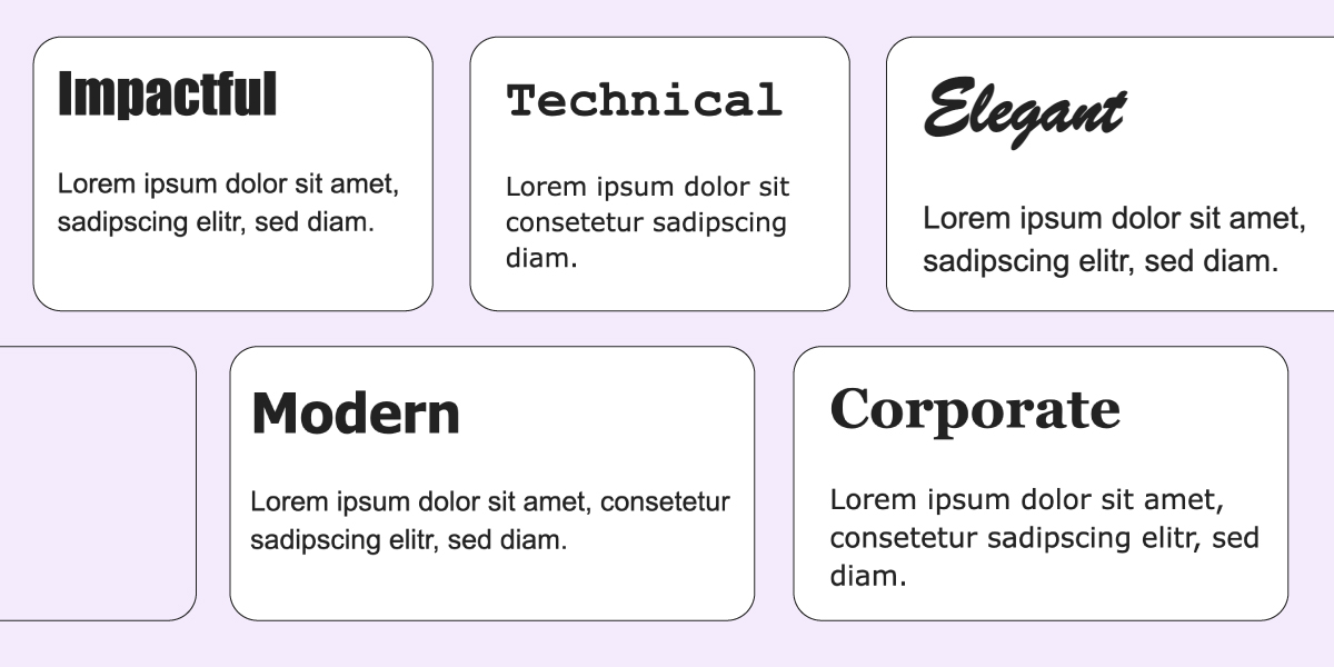
Think Strategically About Font Pairings
Using more than one font in your email layout can actually improve readability—if you do it right. The key is to create a clear visual hierarchy that helps readers quickly scan and digest your content.

A common approach is to use one font for headings and another for body text. This contrast makes it easier for people to spot the key takeaways at a glance, especially on mobile, where people tend to skim more than read.
For example, you might use a bold, modern sans-serif for headlines (like Verdana) and a clean serif for body text (like Georgia). The difference in style creates contrast, while still keeping the overall look cohesive.
Serif vs. Sans-Serif: What’s the Difference?
Serif fonts have small decorative strokes, or “serifs,” at the ends of their letters—think Courier New or Georgia. They give a classic, formal feel and are often used in print. Sans-serif fonts, like Arial or Verdana, don’t have those strokes. They’re clean, modern, and typically easier to read on screens—especially in emails. For most marketing emails, sans-serif fonts are the go-to for clarity and versatility, but serifs can add a touch of sophistication when used strategically.
Hang tight, because we’ll cover more ideal font pairings below.
Stick to Web-Safe and Widely Supported Fonts
We touched on this earlier, but it’s worth repeating: choose standard fonts that are proven to display reliably across all major email clients. Even the best-looking design won’t matter if your text shows up broken or defaulted to a font that you simply did not choose.
Email-safe fonts like Arial, Verdana, Georgia, and Tahoma are safe bets. And f you want to use a custom font, be sure to set a web-safe fallback so your message still looks good if the custom option doesn’t load.
It’s worth noting that SiteGround takes care of all of this for you, automatically implementing both email-safe and web-safe fonts so that you don’t need to worry about a thing.
Keep it Professional
Your font reflects your brand—whether you mean it to or not. So while it might be tempting to get playful with decorative or handwritten styles, it’s best to save those for party invites, not marketing emails.
Stick with fonts that look clean, modern, and trustworthy. Even if your brand has a fun or creative vibe, readability and polish should still come first. A professional-looking font instantly builds credibility and shows you take your communication seriously.
That doesn’t mean boring—but it does mean avoiding anything too stylized, overly casual, or hard to read. Aim for a look that aligns with your brand personality and maintains a level of professionalism that suits your audience.

Think About Mobile Readers
These days, most emails are opened on phones—so if your font looks great on desktop but cramped or chaotic on a smaller screen, that’s a problem.
Choose fonts that are legible at smaller sizes and avoid anything too thin or tightly spaced. A simple sans-serif font often works well on mobile because it’s clean and easy to scan. Also, keep font sizes generous—around 14–16px for body text and larger for headings—to make reading effortless, even on the go.

Bonus tip: Preview your email on both desktop and mobile before sending to make sure your fonts and layout look great everywhere.
SiteGround makes this extra easy, automatically optimizing all email design details (including font size) for mobile, as well as allowing you to easily see and compare screen-size versions, and of course send test emails.
The Don’ts—Common Email Font Mistakes to Avoid
Just as the right font can enhance your message, the wrong one can distract, confuse, or even annoy your readers. Here are a couple of common pitfalls to steer clear of when choosing fonts for your emails.
Don’t Use Script or Decorative Fonts for Body Copy
Sure, that curly script might look creative and playful in theory—but in practice, it’s often hard to read, especially on small screens or low-resolution displays. So decorative fonts might seem like a fun and expressive way to stand out, but they tend to backfire in email copywriting, where clarity is king.
Unless you’re designing a wedding invitation, it’s best to leave script and novelty fonts out of your email marketing. Stick to clean, legible typefaces that make your content easy to skim—and easy to trust.
Don’t Pick Obscure Fonts
Similarly, that rare, quirky font you stumbled across online might look like it has a lot of personality and flavor, but chances are your email recipients won’t see it the same way. Literally.
By now, you know that some email clients don’t necessarily support custom or less-common fonts. So if that super-cool font choice isn’t installed on the reader’s device, their email app will swap it for a default standard font—often with less-than-great results for design and readability.
Stick with tried-and-true fonts that you know will render well across most devices and platforms. And if you do use a custom font, always define a solid fallback to maintain a consistent look.
Don’t Go Overboard With Styles
It’s tempting to play with bolds, italics, colors, and different font sizes to make your email pop—but too much styling quickly turns into visual clutter.
Mixing multiple fonts, sizes, and formats can overwhelm your reader and make your email look unpolished. Instead, aim for consistency. Use a clear hierarchy—like bold for headings and regular weight for body text—and apply styles sparingly to emphasize key points without causing distraction.
Think of styling as seasoning: a little goes a long way.
Don’t Neglect Font Size
Even the best font won’t do you any favors if it’s too small to read. Tiny text is one of the fastest ways to lose readers—especially on mobile.
As a general rule, keep your body text around 14–16px, and headers at 20px or larger, depending on your design. This ensures your content is readable without zooming or squinting, and makes for a smoother user experience overall.
Also, be mindful of line spacing. Crowded lines make your email feel dense and harder to scan. A little breathing room goes a long way.
Best Fonts for Email (with Examples)
Now that you know what to do (and not do) when choosing fonts, let’s get specific with some font suggestions for different types of emails. Whether you’re aiming for clean and modern, professional and formal, or something with a bit of personality, here are some great options—plus a few curated pairings that work especially well together.
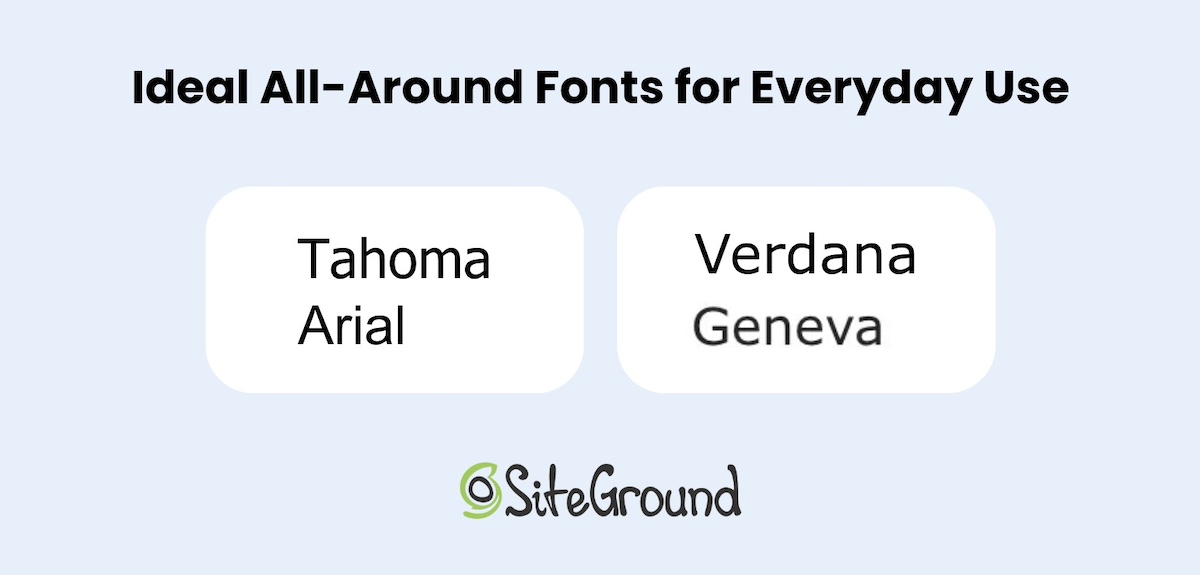
Ideal All-Around Fonts for Everyday Use
For emails like newsletters, product updates, or friendly promos, you want fonts that are clean, clear, and easy to scan. These widely supported sans-serif fonts get the job done:
Recommended Fonts:
- Tahoma – Compact and efficient, great for tight layouts and small screens.
- Arial – A true staple—neutral, clean, and readable across virtually all devices.
- Verdana – Designed specifically for the screen, it’s excellent at small sizes.
- Geneva – Crisp and tidy, it adds a subtle touch of sophistication to everyday content.
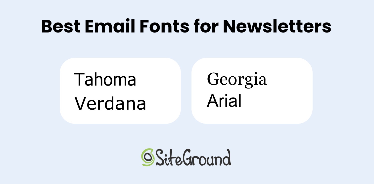
Top Professional Fonts for Business Emails
Business emails often need to strike a balance between professionalism and approachability. Use these fonts in client updates, service notifications, onboarding sequences, or internal newsletters—any message where email etiquette is top of mind, and you need a polished, brand-consistent tone. The best fonts for this purpose are simple, structured, and easy to read on any device.
Top picks for business emails:
- Georgia – A classic serif font that feels polished and reliable.
- Arial – Clean and professional without being stiff.
- Courier New – Monospaced and traditional; best used sparingly for a technical or retro feel.
- Verdana – Solid and straightforward—great for body text.
Best Font Pairings
As we’ve already touched on, pairing fonts is a clever way to create contrast, guide the reader’s eye, and really optimize every part of your email. The trick is to match fonts that complement one another—usually one for headlines and another for body text. So let’s look at several pairings that strike that perfect balance between style and readability.
Best font pairings:
- Georgia + Arial – A classic serif headline with a clean sans-serif body.
- Tahoma + Verdana – A modern, web-safe combo that’s friendly and readable.
- Courier New + Geneva – Technical meets tidy—a unique but effective pairing.
- Impact + Arial – Bold headers paired with a clean body font for high-contrast layouts.
- Brush Script MT + Arial – Script for flair in headlines, grounded by a solid sans-serif base (use script sparingly).
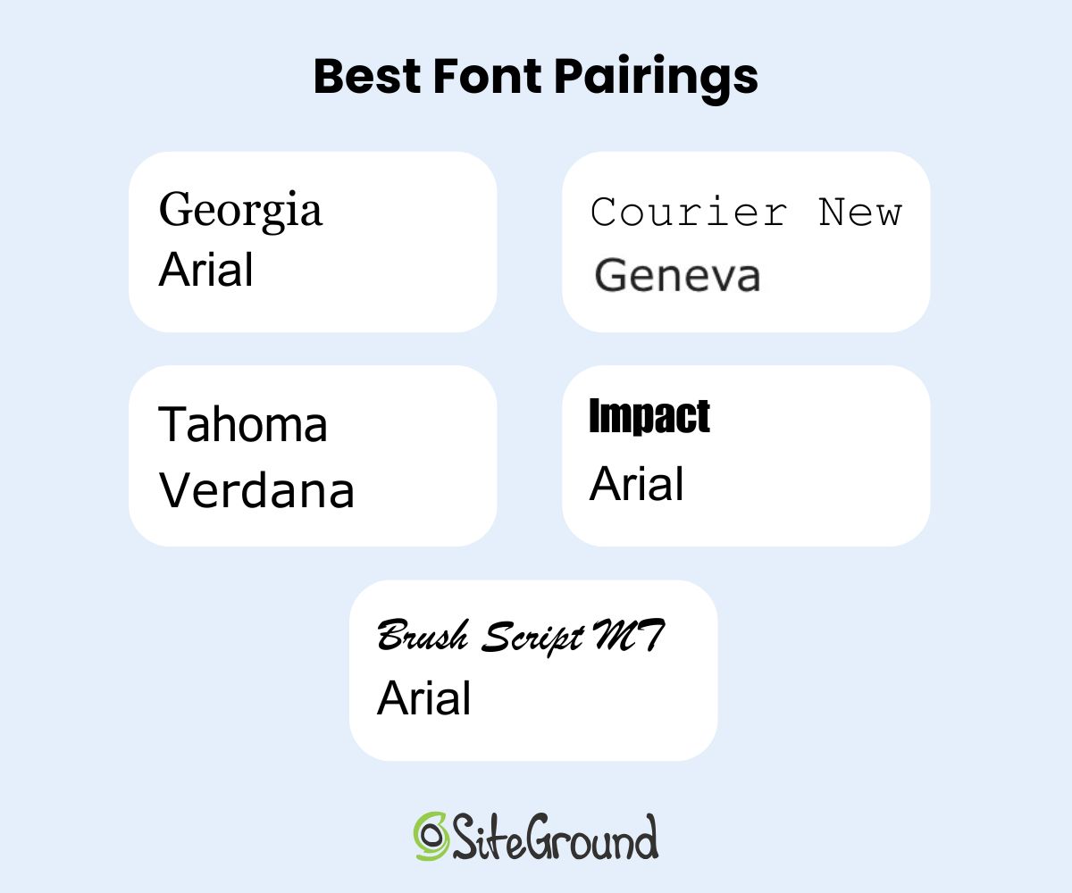
Each of these pairings is pre-built into SiteGround’s email design tools, so you can easily apply them without worrying about compatibility.
Final Thoughts on Best Email Fonts
Choosing the best font for email might seem like a teeny tiny design decision, but it can have a big impact on how your message is received. Clear, consistent, and well-paired fonts help your emails look professional, stay readable across devices, and reflect your brand’s personality—whether you’re sending a welcome message or announcing a big sale.
With SiteGround, creating beautiful, effective emails is simple. From smart font pairings to fully customizable templates, automation tools, and personalization options, our platform makes it easy to design, send, and manage your marketing emails—all in one place. So you can focus less on the technical details and more on building connections that convert.


Comments ( 0 )
Thanks! Your comment will be held for moderation and will be shortly published, if it is related to this blog article. Comments for support inquiries or issues will not be published, if you have such please report it through our official channels of communication.
Leave a comment
Thanks! Your comment will be held for moderation and will be shortly published, if it is related to this blog article. Comments for support inquiries or issues will not be published, if you have such please report it through our official channels of communication.