Have you ever had to use crutches? Suddenly everything that seems accessible to the masses becomes inaccessible to you: stairs, parking, taking a basic shower. Now imagine this in a digital world: your vision is impaired, and while many can easily navigate, say, a website with no problem, without vision it becomes inaccessible to you. This is where accessible web design comes in. It’s the virtual equivalent of adding a ramp and railing next to that set of stairs, permitting equal access for all people.
You’ve surely heard about it, and that’s why you’re here: to understand accessible web design, what it entails, and what it means for your business. So let’s get clear on what it means, and how you can easily implement best practices starting today.
What is Web Accessibility?
Web accessibility and accessible web design means designing and developing websites, tools, and technologies that can be used by people of all abilities, including those with temporary, situational, or permanent disabilities. That includes users who are blind or have low vision, those who are deaf or hard of hearing, people with motor difficulties, cognitive or learning disabilities, and many others.
Chances are that many people you know (if not you yourself) are in this situation. According to the World Health Organization, over 1.3 billion people—or roughly 16% of the global population—live with some form of disability. That’s a massive audience we don’t and shouldn’t want to leave out—partly because it’s just the right thing to do, and also because it’s surely an audience that you want to reach.
Accessibility is about removing barriers so all users can perceive, understand, navigate, and interact with your website. These are the four pillars of the POUR framework, which underpins the Web Content Accessibility Guidelines (WCAG):
- Perceivable: Information and interface components must be presented in ways users can perceive (such as using alt text for images, sufficient color contrast).
- Operable: Navigation and interface elements must be usable via multiple methods (keyboard, screen reader, etc.).
- Understandable: Content and interfaces must be clear and predictable (readable text, consistent design).
- Robust: Content must work reliably across current and future devices, browsers, and assistive technologies.
If you’re not sure what to make of all these concepts, don’t worry—we’re going to break it down into understandable and actionable terms.
Why Does Web Accessibility Matter?
Lest you need further convincing, let’s nail down why web accessibility is so essential. First and foremost, because it is simply a matter of ethics and making sure all are welcome. Apart from that, accessible websites offer a better user experience for everyone. Clearer structure, better readability, and intuitive navigation benefit all visitors—especially on mobile devices or in low-bandwidth environments.
There are other reasons to get on board as well:
- Legal compliance: Many countries enforce digital accessibility laws, and failing to meet them can result in costly lawsuits or penalties.
- Inclusive values: More broadly, building with web accessibility in mind shows respect for all users and reflects a commitment to inclusivity and equal access.
- SEO benefits: Accessible sites tend to perform better in search engines thanks to clearer structure, alt text, semantic HTML, and better page speed.
Accessible Web Design Best Practices
Now that we’re all clear on its importance, let’s look at accessible web design best practices you can start putting into action today.
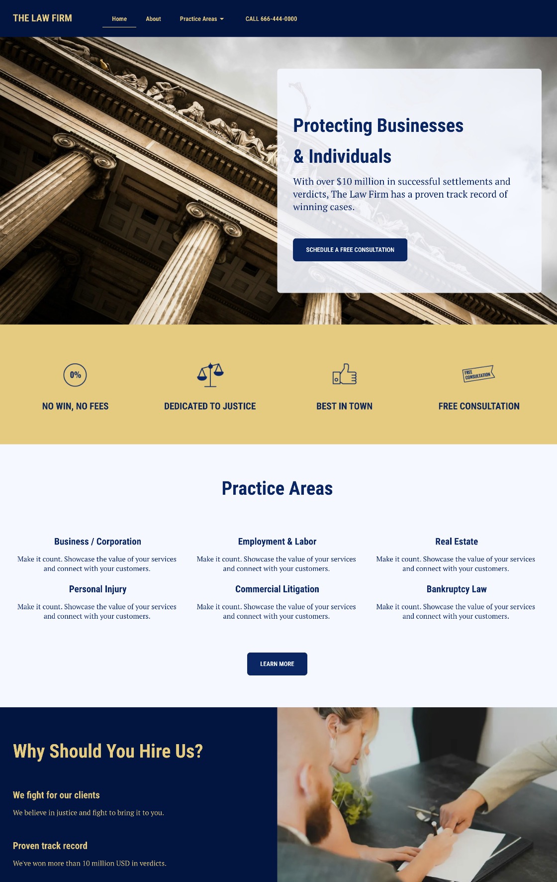
1. Add Clear, Helpful Headings
While seemingly trivial, headings play a surprisingly important role making your content more accessible, readable, and searchable. And when we say “headings,” we don’t just mean a title in big bold lettering for each page or section; we mean actually using proper HTML tags so that screen readers and search engines alike understand the structure of your web pages.
A screen reader is software that reads aloud the content on a screen, allowing people who are blind or have low vision to navigate and interact with accessible websites using speech or braille.
For screen reader users, headings act as signposts. They allow users to navigate through content quickly, skipping to the section they’re interested in without having to read everything in order. This is especially helpful on longer web pages, where a well-structured outline can save time and reduce frustration.
And of course, accessible headings aren’t just good for users—they’re also a key part of SEO basics. Search engines rely on heading structure to understand the hierarchy and relevance of your content. Using proper HTML heading tags (<h1> through <h6>) signals to search engines what your page is about and how it’s organized, making it easier to index and rank.
From a visual design perspective, clear headings also improve readability and scannability. Most people don’t read web pages word-for-word; they scan. Well-designed headings break up long blocks of text, highlight key points, and guide the reader’s eye through the page. When styled consistently, they help create a visual rhythm that enhances the user experience.
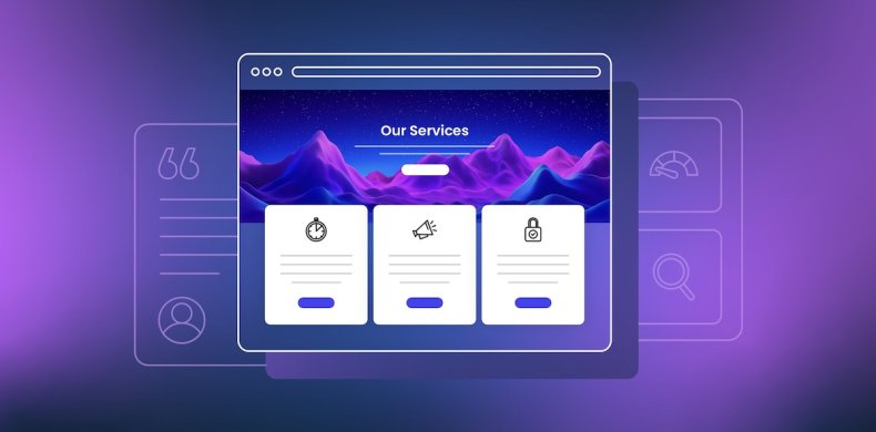
Now, if you’re not familiar with using header tags, no problem—they can be easy to implement. In the SiteGround Website Builder, for example, you can just highlight your text, and modify the type of text as you go.
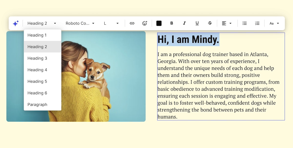
To make the most of your headings:
- Use only one <h1> per web page (usually the page title)
- Follow a logical nesting order (<h2> for main sections, <h3> for subsections, etc.)
- Keep them short, descriptive, and relevant to the content that follows
- Avoid using headings purely for visual effect—use CSS to style regular text if it’s not meant to function as a heading
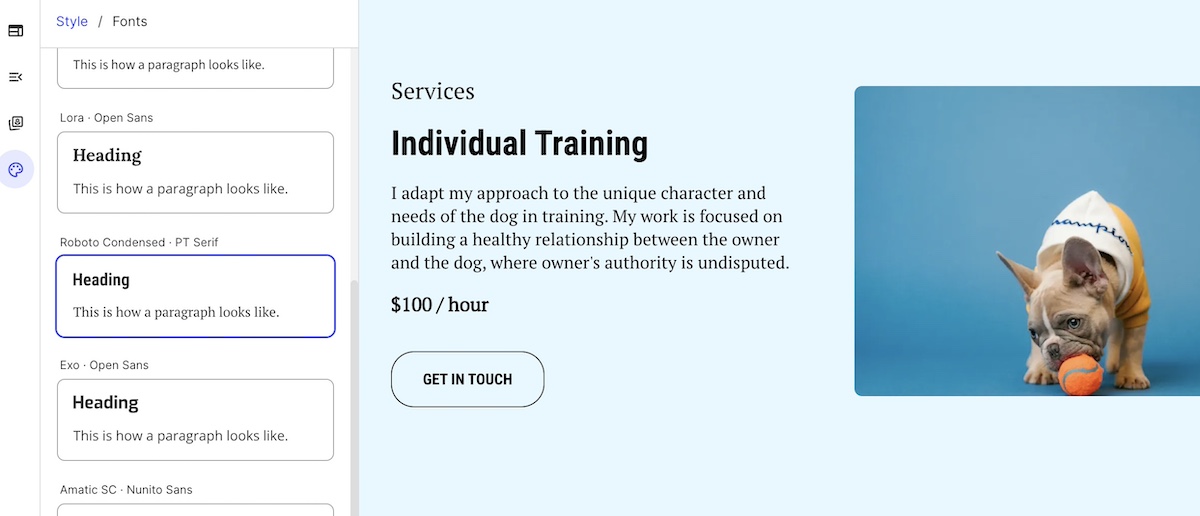
2. Choose Accessible, Easy-to-Read Fonts
Typography is one of the most overlooked aspects of web accessibility, but it has a huge impact on how easily users can read and engage with your content.
For accessibility, the goal is to choose fonts that are legible, clear, and consistent across devices and screen sizes (this is just as important, by the way, when it comes to choosing the best fonts for email). This helps people with low vision, dyslexia, or cognitive disabilities process text more easily. It also improves readability for everyone, especially on mobile screens.
When it comes to choosing font, here are best practices to consider and follow:
Use Simple, Sans-Serif Fonts
Sans-serif fonts like Roboto or Open Sans are generally easier to read on screens of all sizes than serif fonts, which have small decorative strokes at the ends of their letters. Avoid overly decorative, script, or novelty fonts especially in body copy—they might look fun, but they can be hard to decipher for many users.
Keep Font Size Legible
Be mindful of body text size making sure it’s reading without forcing users to zoom in. Also make sure your text scales well when a user adjusts their browser’s zoom settings or increases text size in their operating system preferences.
Pay Attention to Spacing
Use ample line height, letter spacing, and paragraph spacing to give your text breathing room. Dense, cramped text can be overwhelming and hard to follow, particularly for users with reading difficulties or cognitive disabilities.
Limit the Number of Fonts
Stick to one or two fonts across your site to maintain visual consistency and reduce cognitive load. Many competing typefaces can make your design feel chaotic and harder to process.
Avoid Using Text in Images
Text embedded in images can’t be read by assistive technologies, like screen readers, and doesn’t scale well for different screen sizes. If you must use it, make sure the same information is available as live text elsewhere on the page.
When it comes to implementing these font best practices, SiteGround makes it extra simple. Our website builder offers carefully curated font pairings that are optimized for readability, professionalism, and performance. And everything automatically adjusts for all screen sizes so that you can be sure your text is always readable.
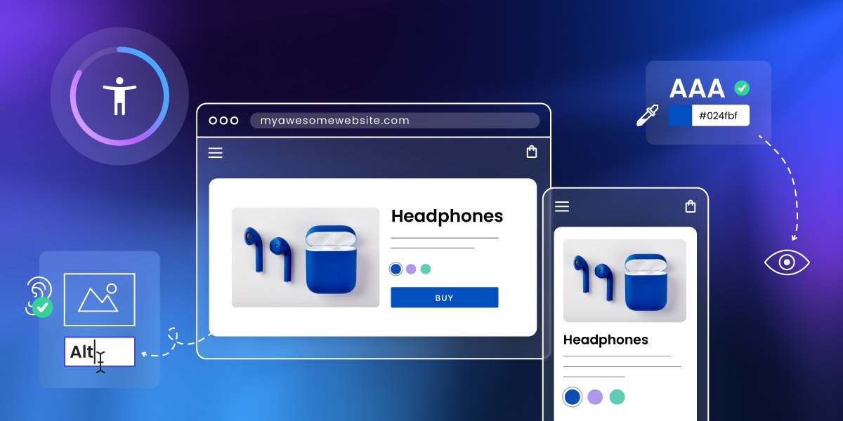
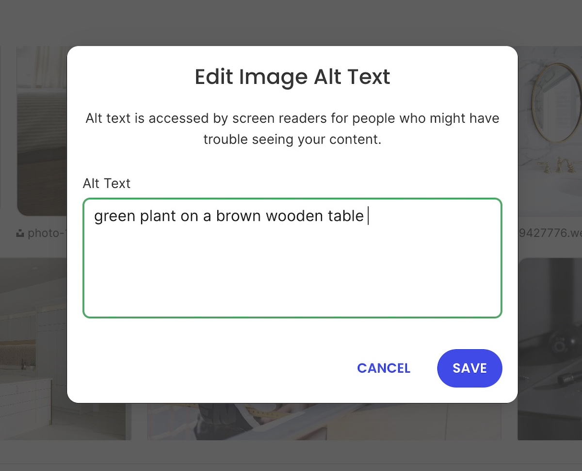
3. Write Descriptive Alt Text for Images
Alt text, or alternative text, is a short description of an image added via the alt attribute in HTML. It’s essential for web accessibility, allowing users who rely on screen readers to understand the content and context of images. It also improves SEO by helping search engines interpret images on your site.
What Makes for Good Alt Text?
Effective alt text is:
- Concise – typically a brief sentence that captures the essential message or purpose of the image.
- Contextual – tailored to how the image relates to surrounding content.
- Descriptive – clearly communicates what the image shows or represents.
Examples:
- “Rock climber scaling a granite cliff at sunrise” — descriptive and relevant
- “SiteGround logo” — short but provides necessary context
- “Red backpack on a forest trail” — gives meaning to a product or lifestyle photo
On the other hand, avoid vague or unhelpful descriptions like:
- “Image” or “Picture” — these provide no useful information
- “Click here” — if used as a linked image, this lacks clarity
- “Logo” — unless you specify whose logo it is
When to use alt text—and when to leave it out
- Use alt text for images that convey information, illustrate content, or provide important context.
- Use alt=”” (an empty alt attribute) for decorative images that don’t add meaning—such as borders, icons used only for style, or background flourishes. This prevents screen readers from announcing unnecessary content.
What about complex images?
For graphs, charts, and infographics, alt text alone may not be enough. Provide a longer description elsewhere on the page (such as a text summary below the image) to convey the data or insights in an accessible way.
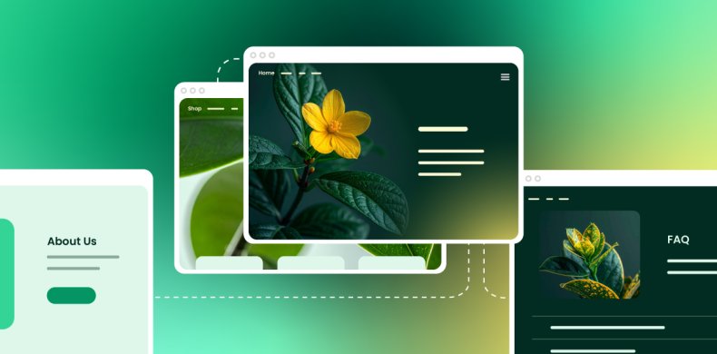
Feeling a little confused about all this talk of using the alt attribute in HTML? It doesn’t have to be complicated. SiteGround makes adding alt text to your images super easy. Just click on an image in your photo library, give it a description in the alt text field, and you’re good to go.
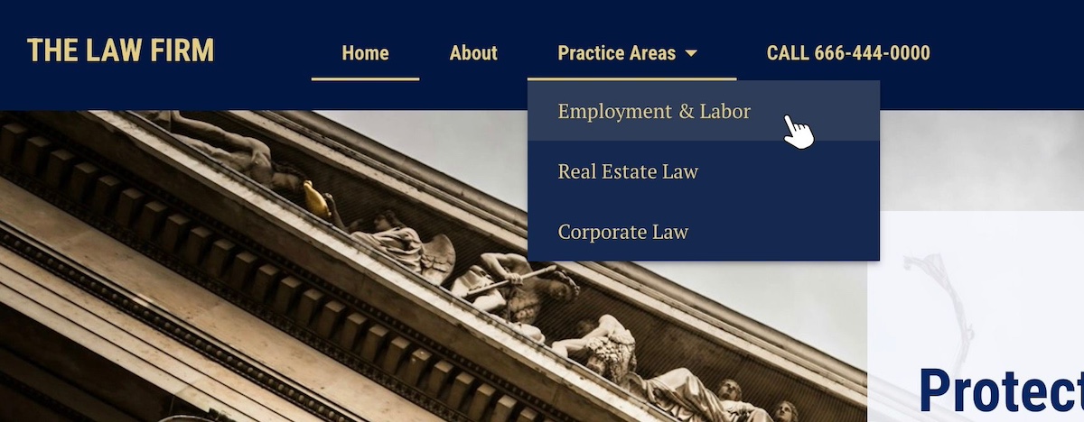
4. Use Clear Links and Strong Calls to Action
Clear, descriptive links and calls to action (CTAs) are one of those small but impactful details that improve both web accessibility and usability. They help all users—including those people with disabilities—understand exactly what will happen when they interact with a link or button.
Why Clarity Matters
Screen reader users often navigate a page by scanning through a list of links. Vague link text like “Click here,” “Read more,” or “Learn more” doesn’t provide meaningful context, making it difficult to understand the purpose of the link without hearing surrounding content.
Descriptive links improve navigation by clearly communicating the destination or action. This benefits everyone, including users with cognitive disabilities or anyone scanning the page quickly.
With that in mind, here are a handful of best practices for links and CTAs:
- Be specific: Use link text that clearly describes what the user will get or where they will go, such as “Download the 2025 Accessibility Guide” or “View pricing plans.”
- Keep it concise: While descriptive, links should be short enough to be easily understood at a glance.
- Use consistent styling: Links and buttons should stand out visually, typically using color and underlining or distinct button shapes, so users recognize them easily.
- Avoid using URLs as link text: Long URLs are hard to read and understand; instead, use meaningful text.
- Use buttons for actions: When the interaction triggers an action (like submitting a form or starting a download), use buttons instead of links to convey this difference.

- Accessible focus states and keyboard navigation: Make sure that links and buttons have visible focus indicators (such as outlines or underlines) when selected via keyboard navigation. This helps users who rely on keyboard input track where they are on the page.
It’s worth noting that these same best practices apply across the board, including when it comes to your email calls to action. Accessible design like this can and should extend beyond just your website.
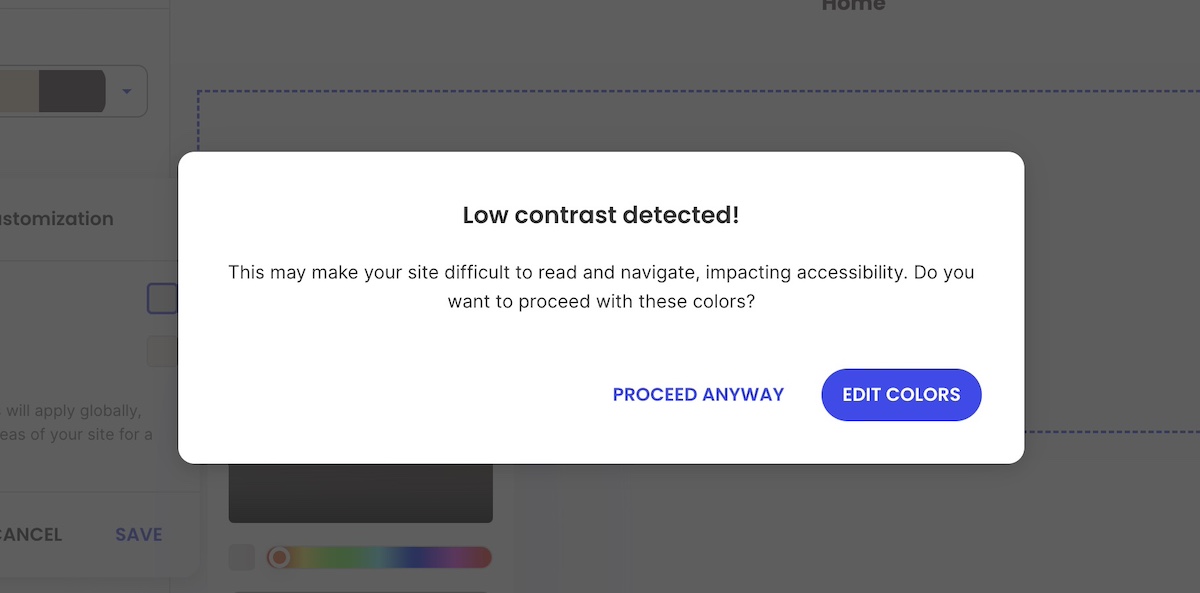
5. Ensure Sufficient Color Contrast
Color contrast is a classic example of where things can really go sideways with accessible web design. Achieving adequate color contrast means that the text and important visual elements stand out clearly against their backgrounds. This makes content readable for users with visual impairments, color blindness, and even those viewing screens in bright or low-light conditions.
What the guidelines say
The Web Content Accessibility Guidelines (WCAG) recommend the following minimum contrast ratios:
- Normal text: At least a 4.5:1 contrast ratio between text and background
- Large text: At least a 3:1 contrast ratio (large text is generally 18pt/24px or larger, or 14pt/18.66px bold or larger)
- UI components and graphical objects: At least a 3:1 contrast ratio to distinguish interactive elements
How to check and improve contrast
- Use online tools to test your color combinations. Alternatively, the SiteGround Website Builder automatically notifies you if your color contrast isn’t optimal.
- If your contrast ratio is too low, consider adjusting either the text color or the background color to increase the difference.
- Avoid using color as the only means of conveying information—for example, don’t rely solely on red text to indicate errors. Use additional visual cues like icons or text labels.
- Be mindful of background images or gradients that can interfere with text clarity—consider adding overlays or solid backgrounds behind text.
- Consistency is key. Use a defined color palette with accessible contrast ratios for your primary, secondary, and accent colors.
6. Design for Easy Layout and Scannability
Most people don’t read web content word-for-word; they scan. This is especially true for users with cognitive disabilities, limited attention spans, or those who are simply short on time (so, most of us!). A clean, well-organized website layout improves both accessibility and user experience by making it easier for everyone to find and understand information.
Here are some best practices for scannable, accessible design:
- Use headings and subheadings: Break content into logical sections using clear, hierarchical headings. This creates a visual and structural roadmap for the page.
- Write in short paragraphs: Long blocks of text can be difficult to follow. Aim for no more than 3–4 sentences per paragraph. This improves readability and allows users to scan quickly.
- Use bullet points or numbered lists: This helps organize information, making it easier to process. Lists also work well with screen readers, which announce how many items are in the list and read them one by one.
- Maintain consistent spacing: Leave enough white space between sections, paragraphs, and elements to avoid visual clutter. This gives users time to process one element before moving on to the next.
- Group related content: Keep related information close together—visually and structurally—so users can quickly understand the relationship between different elements.
- Keep navigation simple: Use predictable menus and page layouts across your site. Consistent navigation helps users orient themselves and move through your site confidently.
- Avoid distractions: Limit unnecessary animations, auto-playing content, or flashing visuals. These can distract or even trigger seizures for sensitive users. If you do use motion or video, allow users to pause, stop, or control it.
Good layout design is as much about what you leave out as what you include. When in doubt, simplify. A clear, uncluttered layout improves usability for everyone, and supports accessibility without sacrificing visual appeal.
7. Follow Accessibility Standards & Guidelines
Web accessibility isn’t just a design preference; it’s guided by internationally recognized standards that help make sure digital content is usable by as many people as possible. Following these guidelines gives you a framework for making informed, inclusive design decisions, helping your site stay compliant with website accessibility laws.
The Gold Standard: WCAG
The Web Content Accessibility Guidelines (WCAG) are the most widely accepted benchmarks for accessible design. Created by the World Wide Web Consortium (W3C), the WCAG is now in version 2.2, with most organizations targeting Level AA compliance as it offers a strong balance between broad accessibility and practical implementation.
Why Following WCAG Matters
- Legal protection: In many regions—including the EU, U.S., and parts of Canada and Latin America—failing to meet web accessibility standards can result in legal action.
- Clear benchmarks: Rather than guessing what “accessible” means, WCAG gives you specific, testable goals.
- Future-proofing: Designing to recognized standards makes your site more adaptable as new devices, platforms, and user needs emerge.
Thankfully, by applying the best practices we’ve described above, you are well on your way to complying with these guidelines and making your website accessible for all.
8. Test Your Site
Even if you’ve followed every website accessibility best practice, you can’t assume your site is fully accessible until you test it. Testing helps you catch issues you might not see during design and development. It also ensures that your site works for real users with a variety of needs.
The best way to make sure your site is accessible is to combine automated testing with manual checks. Here’s the best approach:
- Automated tools can quickly catch common issues like missing alt text, low contrast, or improper heading structure. They’re a great first step, but they typically detect only a portion of potential problems.
- Manual testing helps fill the gaps. Try navigating your site using only a keyboard, zooming in to 200%, and using a screen reader to experience your content from a different perspective. Make sure focus indicators (the visible outlines and underlines that show where you are on the page) are present and interactive elements are easy to reach and understand. Whenever possible, include people with disabilities in your testing to uncover issues that tools and developers might miss.
Build testing into your process
Website accessibility testing shouldn’t be a one-time task or something saved for the end. Integrate it into your website planning, especially during redesigns, new content rollouts, or feature updates. Catching issues early is faster, cheaper, and more effective than fixing them after launch.
Make Web Accessibility Part of Your Site Today
An accessible website goes beyond meeting legal requirements—it means equal access for everyone to enjoy your content. So when you apply accessible web design best practices, it not only removes barriers, but it improves overall usability, and extends your reach to a broader audience. This is good news for everyone.
And if you’re ready to put these principles into action without getting lost in technical details, the SiteGround Website Builder has you covered. It’s designed with accessibility in mind, offering easy-to-use tools for headings, font pairings, color contrast checks, alt text, and more—so you can focus on your content while knowing your site is both beautiful and inclusive from the start.


Comments ( 0 )
Thanks! Your comment will be held for moderation and will be shortly published, if it is related to this blog article. Comments for support inquiries or issues will not be published, if you have such please report it through our official channels of communication.
Leave a comment
Thanks! Your comment will be held for moderation and will be shortly published, if it is related to this blog article. Comments for support inquiries or issues will not be published, if you have such please report it through our official channels of communication.